I haven't posted lately because I've been traveling.
We arrived in Ohio (for my brother Alan's wedding, on Friday) after a two-hour trip to the Kansai International Airport, checking in, an 11-hour flight to Chicago, half an hour of taxing on the runway, three-and-a-half hours of immigration/customs/layover, another hour and a half to get to Cleveland, then the 45 minutes to the hotel, and then another hour sorting out the room (there was the small matter of water dripping from the ceiling in our first room). In all told, it was about 24 hours between leaving Kyoto (at 2pm Kyoto time) and being able to hit the sack at 1am Ohio time.
I was awoken at noon by the rental car guy coming to pick me up to take me back to the rental office. I was in somewhat of a haze for the first few minutes, but when I mentioned that I'd just flown in from Japan, he was very understanding.
I got the rental car and drove back to the hotel. Having had 11 hours of sleep, once I got the morning cobwebs out I felt just great, which made it all the more surprising that once I got back to the hotel, I was suddenly enveloped in a crushing tiredness that consumed me for the rest of the day, drifting in and out of consciousness until I finally awoke feeling refreshed at 8:45pm.
During this whole time, Fumie was equally affected, although Anthony (who had been an angel on the flight) got up with the noon call and played, mostly by himself, unless Mommy or Daddy was having a lucid moment.
In the three or four days (it's hard to keep track) since, our schedules have been all screwed up in seemingly random ways. Yesterday I awoke at 7am and felt fine, but fell asleep at 8am again until noon. Periods of feeling refreshed are interrupted by extreme tiredness that arrives suddenly and quickly. Coffee helps.
Last night we all got to bed at about midnight, and so I expected Anthony to sleep late into the morning, but he was up at 6am. I fully expect that he'll go back to bed for another 5 or 6 hours, at least, but it's now almost 9am and he's going strong. Fumie and I can't quite say the same for ourselves.
I wish I could understand this, but I've been trying for 20+ years and am no closer today than the day I started. I only hope that we're awake tomorrow at 3pm!
If I ever find time, I'll write about our hotel, Sheraton Suites in Cuyahoga Falls, Ohio (overlooking the aforementioned waterfall). It's got a wondeful look from the outside, the lobby is absolutely gorgeous, and the rooms are slimy, dilapidated, and just gross — and $150-$250 per night! [Update: I found the time]
I like the little Apple iBook I bought in 2002 (just before Anthony was born), but the iBooks have a design flaw that causes a wire leading to the screen's backlight to become frayed and fail. It manifests itself with a “flaky” backlight that flickers when the screen angle is adjusted, getting worse and over the course of days or weeks until the screen just won't come on anymore.
It's a common problem.
My iBook had this problem while it was still under the extended warranty I'd bought, and was fixed, but then started acting up again a few months ago. I was busy working on a project (that I finished today -- more about that later) so I didn't want to deal with it, so I literally left the iBook on my desk and never closed the lid or even adjusted the screen. I used it every day, but as if it were a desktop computer, not a laptop.
Needing a working laptop for my trip to The States (we're leaving in a week; my brother Alan is getting married on the 14th), I decided to bite the bullet and get a new system. I hope Apple's learned how to make a hinge properly, because I bought a new MacBook (one of the new Macs with an Intel processor; I can even run Windows on it, but, well, that'd be like covering a slice of tasty pie with poop, so I won't be doing that.)
I got the “13.3" white 2.0GHz 80 gig-drive” version with no extra memory, and bought two gigabytes of memory from Other World Computing (which arrived from America in an amazing three days). I would have liked the black version, but that color choice costs $150 more, so I opted for the standard white.
I copied my home directory over from the iBook yesterday, and then for the first time in months, actually shut the iBook cover. Talk about good timing ... that was it for the iBook! The backlight doesn't come on anymore. (I'm sure I'll get it fixed once I get back from America. UPDATE: I eventually fixed it myself)
Any must-have recommendations for MacBook software?
My Tech-Related Photography Posts
- My Lightroom-to-iPad Workflow
- Lightroom Goodies (lots of plugins)
- Digital Image Color Spaces
- Online Exif (Image Data) Viewer
- Jeffrey's Autofocus Test Chart
- Photoshop Calendar-Template-Building Script
- How to Prepare Photos for an iPad
- A Qualitative Analysis of NEF Compression
- Tripod Stability Tests
more...
Have you ever noticed that some parking lots have yellowish lights that make things look crazy colors at night? A movie theater in Santa Clara, CA we used to go to made Fumie's silver car look perfectly green, or something like that.
Such situations are an extreme example of the simple fact that all light is not created equal. Any middle-school student can tell you that perfect white is an even dose of all colors across the visible spectrum, but it's only common sense that if the light shining on something white doesn't contain that even dose of all colors, then neither can the light reflected from that white object. (And hence, it won't appear to be white.)
What may be surprising are the striking differences among the types of light we find ourselves in every day. Women, with their daily makeup ritual, know there's a tangible difference in how “natural” colors appear between the light from an incandescent (“normal”) light bulb and fluorescent one, but did you know that the difference in spectrum between direct sunlight and shade is much larger still? (To be clear, I'm not talking about the intensity of light, but the color makeup of light).
Yet, unless we're really paying attention (such as when applying makeup, I guess), we don't normally notice these differences, and so those objects that shouldn't in theory appear white do seem white. Why?
To quote Michael Briggs from a photo.net forum post three and a half years ago:
The human visual system is designed to define the ambient light as white and so people tend not to notice differences in the color of the ambient light. Photographic film doesn't have this ability.
Nor, for that matter, do the sensors of digital cameras.
In order for a digital camera (still or video) to come up with the proper digital value for “white” for something that's indeed white, it must know the kind of light reflecting off it. It must either figure this out for itself (color averaging across the scene? -- I don't know) or be told by us, which brings us to the subject of white balance. Setting a camera's white balance is all about setting the camera's color perception to match our own.
Of course, the perception of all colors are affected, not just white. In the face of an incorrect color-perception setting (the wrong white balance), images take on an overall color cast (often bluish or reddish/orange).
With my camera (Nikon D200), I can choose from among these white-balance settings:
- Auto (will try to figure it out itself)
- Incandescent
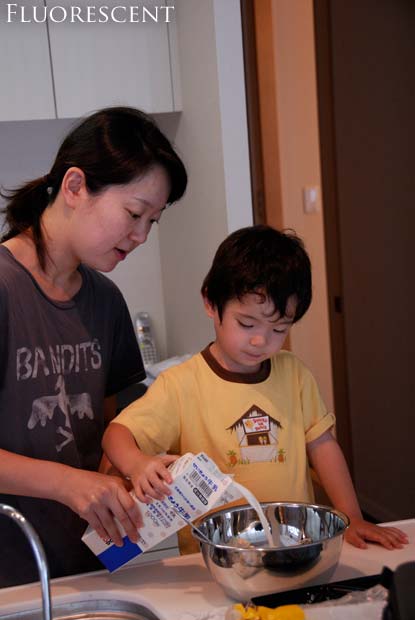
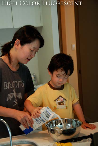
- Fluorescent
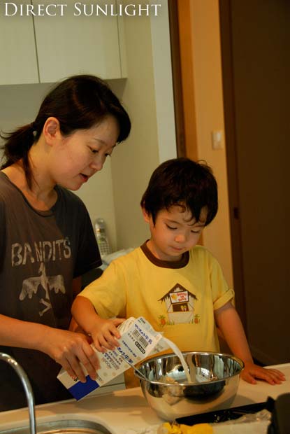
- Direct Sunlight
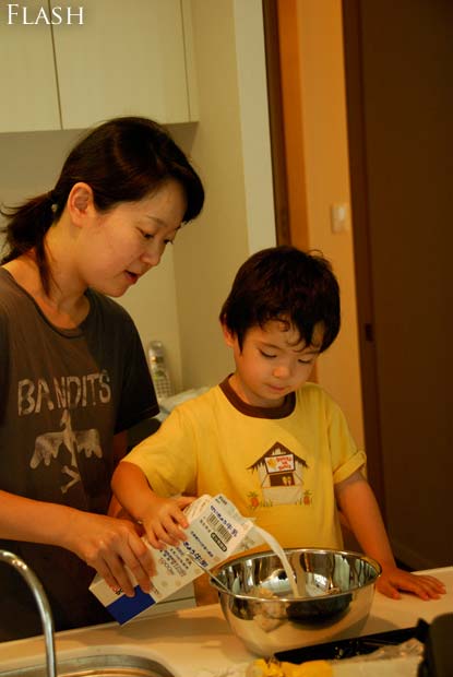
- Flash
- Cloudy
- Shade
- Preset
The last one, preset, allows me to take a picture of something gray and tell it “this is supposed to be gray”, and the color perception for future pictures will be adjusted accordingly. This works because something truly gray (or white, for that matter) has an equal amount of each of the primary colors (red/green/blue), and so if the camera's sensors actually detect an excess or lack of any of them, it can adjust them so that they all even out. The same adjustment is then applied to the entire picture, and (in theory) all colors should then appear natural.
The other settings are just ballpark guesses for commonly encountered scenarios. For example, there's not one “incandescent” light type -- heck, the light from an incandescent light bulb changes depending on the voltage applied. Maybe this is why the D200 has such abysmal incandescent white balance (images taken in “incandescent light” with the incandescent white-balance setting tend to look a bit unnatural)
So here's a question: what should you do when there's a mix of light sources?
I took the picture below, of Fumie and Anthony making waffles, in our kitchen. The general kitchen lighting is fluorescent, but there are incandescent spot lights directly above (shining straight down to the counter surface), and the 9am sun was drifting in from the windows behind me.

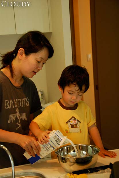
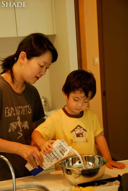


Cloudy - Shade - My Result - Jason's WB - Jason's Result
mouseover a button to see that image
Although they don't apear so, the wall and cabinet behind Fumie are white, as is the countertop, milk carton, and, of course, the milk itself.
Mouseover the buttons below the image to see the different color-perception interpretations. Note, in particular, the wall behind Fumie and the countertop (again, both of which should be white).
The countertop is primarily lit by the incandescent spots, so it appears the whitest via the “incandescent” setting. (But the parts of the countertop in the shadow under the carton and bowl are lit primarily by the ambient fluorescent, they're the most properly gray under that setting.
The walls behind Fumie are white and mostly lit by the ambient fluorescent, but the flat surfaces facing forward are also getting some sun, so they have a different cast than the side wall appearing between Fumie and Anthony.
What got me thinking to write this post was the horrible time I had in post-processing this image to create something appearing vaguely natural. At the time I took it I was well aware of the different lighting and of the trouble it would bring-- if I'd had the time, I would have turned off one of the types of light, but it was one of those catch-it-or-lose-it moments.
What I eventually came up with is shown via the “My Result” button above. I didn't do a very good job -- the skin tones are still way off (compare Anthony's arms to his face -- his face is not getting much incandescent light, but his arms are). Mostly, I isolated areas that were generally lit by one type of light and performed a color balance adjustment in Photoshop. I also used the desaturate tool to clean up things that should appear white/gray.
UPDATE (This section added five days after the initial post)
My friend Jason took a quick whack at this
image. The “Jason's WB” button is his rough attempt to
whitebalance the image for proper skintone.
He took a few more minutes
(a total of four, he says) to make a few other adjustments
(“adjusted the tint to 3; exposure +0.96 EV, Saturation 1.09,
added a little sharpening, straightened it by -2.9 degrees, cropped it a
bit.”). His final
result certainly has a more pleasing composition, although it looks odd
in the “Jason's Result” view above, because I had to reposition
it to make it match the others for this post.
By the way, in case you're wondering how I came up with the seven white-balance-specific versions of the image, I did so by going to the raw file I have my camera set to produce. It contains the pre-white-balance raw sensor data, and so any of the white balance settings can be mimicked after the fact in software (in my case, when loading it into Photoshop).
So, I loaded it seven times, using a different white-balance setting each time. (The “HC Fluor” setting is for a special kind of fluorescent light that has less holes in its color spectrum than common consumer fluorescent lights, and so is better at accurately lighting a scene.)
Now that I have all these setting-specific versions, I should go back and redo my post processing to see if I can use them to get a better result. But considering that I just spent three hours writing this post, I find that I don't have the time!
Some links for further reading:
- white balance at Sean McHugh's site
- white balance at Wikipedia
These tend to talk more about “color temperature”, “black body radiation”, and other things that are of no practical use to the photographer, but they explain the science behind it.
Finally getting around to processing some of the accumulated few-thousand photos I've taken but not yet dealt with, here are some from a park Anthony and I visited in May.


Okay, it seems to work — let's see what this baby can do!

Warp Speed
(That last picture has an exposure of only 1/5th of a second — he was really cranking!)
I'd like to expand Anthony's exposure to English, and one way to do that is with a broader range of videos or movies. We've been pretty restrictive about watching anything on TV/video, and until now he's been limited to the occasional Dora the Explorer, Bob the Builder, Clifford the Big Red Dog, and the Disney movies Dinosaur and Finding Nemo. By far, Dora is his favorite.
Looking for different types of videos, I went to my old DVD collection and found a few to try: 101 Dalmatians, Ice Age, and Space Jam.
We started out with Ice Age, and wow, what a mistake that was. Within five minutes he was extremely scared (and shaking!) because of a scary scene. We bailed on that movie, but the damage was done -- he had to sleep with the door open, and woke up scared at 5am (I then slept with him for a while).
We tried Space Jam a bit, but it's way beyond his age, and just full of senseless violence (a la Bugs Bunny). He wasn't interested in it and I didn't want him to be, so we bailed on that fairly quickly.
We had better luck with 101 Dalmatians. There were some sad/scary parts, but they were beyond him and he didn't understand, so wasn't scared. There were a lot of puppies, and that was enough. He didn't really understand the story (and certainly not the premise of the mean lady wanting to kill the puppies to make a coat), so it was fine for a 3.5-year old, but probably won't be good for a 5 year old.
We'll be in The States for much of the summer, and so will have a chance to pick up more videos. Any suggestions on wholesome, non-violent videos for a 3- or 4-year old?