I love April-Fool's jokes.
I don't care so much for ones played on me by someone I don't know, by a source I don't trust. No, it's best when it's a friend or trusted source, when the joke is so good that I actually regret having given them my trust. Yes, the satisfaction you feel when you make me regret having trusted you..... well, jokes just don't get better than that, now do they?
One of the best ever was back in 1998, when I'd been working for Yahoo! for a year. This was near the beginning of Yahoo!'s great heyday and we were putting out new properties left and right... Yahoo! Mail, Yahoo! Atlanta, Yahoo! Auctions, Yahoo! This, Yahoo! That. It was common for a pre-launch company-wide invitation to check out the a site and pass along feedback to the developers, and I often spent considerable energy on this, as many of us did. So one day when a company-wide call went out to check out the forthcoming “Yahoo! Jokes” site, I spent several hours combing through its mechanics to provide feedback.
Of course, you see where this is going: it was April 1st, and the entire site was a joke, as was the company-wide call to action. I'm sure they got a great laugh at everyone who wasted hours of their paid workday, and I learned a great lesson in return: never again to trust the person who sent the request.
Perhaps I'm just a sourpuss, but it seems that the whole point of April Fool's jokes these days is to trick someone into believing you, which put another away, is to make them regret having trusted you. Trust and respect shouldn't be so easily discarded.
Of course, having fun is fun, so if it's obviously silly (like this from Seth Godin), I'm all for it. Just don't teach me to not trust you.

Nikon D700 + Voigtländer 125mm f/2.5 — 1/800 sec, f/2.5, ISO 200 — map & image data — nearby photos
And So It Begins
first buds 2012
Dark buds have been slowly making the cherry-tree branches bumpy, but today they suddenly erupted with color. No blossoms as of yet, but the color is clearly there where yesterday there was none.

Nikon D700 + Sigma “Bigma” 50-500mm OS @ 340mm — 1/400 sec, f/6.3, ISO 450 — map & image data — nearby photos

Nikon D700 + Sigma “Bigma” 50-500mm OS @ 500mm — 1/400 sec, f/6.3, ISO 640 — map & image data — nearby photos
The blossoms are quite late this year. Comparing to the my cherry-blossom timelapse from 2007, this year seems to be about five days late.
While I was down taking shots of the buds, an obvious grandpa/grandson pair strolled by, and they just looked so pleasant that I had to snap a shot...

Nikon D700 + Voigtländer 125mm f/2.5 — 1/1250 sec, f/2.5, ISO 200 — map & image data — nearby photos
Out With Grandpa

Before |
After | |
| “Chipping” my Nikon-Mount Voigtländer 125mm f/2.5 | ||
UPDATE: Sadly, the procedures reported on this post ended up not working. More info here.
I'll leave the whole post, including the inline updates, but be warned that it was all for nothing. )-:
As most folks guessed correctly in my golden bumpy “What am I?” quiz, the object is a lens CPU chip/contacts set. I'm surprised so many people knew what it was because I had no idea they existed until recently. It allows one to update an old lens with modern electronics that tells the camera body a few particulars about the lens.

Nikon D700 + Voigtländer 125mm f/2.5 — 1/800 sec, f/8, ISO 1400 — full exif
Tiny “Dandelion” Lens CPU for Nikon
By far my favorite and most-used lens is the “Cosina Voigtländer Macro APO-Lanthar 125mm F2.5 SL”, a mouthfull of a name for a gorgeous lens described here. My blog has no end of posts that highlight some of what this lens can do, but here are a few:
- The Towel Museum in Imabari Japan, Part 2
- Exploring the Edge of Creamy Macro Bokeh with Lily of the Nile
- Exquisite Beauty Growing Like a Weed by the Side of the Road
- Haphazard and Defocused: Elusive Lesson in Photographic Composition
- Exploring a Glass of Dainty Flowers With the Voigtländer 125mm f/2.5
- Exploring the Sharper Side of the Voigtländer 125mm f/2.5
- Low-Hanging Fruit: Flower Detail from Kid Ikebana
- Little Flowers, Little Context
- a post about Lightroom using a creamy magnolia example photo
Unfortunately, even though it was made just a decade ago, it has no internal CPU to tell the camera body what it is, so I've had to rely on the “Non-CPU Lens Data” feature of my Nikon D700 to allow basic use of the lens. This is fairly inconvenient because I use a number of non-CPU lenses and must remember to switch to the data set for the lens each time I switch.
So, when I found out about the Dandelion all-in-one CPU and contact set made by Russian firm Filmprocess, I ordered some. Filmprocess doesn't actually sell them to consumers, so I bought some from Spanish firm Leitax, for 27 Euro. (They list it on their “Leica for Nikon” page, but you can buy just the chip in the entry described "And this is the special Dandelion Chip for Nikkor manual lenses (and other lenses where the chip rests on top of a flat surface)", which adequately describes my Voigtländer.
It seems that most people who install these chips on their own lenses write up an article about how they did it, so a web search quickly brings up plenty of places you can go to find details. Of note is this post on Leitax's own site about how to glue the chip, or this one from almost two years ago.
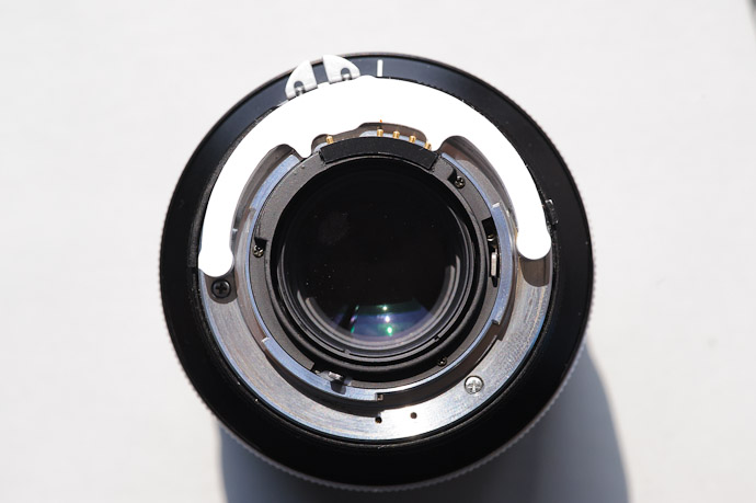
The chip comes with a little mount-location guide, so it's easy to see where it has to go:
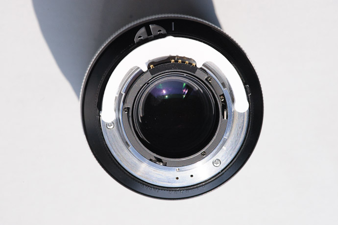
Nikon D700 + Voigtländer 125mm f/2.5 — 1/800 sec, f/11, ISO 1000 — full exif
Rough Placement Test
with the chip sitting on the section of plastic it needs to be placed in
Just make sure that the four pins are to the right when viewed as in the photo above; you don't want to put the thing in upside down!
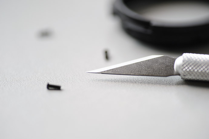
While the chip was on top of the black collar, I scored the edges of where it should go with an X-Acto blade...
Then removed these three screws...
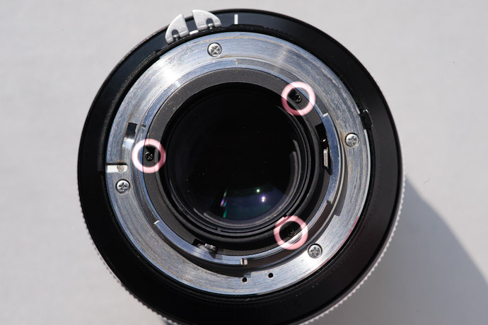
Nikon D700 + Voigtländer 125mm f/2.5 — 1/800 sec, f/11, ISO 2000 — full exif
Just Three Screws
to remove the plastic collar
...and the black collar can be pulled out without fuss.
I was surprised to realize that it's fairly soft plastic; I had my Dremel ready because I thought it was metal of some kind. Being plastic, I could just work on it with the knife...
It turns out that the area where the chip must go is hollow:

Nikon D700 + Voigtländer 125mm f/2.5 — 1/800 sec, f/8, ISO 1250 — full exif
Hollow
reverse angle of area to remove
This is great news because it makes it all the easier to cut, just by shoving the knife blade up from the bottom, flush with the inside wall:

Nikon D700 + Voigtländer 125mm f/2.5 — 1/800 sec, f/8, ISO 1400 — full exif
Natural Lower Cut Limit
the “seam” running up and down in this pic
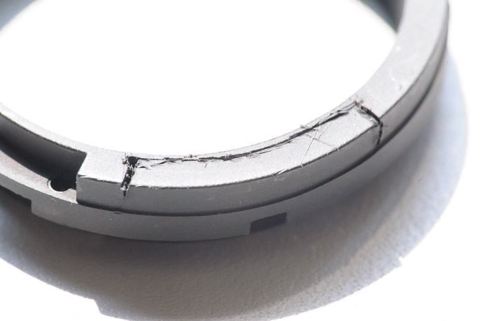
I tried a number of methods to make the cut... including repeated scoring with the blade, but after much trial and error I found that I got best results by just repeated “poking” with the blade, eventually perforating where I wanted the cut. Because the whole collar is soft plastic, ripping part and/or squishing the whole thing were real concerns, but I was able to get through successfully...

Nikon D700 + Voigtländer 125mm f/2.5 — 1/60 sec, f/8, ISO 6400 — full exif
Looking Ragged
but it cleaned up nicely
Once the fit was checked I was ready to glue it in. I've never in my life had good luck with Krazy Glue or the like, so when I ordered from Leitax I had them include a small tube of what they use, sold for eight Euro on the same page they sell the chip itself. It came without instructions, but I was able to find them both in Spanish and in English. The summary is “Sets and dries quickly; best removed, if needed, with a knife”.
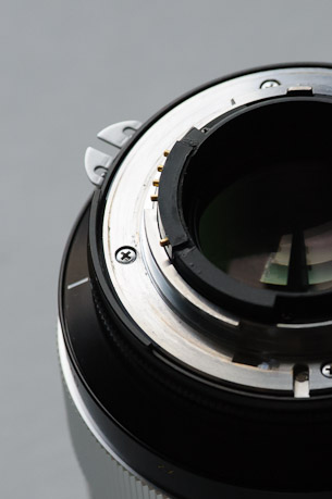
I glued the chip mostly at the back, but also along the bottom edge and two side edges. It also says that it's ready for practical use within a few minutes, but I left it for several hours before replacing it and its three screws:

Nikon D700 + Voigtländer 125mm f/2.5 — 1/400 sec, f/2.5, ISO 280 — full exif
Success
Glued and Dried
Once it's been mounted, you need to program it for the specific lens, which involves an ingenious method of telling the chip the lens focal length, minimum aperture, and maximum aperture. Full instructions are here, but in short:
To set the widest aperture (“f/2.5” for the Voigtländer):
- Turn the camera on
- Set the camera to manual-exposure mode
- Take a photo with a 1-second exposure.
- Take a photo with a 5-second exposure.
- Take a photo with a 1-second exposure.
- At this point the aperture displayed in the camera settings will start to cycle, changing every second or so. You can then pick a programming mode by taking a 1-second-exposure shot when a specific aperture is displayed. In the case of setting the widest aperture, wait until “f/2.8” is shown, then take the 1-second-exposure shot. Now the chip is in “set widest aperture” mode".
- Now the aperture will cycle again, changing by a small amount every second or two. When it gets to “f/2.5”, take a 1-second exposure shot. The chip has now been programmed to tell the camera that the widest aperture is f/2.5.
- Turn the camera off.
To set the narrowest aperture (“f/22” for the Voigtländer):
- Repeat all the steps above, except in step 6 wait until the display cycles to “f/40” before taking the shot. That puts the chip into “set narrowest aperture” mode.
- Then in step 7, wait the minute or two until the display cycles up to f/22 and take the shot.
To set the lens focal length:
We'd like to tell the chip that the lens has a focal length of 125mm, but, according to the maker, it's not possible. That makes some sense because Nikon also doesn't allow you to set that focal length in the camera's “non-CPU lens data”, so 125mm seems to simply not exist in Nikon's world.
So, I picked to program the lens as “135mm”, to match what I've used in the non-CPU lens-data section. This is done by repeating the steps above, except in step 6 wait until “f/4.5” is shown to take the shot. That puts the chip into “set focal length” mode. Then in step 7 wait until f/13 is shown, which, according to the instructions, corresponds to “focal length is 135mm”.
And that's that. Update: Not quite... see below.
Now I don't need to remember to set the lens data when I use this
lens... it just works. I leave the lens's physical aperture at f/22 and
control the shot aperture via the thumb wheel on the camera body, just like
with a modern lens.
Update: after first trying the newly-chipped lens in aperture-priority mode (as I tend to shoot), I got severe under-exposure in the middle apertures. This could happen if the Voigtländer's aperture control is not linear (if it's not really AI-S as it claims), or, I suppose, through some problem with the chip. In either case, the lens was not practically usable except wide open or fully stopped down, so I wanted to revert to controlling aperture via the physical ring on the lens. (I had wanted to do this anyway because I had become accustomed to doing so, and missed the feel of shooting that way when first trying the chipped lens.)
BTW, Nikon AI-S lenses with aperture rings have the largest f-number printed in orange, a sign that it's AI-S and not AI, but it seems that the Voigtländer does not follow this convention.
Luckily, it turns out that you can revert to the aperture ring while still retaining the CPU for lens identification, at least if you have a pro-level camera body:
Put the chip into programming mode via the 1" - 5" - 1" shot combo, then take a 1" shot when the aperture display rolls around to f/60.
Upon doing this, the camera LCD display will likely show “FEE”. That error display may go away when you power cycle the camera while the aperture ring is set to f/22, but it will reappear quickly, which brings us to...
Visit the camera's custom-setting menu, item “Customize command dials” (which is custom menu item “f9” on a D700), and set “Aperture setting” to “Aperture ring”.
Voilà, it now works properly... the aperture is controlled manually as before the chipping, but I no longer need to worry about setting the “Non-CPU Lens Data”.
I was able to figure this update out with some web sleuthing, and a hint from Viktor at Filmprocess (who I think is the chip's inventor). He didn't give me much, but it was apparently enough, and he kindly allowed me to correspond in English, which I very much appreciate.
The only down-side of all this that I can think of is that if I ever tether the camera (to be controlled by the computer or an iPad or the like), I'll not be able to control aperture remotely. I've never needed to do this, but perhaps I'll want to some day.
It's a bummer that the metadata records as 135mm instead of 125mm, but I had that problem before, so I still pre-process my images before loading them into Lightroom, injecting proper lens data (including the “Voigtländer 125mm f/2.5” name) so that I see it properly in Lightroom.
Next on the list: the 1983 Nikkor 300m f/2. I also have a Nikkor 50mm f/1.2 that I'd like to do this to, but its rear glass is so big that there's not enough room to physically mount the chip (at least not without physically chipping the lens glass), so that's a no-go.
Time again for one of my “What am I?” quizzes. The Exif data won't help you with this one, sorry. 😉
As usual, I will keep any comments private until I post the answer, to give everyone the same chance.

iOS Color Management
Leaves Me Feeling Blue
( note: all browsers, whether color managed or not, will show me as blue in this copy )
Well, this is surprising: iOS does not seem to be color managed. At all.
My Tech-Related Photography Posts
- My Lightroom-to-iPad Workflow
- Lightroom Goodies (lots of plugins)
- Digital Image Color Spaces
- Online Exif (Image Data) Viewer
- Jeffrey's Autofocus Test Chart
- Photoshop Calendar-Template-Building Script
- How to Prepare Photos for an iPad
- A Qualitative Analysis of NEF Compression
- Tripod Stability Tests
more...
This is a long and technical article. Here's the table of contents:
- Introduction
- Color Management
- Embedded Color-Profile Support
- Device-Specific Color Profiles
- The Curiously-Deficient “SpyderGallery” App
- What's Next
- One Last Caveat
Introduction
With all the talk these days about glorious color performance of the third-generation iPad screen, such as this article and this, I realized that my Lightroom-to-iPad workflow (presented in “Getting Photos from Lightroom to iPad: a Much Smoother Workflow”) neglected to consider color profiles. This is a huge oversight for someone like me who wrote an in-depth primer on digital-image color spaces six years ago.
So, I looked into how I might enhance my workflow along color-management lines, and discovered to my shock that iOS is not color managed. At all. I haven't found a single application, from Apple or anyone else, that is color managed. Even Datacolor's SpyderGallery app, which allows you to profile your iPad screen with a real hardware colorimeter, is not color managed.... it seems to be nothing more than a technically-incompetent placebo.
Color Management
If you're not familiar with what “color managed” means, my old primer on color spaces goes into great detail, but in short, digital images such as the JPGs you find everywhere are made up of numerical data that becomes a picture only when interpreted for display by the viewing application, such as your web browser in showing the images on this post. The display application can make assumptions about how to convert that numerical data to color, or it can be told explicitly by various notations within the file.
Of course, any assumptions may be wrong on an image-by-image basis, so it's always best if the display application uses the explicit notations if they're there, but some applications don't bother. An application is “color managed” if it uses the notations, and not color managed if it uses only assumptions.
(There's another facet of color management that deals with how those colors are then presented on any specific display device; I'll get to that later.)
So, why am I blue?
It's okay and expected that I'm blue in the photo above, which originally was by Paul Barr of me from my previous post; I'll explain why in the next paragraph, which will then prepare us to understand when I present the real problem in the paragraphs that follow.
Embedded Color-Profile Support
The lead photo of this post uses raw color data that makes me look blue when interpreted with “common” assumptions about the data→color conversion process. In the copy above, I make sure that there are no notations about how to do the proper conversion (I stripped the “color profile” that would normally be embedded within the image file), so your browser has no choice but to guess, and for this test I made sure that the common guesses would produce an obviously-wonky result. (No comments, please, about how any photo of me is “obviously wonky” 🙂 )
Now, let's look at exactly the same image, except that it does have an embedded color profile describing the exact data→color conversion process. This means that the next image will appear to you with generally proper colors (I'm pink, not blue) if your browser does not ignore the color profile. If it ignores it, instead opting to make assumptions, I'll look exactly the same blue as in the top image.

Am I Feeling Blue or Tickled Pink?
this is the main test image
if this version looks blue, your browser is not color managed
Did your browser pass the test?
When I first wrote my color-space primer six years ago, most browsers would fail, showing a blue me. Things are better today, especially on a Mac where all major browsers have been color managed for years.
On Windows, it's still a mixed bag. Firefox and Safari have been color managed for a long time, but Internet Explorer became color managed only last year with IE9, and Chrome and Opera are still not color managed and leave me blue. (In a twist of irony illustrating the Mac's general lead in this area, Microsoft's own Internet Explorer for the Mac, last updated nine years ago, is color managed and shows me in all my pink, er, glory. It took Microsoft another eight years to get around to doing the same thing for their own operating system's users.)
I won't go so far as to say that if you see a pink me, you're seeing accurate colors, because I have no idea whether your computer display is adjusted properly (or even at all!), but any kind of pink is a lot closer to accurate than blue.
Okay, so now try viewing this blog post on your iOS browser; the results will, I'm fairly certain, leave you feeling blue.
Obviously I can personally test only a small subset of devices and applications, but I have not found any — not even one — iOS application that displays the second image properly. You can save it to your camera roll and view it with any number of applications, including apps from such leaders as Apple and Adobe, and they all show me as blue because they all ass·u·me incorrectly, even though the color profile is right there in the image. Back in 2006, on the History of Color Mis-Management page of my color-space writeup, I called such applications “Color Stupid”, but in this day and age, such applications should probably be called something much worse, like “Color Moronic”, or “Color Leaves-Me-Dumbfounded”.
To make testing easy, here are three versions of the image presented in a convenient group, two as test “controls”, and one for the real test:
|
Control Image
Always Correct 
|
Test Image
Pink or Blue? 
|
Control Image
Always Blue 
|
I'd be curious to hear how these images display in various situations... what about Chrome on Android? Photoshop for iPad? If you try them, let me know the results in the comments below.
I created these test images with the intent that a lack of color management is exaggerated to the point of being obviously apparent. In the real world it can be subtle, but the practical effect is often a “washed out” image. You can see some real-world examples on the “Test Images” page of my color-space writeup.
Not wanting an article where the only photo is of me, I'll take the liberty to sprinkle the rest of the article with random photos that have appeared on my blog during the past year, each with the “Funky RGB” color so that they're at least “interesting” when viewed in a non-color-manged browser. Clicking on them brings you to the article where they first appeared, presented there in a color space that should at least not look totally wonky when not color managed. (If your browser is color managed, it may be fun to look at this article with a non-managed browser.... some of these pics look pretty crazy that way.)
Okay, so back to iOS. It's surprising enough that iOS is not color managed, but the most egregious offender I've found is Datacolor's SpyderGallery app. If you can get by the vomit-inducing intro text (“If you could be a color, which one would you be?”), you'll find claims that users will “enjoy color corrected viewing of their photos” and that you “will no longer need to compromise color accuracy for the convenience of your iOS device.”
This is all fine and dandy if it were true, but the app is not color managed!
Device-Specific Color Profiles
Let's step back a bit to first look at the other facet of “color managed” that I mentioned earlier. Above we talked about how colors are derived from an image file, and about how a color profile — a device-independent color profile — can be used to accurately guide the conversion process to come up with the proper conceptual idea of “color” for each pixel. The flip side is the facet of how those conceptual colors are actually presented on each specific display device.
We've all seen the banks of TV screens at the electronics store showing the same program, but with wildly different looks.... each TV seems to have its own tint or richness or brightness, etc. The same goes for our display devices (computer monitors, tablet screens, etc.), and a properly color-managed application will adjust on the fly for the characteristics of the device(s) it's displaying on.
In order to properly adjust for each specific display device, the application must know the answer to the question: "When I think I'm sending such-and-such a color to the display device, what color actually shows up on screen?". The answer is unique to each device, and changes even from day to day with any particular device. The answer changes every time you adjust the device video settings (brightness, contrast, tint, etc.), and the answer even changes over time as the display warms up after first being turned on in the morning.
The only reasonable way to answer the question is to “profile” the device with specialized hardware. This hardware includes a light sensor temporarily placed over the display device, then a profiling app is run that floods the sensor with a wide range of colors, allowing the app to compare the color it thinks it's sending with the color actually measured by the sensor. By calculating the difference, a “device-dependent color profile” can be created that instructs applications how to modify color data on the fly for that one specific monitor.
Now, as I said, this changes over time, so the device profile that I create today for my monitor (after it has warmed up, of course) will not be useful for you and your monitor, even if you have the same make and model, and it will likely fade out of accuracy as even for my own monitor as it ages. And it becomes immediately invalid if I make any adjustments to the monitor brightness setting, etc. But if I leave my monitor settings alone, it'll be fine for me for a while... I tend to reprofile several times a year, though serious folks do it weekly or even daily.
All that about “mine not valid for you” does apply to an iPad as well... the display characteristics of two iPads are in theory different... but from what I hear, the production is very reliable and all iPads of the same generation have very, very similar display characteristics, so a single “generic first-generation iPad” profile can likely be used by everyone with an iPad 1 with great success. This is where I failed in my original Lightroom-to-iPad workflow, something I intend to correct in a followup, soon.
Still, despite the apparent lack of a need for per-device calibration, some folks wanting the absolute last measure of quality in their photo display may want to create a hardware profile for their specific iPad. This desire meshes very nicely with the desire of colorimeter manufacturers to sell more product, and so voila, we have Datacolor's SpyderGallery app.
The Curiously-Deficient “SpyderGallery” App
It's important to understand what this app claims to offer. It's saying “use specialized hardware we sell you to measure the exact color output of your specific iPad, so that when displaying your photos with our app, we won't have to make assumptions about how your iPad displays color, we will know.” This is coming from a company that makes hardware colorimeters, so it's only natural to trust that they're experts in this area and understand the issues involved, and that when they offer a solution, it can actually do what it claims.
When I first saw this, it made me wonder what the assumptions were to begin with. I hadn't thought deeply about it, but I would have thought that iOS would contain generic device-dependent color profiles for the various iPads, iPhones, and iPod Touches that iOS runs on. The profiles are not very large, and there aren't that many iDevices, so it seems to be a no-brainer to include them all. If this is the case, hardware profiling like in SpyderGallery would be of minimal use because, at best, it could try to adjust for any subtle difference between the rock-solid average iPad and each user's specific iPad. Not really much point to that, but it wouldn't hurt.
But it turns out that SpyderGallery is not color managed in the first sense we talked about in the top half of this post: even if the images contain their own color profile — specific instructions on how to convert from the numerical data to conceptual color — SpyderGallery ignores it. The app may have stopped making assumptions about the display hardware, but it's still making assumptions about the original image data in the first place. This is moronic beyond belief. It's as if they're a tailor with cutting-edge facilities to make garments to the tightest of specifications, but insist on creating your shirt based on the average human size instead of your specific measurements.
In short, Datacolor's SpyderGallery is, it seems to me, just a meaningless placebo.
I wrote to Datacolor to ask for comment, and got a fairly quick reply that implied that the app assumes all images are in the “sRGB” color space, which is the de facto standard for unprofiled images on the web. This was presented as a “recommendation”, which seems very strange, since if true, doing anything else would guarantee incorrect colors.
Possible Mitigation with iTunes?
As I wrote in my initial, now-obsolete first Lightroom-to-iPad writeup, iTunes does some very strange things to your photos in preparing them for the iPad, but it is color managed, at least on OSX, because it converts everything to the “sRGB” color space before shipping it off to the iPad. This is not exactly ideal, but in practice is probably not that big a deal one way or the other.
So, if the implication in Datacolor's response to me is true, that they assume every image is in the sRGB color space, it'll work just fine for photos that end up on your iPad via iTunes, and perhaps for other images as well. Like I said, that's all fine and dandy when the assumption works out, but considering that there's no need to make any assumptions in these cases, doing so is inexcusable for a company like Datacolor.
What's Next
Going forward, one can hope that iOS and its apps will become color managed. This is probably something Apple can address in one fell swoop with an iOS update, but since I'm not an iOS developer, I don't know the details. I suspect that lacking an iOS update on Apple's part, individual developers can work to make their apps color managed. Again, I don't know the details, but it wouldn't surprise me if lcms suddenly became a bit more popular.
There's also something we can do now in preparing our photos for the iPad.
Normally it's flat-out wrong to put a device-dependent color profile into a JPG image file, and in a classic case of “just enough knowledge to be dangerous”, any suggestion of doing so is a clear sign that someone has no clue what they're talking about. But I'm going to suggest it here. 🙂
I have created a device-dependent color profile for my specific iPad 1 (created, ironically, with a Spyder3 colorimeter from Datacolor), and I will use it when I export from Lightroom for my iPad. Currently it will be ignored by all apps I've tested (including the photo-viewing app I use), but since the image data is already exactly tailored to my device, the result should be as absolutely perfect as is possible to obtain. If iOS or my photo-viewing app suddenly becomes color managed, they'll use the color profile to realize that no conversion needs to be done, and I'll get the same perfect result.
Furthermore, if the iPad's build consistency is as solid as reported, the color profile I made for my iPad 1 will work very nicely for your iPad 1. But frankly, I don't trust that I have the skill and equipment to make the best “iPad 1” color profile possible, so before I update my Lightroom-to-iPad workflow article, I'm looking for a better source of profiles, perhaps one that can also provide profiles for the third-gen iPad and other iDevices as well. Any ideas?
One Last Caveat
I'll end this post with the admission that it seems so unlikely in this day and age that iOS is not color managed, and that the greater likelihood is that I'm simply making some stupid error, and that my complaints about iOS and SpyderGallery are undiluted ignorance on my part.
I'll be mortified and embarrassed if that's true, yet, somehow I hope it is. We'll see.
The End
The rest of this article is just more funky/pretty pictures, though which (funky or pretty) depends on whether your brwoser is color managed, and, of course, personal taste. 🙂


