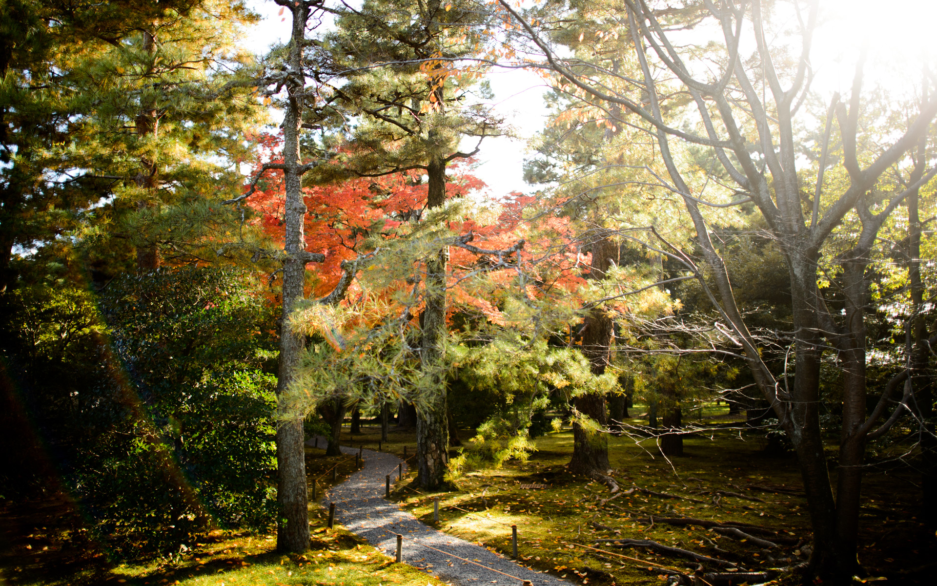
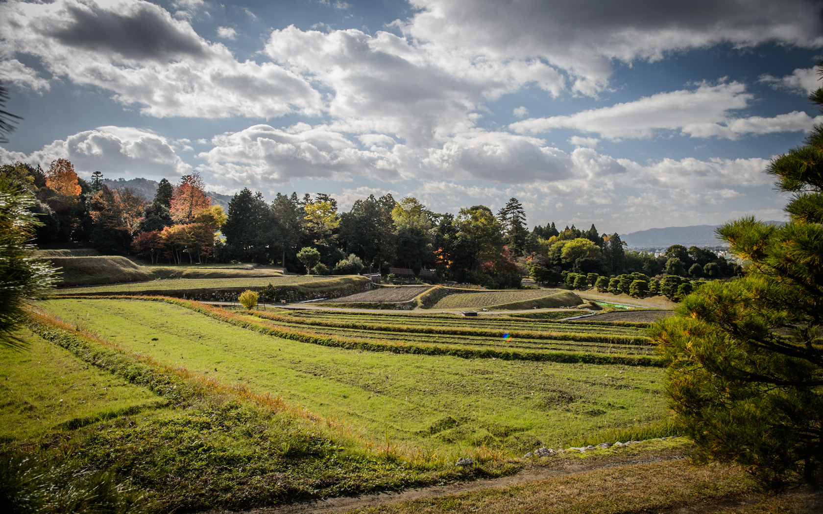
, Kyoto Japan -- Shogunzuka Overlook (将軍塚) -- Copyright 2013 Jeffrey Friedl, https://regex.info/blog/ -- This photo is licensed to the public under the Creative Commons Attribution-NonCommercial 4.0 International License http://creativecommons.org/licenses/by-nc/4.0/ (non-commercial use is freely allowed if proper attribution is given, including a link back to this page on http://regex.info/ when used online)")
Nikon D4 + Nikkor 70-200mm f/2.8 @ 200mm — 1/800 sec, f/22, ISO 5600 — map & image data — nearby photos
Still Searching
for a Garmin product that doesn't suck
at the Shogunzuka Overlook (将軍塚), Kyoto Japan
I hate to have any negative articles on my blog, much less two in a row, but wow, it's difficult to count how many ways Garmin's products are so much worse than they need to be, from devices designed for the pocket but without a way to lock the buttons from being bumped in pocket, to worse-than-nothing “features” you can't turn off, to memory-card slots buried behind batteries (really? How does one screw up something as simple as a memory card slot? Ask Garmin.), to any number of additional “what on earth are they thinking?” observations.
From hardware to software to support, they have mediocrity covered. It seems apparent that you don't have to bother with common sense or quality when you don't have much competition.
Anyway, this blog post is for the search engines, to help folks with the same problem I had.
In short:
If you formatted your Garmin flash drive on a Mac, and now you get “The update file is corrupted” when using Garmin's WebUpdater, even though you've borrowed a Windows box to redo the format with FAT32, and even placing a new GCD file seems to be ignored... the solution is to format using the method described here.
, Kyoto Japan -- Nishi Hongwanji Temple (西本願寺) -- Copyright 2013 Jeffrey Friedl, https://regex.info/blog/ -- This photo is licensed to the public under the Creative Commons Attribution-NonCommercial 4.0 International License http://creativecommons.org/licenses/by-nc/4.0/ (non-commercial use is freely allowed if proper attribution is given, including a link back to this page on http://regex.info/ when used online)")
Nikon D4 + Nikkor 24-70mm f/2.8 @ 24mm — 1/500 sec, f/2.8, ISO 360 — map & image data — nearby photos
Bell
at the Nishi Hongwanji Temple (西本願寺), Kyoto Japan
As per that page, I used the “rmpresub” program, but finding the download link is difficult among the waterfall of ads. The download link I eventually got to is this one, but to find it yourself visit http://www.rmprepusb.com/ and then in the left-hand nav select “Latest RMPrepUSB versions + downloads” then scroll down a bit until you see a list. It's the second one.
Find a Windows box and run that program while your unit is plugged in, and adjust the dialog as per the method description. Then unplug the Garmin device and plug it back in, and now you can run WebUpdater.
If this doesn't work, additional help can be found here and here, but not here.
, Kyoto Japan -- Chion'in Temple (知恩院) -- Copyright 2013 Jeffrey Friedl, https://regex.info/blog/ -- This photo is licensed to the public under the Creative Commons Attribution-NonCommercial 4.0 International License http://creativecommons.org/licenses/by-nc/4.0/ (non-commercial use is freely allowed if proper attribution is given, including a link back to this page on http://regex.info/ when used online)")
Nikon D4 + Nikkor 24-70mm f/2.8 @ 45mm — 1/100 sec, f/2.8, ISO 3200 — map & image data — nearby photos
Temple Bridge at Dusk
at the Chion'in Temple (知恩院), Kyoto Japan
Garmin just sucks so bad. They advertise their products as working with Mac, but they can't handle being reformatted on a Mac, as if they don't truly understand how to work with flash memory as a disk. (It's not “as if”, it's pretty clear that they don't.)
A web search shows an ocean of folks suffering this same problem, across a wide variety of Garmin products. Yet, when I contact Garmin to ask how to fix it, they don't know what to do. At first they sent me a Windows executable to run, and when I told them that hello, I'm on a Mac, they sent me a “you need a Windows machine” reply.
I borrowed multiple Windows machines and tried their procedure, but it simply didn't work. Determined not to reward them with an $80 fee to fix a problem that arose from their ineptitude, I continued digging until I found the must-reformat-in-this-special-way procedure linked above.
If Garmin had the slightest clue, the unit would do it itself the moment it discovered that the internal format wasn't to its liking. Or, at least, Garmin's fix-it script would do that. Or, at least, Garmin would have seen the multitude of folks running into this problem and have figured out the same procedure I found. But no, they're just idiots.
I hate Garmin's inept design, but I haven't found any other location logger that does what I want (1Hz logging for 12+hours, and a display that clearly shows the time and the current accuracy). Sigh.
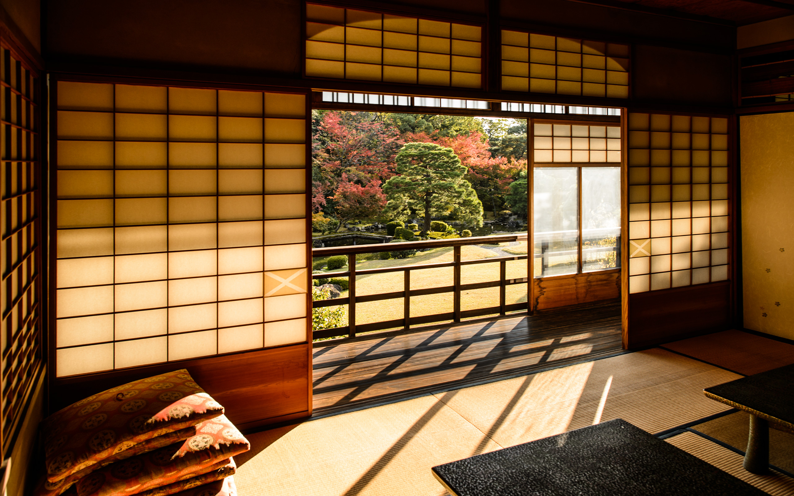
, Kyoto Japan -- Seifuso Villa (清風荘) -- Copyright 2013 Jeffrey Friedl, https://regex.info/blog/ -- This photo is licensed to the public under the Creative Commons Attribution-NonCommercial 4.0 International License http://creativecommons.org/licenses/by-nc/4.0/ (non-commercial use is freely allowed if proper attribution is given, including a link back to this page on http://regex.info/ when used online)")
Nikon D4 + Nikkor 24mm f/1.4 — 1/800 sec, f/1.4, ISO 100 — map & image data — nearby photos
Backyard
at the Seifuso Villa (清風荘), Kyoto Japan
, Kyoto Japan")
Nikon D4 + Nikkor 24mm f/1.4 — 1/50 sec, f/5, ISO 110 — map & image data — nearby photos
Timeless
Simple, elegant design is timeless
(the Seifuso Villa (清風荘), Kyoto Japan)
| — | My friends' and family's reaction to
Apple's latest interface for its phones and tablets. |
“Beauty is in the eye of the beholder” is perhaps most true when a well-established convention undergoes a radical change. Not only is it then judged on its merits, but also by how it differs to what came before.
The user-interface (UI) design of iOS 7 seems to be of the radical variety. Not quite as radical as the initial iPhone was to the cell-phone world at the time, but also not as universally lauded. A lot of people really hate iOS 7.
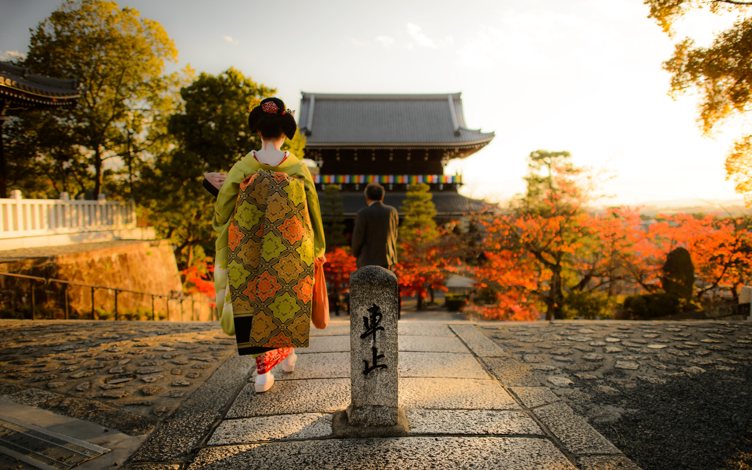
 at the Kurodani Temple (金戒光明寺), Kyoto Japan")
Nikon D4 + Nikkor 24mm f/1.4 — 1/800 sec, f/1.4, ISO 100 — map & image data — nearby photos
Spoiling My Shot
the geiko and her patron walked into what had been a clear shot of the temple
at the Kurodani Temple (金戒光明寺), Kyoto Japan
(Except the first, the photos on this page have nothing to do with the text; they're just random photos I've taken recently.)
Until recently I'd never actually used iOS 7, but from seeing it in news and advertisements over the last few months, I knew I didn't like the new look. The same aesthetic that I like so much about Apple hardware — a clean, ultra minimal, uncluttered look — seems to me in the software of iOS 7 to be flat, dead, lifeless. Soulless. It looks like Microsoft designed it. It would fit right in with the new Windows® logo.
To be clear, the look may not be my cup of tea, but that certainly doesn't mean it's a bad design, it's just one that I don't personally care for.
However, I'll go ahead and say that for reasons I'll describe below, iOS 7's design is bad.
, Kyoto Japan")
Nikon D4 + Nikkor 85mm f/1.4 — 1/200 sec, f/4.5, ISO 1000 — map & image data — nearby photos
“No Parking”
“Vehicles pass even at night”
at the Saginomori Shrine (鷺森神社), Kyoto Japan
Having had the chance to actually play with iOS 7 recently while setting up a new phone for my wife, I was shocked that Apple could introduce such gimmickry at the expense of function.
The visual change in iOS 7 that got the most press is the dropping of many of the gratuitous skeuomorphs, such as the “stitched leather” decoration of the calendar app. Some skeuomorphs make a lot of sense, tapping into the accumulated experience users have developed in life so that basic things don't have to be learned from scratch. That's why interactive buttons in computer applications, for example, have long looked like real-world buttons: the look instantly explains what kind of control it is and how to interact with it. Others are just cutesy design embellishments, and Apple has gotten rid of most of those now.
, Kyoto Japan, prior to an evening-lightup event")
Nikon D4 + Nikkor 24-70mm f/2.8 @ 42mm — 1/100 sec, f/2.8, ISO 5600 — map & image data — nearby photos
Waiting
to enter an evening lightup event
at the Chion'in Temple (知恩院), Kyoto Japan
Another iOS 7 visual change that got a lot of press was the “simplifying” of the look. Someone who likes the new look might describe it as “clean” and “uncluttered”. Someone who doesn't might say “uninspired”, “monotonous”, “flat”, and “dull”. (An engineer would say “vectorizable”, but that's just a back-end implementation optimization.)
But these design decisions are mostly a matter of taste and not of “good” or “bad” design. Personally I find the new app icons to be a bit too visually indistinct to recognize as easily as the old ones, therefore requiring more conscious brain power to recognize. This is not a good thing, but perhaps time and experience will remedy that.
, Kyoto Japan")
Nikon D4 + Nikkor 24mm f/1.4 — 1/200 sec, f/1.4, ISO 100 — map & image data — nearby photos
Diving into Shadow
at the Sento Imperial Palace (仙洞御所), Kyoto Japan
The quantitatively worst aspect of iOS 7's design that I've noticed is the incessant use of transparency for zero practically-useful effect. It's a visual gimmick that can be done now because the hardware has enough horsepower to support it, but “because we can” has never been a good design principle. There are times where transparency in one window (allowing you to see what's both in it and behind it at the same time) is useful, but I didn't notice such an instance on iOS 7's: every time transparency was used, the result was a less-clear UI.
Here's an example from Apple's own marketing:
What leaks from behind is the field of app icons and the background image behind them. There is absolutely no benefit to seeing that information at this point in the user's interaction, so at best it can be “not a distraction”, but at least to me the blobs of color are a horrible distraction, and the text is more difficult to read where the blobs are bright white. And this is the example they chose for product marketing... it could be much, much worse, depending on what happens to be in use for the icon-screen background.
In other areas of iOS 7, the transparency had different levels of impact, but in every case I noticed, it was a detriment. Transparency seems to be to iOS 7 as a curved screen is to a cell phone: worse than before.
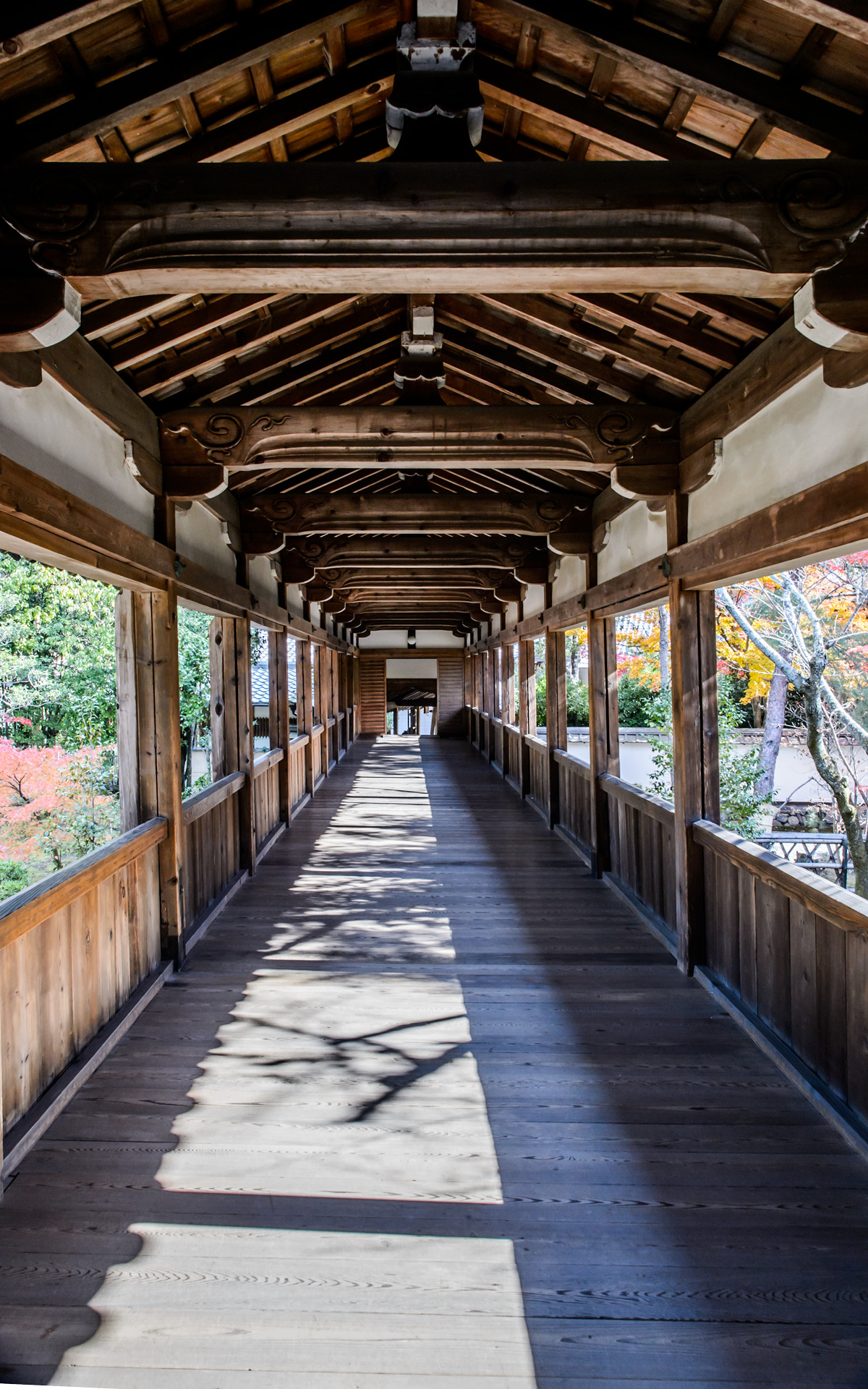
, Kyoto Japan")
Nikon D4 + Nikkor 24mm f/1.4 — 1/50 sec, f/11, ISO 1800 — map & image data — nearby photos
Outside Hallway
at the Seiryoji Temple (清涼時), Kyoto Japan
Another bad design chose of iOS 7 is that in its drive to remove as many design elements as possible (“more clean, less cluttered!”), important visual clues that helped direct the eye were removed, such as visual clues to isolate individual items in a list. Lists of friends in the Find my Friends app used to be clear and obvious, now became jumbled masses of pixels that one must spend neurons on to decipher.
Feature wise, the theme of iOS 7 seems “more features; harder to discover”. Discoverability is normally a big part of interface design... great features mean nothing if users don't even notice that they're available.
Prior to iOS 7, one could access the whole-device search feature by moving to the zeroth screen of app icons, advertised by the standard “search” magnifying-glass icon at the left of the line of dots that represent each screen of app icons. Even if you somehow missed the search icon, in normal use of the device you'd sometimes overrun the home page while swiping around and quickly learn how to get to the search screen.
Now in iOS 7, the search screen simply seems to be gone, at least until you get frustrated enough to do a web search to learn where it went. Once you learn it, it's quite useful, but completely non-intuitive and hidden until you do.
, Kyoto Japan")
Nikon D4 + Nikkor 85mm f/1.4 — 1/2500 sec, f/1.4, ISO 100 — map & image data — nearby photos
Consultation on the Go
at the Nishi Hongwanji Temple (西本願寺), Kyoto Japan
It used to be before iOS 7 that you could get to the “notification center” (list of alerts like new messages and email) by swiping from the top of the screen down. This wasn't easily discovered unless your finger happened to bump the top area of the screen, in which case a skeuomorphic set of “grip ridges” would show up letting you know that there was something to pull down. It's worse in iOS 7 in that what you get when you swipe down like that depends on where you start. (If you have iOS 7, give it a try: swipe down from the very top, and from some place that's not the top. Also, for a great feature, try swiping from the bottom of the screen.)
Another gimmicky bend to iOS 7 is the use of meaningless “because we can” animation. Many animations are actually useful, such as the “disappearing genie” effect in OS X when you hide a window, because it shows you where the window has gone, which in turn teaches you how to get it back. The animations in iOS 7 that I noticed are not of that variety: they add no information, merely frustration.
, Kyoto Japan")
Nikon D4 + Nikkor 24mm f/1.4 — 1/100 sec, f/9, ISO 100 — map & image data — nearby photos
Sundrenched Rice Paddies
at the Shugakuin Imperial Villa (修学院離宮), Kyoto Japan
“Change” is neither necessarily good nor bad... only the result should really matter. I only suggest that if you're going to change something well established, be sure to have a good reason. It seems to me that many of the UI changes to iOS were not done for a good reason.
(I should point out that for the most part I, like the iOS 7 team, am bad at design... heck, just look at my blog's visual design. But you don't have to be an opera singer to recognize when someone else can't carry a tune.)

Nikon D4 + Nikkor 85mm f/1.4 — 1/200 sec, f/1.4, ISO 2200 — map & image data — nearby photos
Pure Enjoyment
my friend Kataoka-san enjoying his teeny tiny baby-cup of espresso
at Restaurant La Verveine, Kyoto Japan
, Itami Japan -- Osaka Airterminal Hotel (大阪国際空港ホテル) -- Itami, Osaka, Japan -- Copyright 2013 Jeffrey Friedl, https://regex.info/blog/ -- This photo is licensed to the public under the Creative Commons Attribution-NonCommercial 4.0 International License http://creativecommons.org/licenses/by-nc/4.0/ (non-commercial use is freely allowed if proper attribution is given, including a link back to this page on http://regex.info/ when used online)")
Nikon D4 + Nikkor 24-70mm f/2.8 @ 24mm — 1/25 sec, f/2.8, ISO 5600 — map & image data — nearby photos
In Real Life
this looked much more cool
at the Osaka Airterminal Hotel (大阪国際空港ホテル), Itami Japan
I've discovered a new way to travel out of Kyoto/Osaka: a morning flight out of Osaka Itami combined with a previous-night's stay at the Osaka Airterminal Hotel.
Note: the airport is Osaka Itami (ITM), not the larger and more popular (and farther away) Kansai International (KIX).
It's less than 45 minutes to my fligh,t but I'm just getting out of a long, hot bath and now sitting down to write this. No rush. The entrance to the gate security area is a two-minute stroll from the hotel front desk, with a Starbucks in between any time I want to avail myself. I already checked my bag when I woke up, spending the three minutes to walk it down to the no-line-yet ticket counter. Back to my room a few minutes later for breakfast and the aforementioned bath.
What a great value. A clean, quiet room for $75 is hard enough to find to begin with, but with this kind of convenience providing such a gentle start to a 20+ hour trip, it's well worth it.
The free internet access is blazingly fast. Last night I downloaded an hour-long video from YouTube to put on my phone. It took just a minute or two.
My only words of caution: book in advance (the hotel was fully occupied last night), and note that the free internet is wired only.
Oh well, I guess I should get to my plane...
, Kyoto Japan")
Nikon D4 + Nikkor 200mm f/2 — 1/125 sec, f/4, ISO 100 — map & image data — nearby photos
Thinking Cap
at the Enkoji Temple (円光寺), Kyoto Japan
I've been feeling remarkably lazy about writing lately, sorry.
My wife and I were in a travel agency the other day (here in Kyoto, Japan) to purchase some pricey tickets for some upcoming family travel, and since it was a lot to put on the credit card at once, I had called ahead to my US-based credit card to let them know the charge was coming so that it would go through smoothly.
Of course, while standing there at the travel agency office, the transaction was denied. Sigh.
, near Kyoto Japan")
Nikon D4 + Nikkor 24mm f/1.4 — 1/800 sec, f/1.4, ISO 100 — map & image data — nearby photos
Next to the Parking Lot
at the Miho Museum (ミホミュージアム) near Kyoto
I couldn't call The States with the travel agent's phone, so we were facing the prospect of having to bicycle back home to make the call to the credit card company (again), then head back to the travel agency (again) to try the transaction (again). What a pain.
But before leaving the travel agency, I had an idea. I had installed the Skype app on my iPhone years ago but had never used it. I do that a lot... I've never launched most of the apps that I have on the thing. (I mostly don't even remember what I've put on there most of the time.) Anyway, it was on my mind because I've heard good things about Skype's quality for app-to-landline calls from Paul Barr who uses it to chat Stateside while he's in Japan. The calls are not free, but they're cheap enough not to matter, but you do have to fund your account with some money to use it... or so I thought.
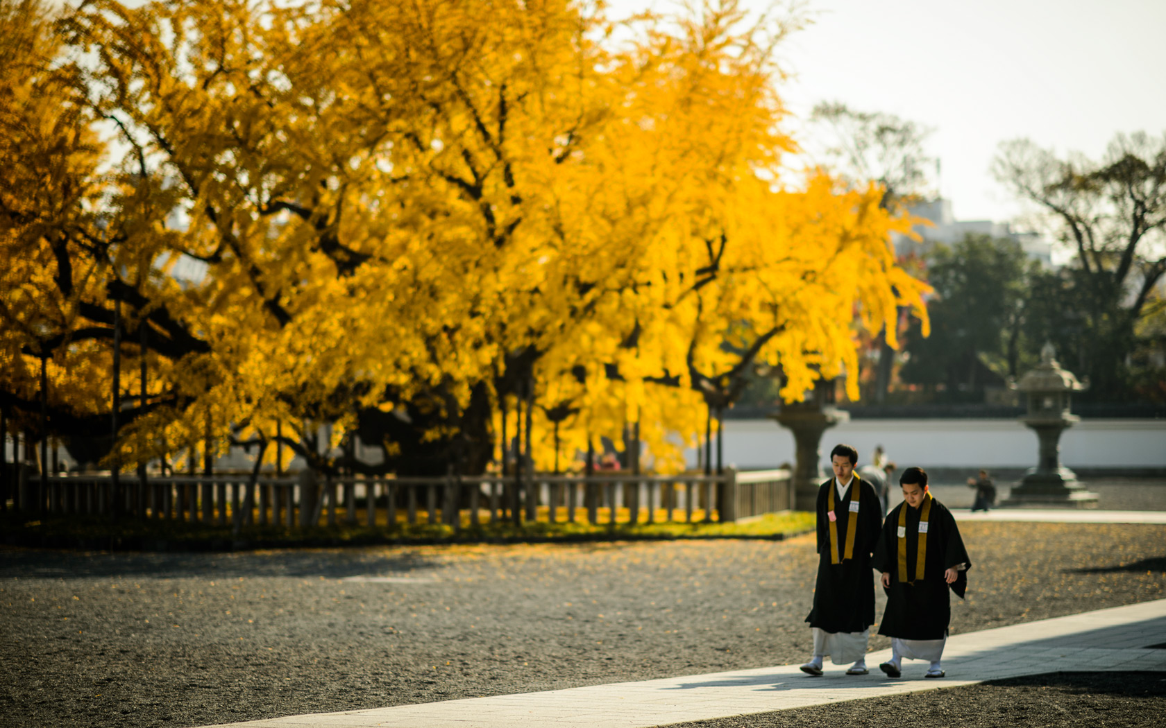
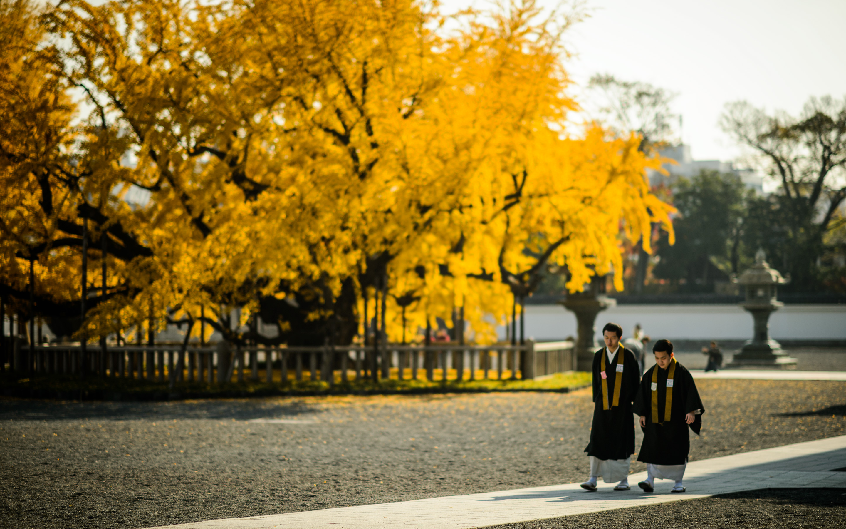
, Kyoto Japan) -- Nishi Hongwanji Temple (西本願寺) -- Copyright 2013 Jeffrey Friedl, https://regex.info/blog/ -- This photo is licensed to the public under the Creative Commons Attribution-NonCommercial 4.0 International License http://creativecommons.org/licenses/by-nc/4.0/ (non-commercial use is freely allowed if proper attribution is given, including a link back to this page on http://regex.info/ when used online)")
Nikon D4 + Nikkor 85mm f/1.4 — 1/2500 sec, f/1.4, ISO 100 — map & image data — nearby photos
Picture I took of some chick taking a pic of some guy taking a pic of some leaves.
(at the Nishi Hongwanji Temple (西本願寺), Kyoto Japan)
I hadn't given Skype any money, but on a whim I gave the Skype app a try and dialed the toll-free number shown on the back of my credit card, and voilà, I was talking to my credit-card company as if they were sitting next to me. It was amazing.
I guess toll-free numbers are supported as such (without toll) by Skype. Very, very nice. I encouraged the credit card company to acquire a clue, the travel agent retried the card while the company was still on the line, and all went well.
It saved my afternoon. Thank you Skype, and thank you Microsoft for not screwing them up when you bought them.
I've since funded my account with $10 just in case I ever have to use it to call a non-toll-free number. US calls go at a the not-worth-thinking-about rate of about a buck an hour, so practically speaking I'll probably never use that $10, but it's cheap peace of mind.
, Kyoto Japan")
Nikon D4 + Nikkor 200mm f/2 — 1/1250 sec, f/2, ISO 100 — map & image data — nearby photos
Moody
at the Enkoji Temple (円光寺)
These photos have nothing to do with the article... they're just some recent photos from among the huge backlog my laziness has prevented me from dealing with.
And no, I did not place the yellow leaf on the small statue's head in
the lead photo.
(I saw someone else do it and took the opportunity to snap
a picture 🙂 )
 in Koka, Shiga Prefecture, Japan")
Nikon D4 + Nikkor 85mm f/1.4 — 1/640 sec, f/3.2, ISO 100 — map & image data — nearby photos
Fog and Smoke
the latter from an early-morning leaf-burning fire
at the Tenjin Shrine (天神神社) in Koka, Shiga Prefecture, Japan
(not far from the Miho Museum)
 near Kyoto, Japan -- Miho Museum (ミホミュージアム) -- Koka, Shiga, Japan -- Copyright 2013 Jeffrey Friedl, https://regex.info/blog/ -- This photo is licensed to the public under the Creative Commons Attribution-NonCommercial 4.0 International License http://creativecommons.org/licenses/by-nc/4.0/ (non-commercial use is freely allowed if proper attribution is given, including a link back to this page on http://regex.info/ when used online)")
Nikon D4 + Nikkor 85mm f/1.4 — 1/200 sec, f/1.4, ISO 160 — map & image data — nearby photos
Meep-Meep
golf cart shuttle at the Miho Museum (ミホミュージアム)
near Kyoto, Japan
I've spent the weekend since having posted “Visiting the Miho Museum” trying (and failing) to fight off a cold, but I seem to be slowly recovering today, so today we have a simple post, of a bunch of geometric-ish images from my visit to the museum, presented in the order I took them (with the exception of the first two images being swapped).
These first two from the tunnel leading to the museum have been processed with differing white-balance settings for dramatic effect. The one above is processed so that the sunlight streaming in is white, turning the incandescent lights lining the tunnel a deep orange.
The one below is the opposite, set so that the tunnel lights are white, thereby turning the sunlight a cool blue...
 in Shiga Prefecture, Japan")
In reality it was neither blue nor orange... it was a dark spacey gray. But still cool.
 -- Koka, Shiga, Japan -- Copyright 2013 Jeffrey Friedl, https://regex.info/blog/ -- This photo is licensed to the public under the Creative Commons Attribution-NonCommercial 4.0 International License http://creativecommons.org/licenses/by-nc/4.0/ (non-commercial use is freely allowed if proper attribution is given, including a link back to this page on http://regex.info/ when used online)")
Nikon D4 + Nikkor 14-24mm f/2.8 @ 14mm — 1/320 sec, f/2.8, ISO 100 — map & image data — nearby photos
Too-Tall Paul
distorted by the fisheye lens
 -- Koka, Shiga, Japan -- Copyright 2013 Jeffrey Friedl, https://regex.info/blog/ -- This photo is licensed to the public under the Creative Commons Attribution-NonCommercial 4.0 International License http://creativecommons.org/licenses/by-nc/4.0/ (non-commercial use is freely allowed if proper attribution is given, including a link back to this page on http://regex.info/ when used online)")
Nikon D4 + Nikkor 14-24mm f/2.8 @ 24mm — 1/80 sec, f/2.8, ISO 100 — map & image data — nearby photos
Bridge Truss
 -- Koka, Shiga, Japan -- Copyright 2013 Jeffrey Friedl, https://regex.info/blog/ -- This photo is licensed to the public under the Creative Commons Attribution-NonCommercial 4.0 International License http://creativecommons.org/licenses/by-nc/4.0/ (non-commercial use is freely allowed if proper attribution is given, including a link back to this page on http://regex.info/ when used online)")
 -- Koka, Shiga, Japan -- Copyright 2013 Jeffrey Friedl, https://regex.info/blog/ -- This photo is licensed to the public under the Creative Commons Attribution-NonCommercial 4.0 International License http://creativecommons.org/licenses/by-nc/4.0/ (non-commercial use is freely allowed if proper attribution is given, including a link back to this page on http://regex.info/ when used online)")
I'm not sure what the thing above is, but I think it's a light. (The photo is from directly underneath, looking straight up).
Here's a more conventional view...
 -- Koka, Shiga, Japan -- Copyright 2013 Jeffrey Friedl, https://regex.info/blog/ -- This photo is licensed to the public under the Creative Commons Attribution-NonCommercial 4.0 International License http://creativecommons.org/licenses/by-nc/4.0/ (non-commercial use is freely allowed if proper attribution is given, including a link back to this page on http://regex.info/ when used online)")
Nikon D4 + Nikkor 85mm f/1.4 — 1/800 sec, f/1.4, ISO 100 — map & image data — nearby photos
“L” is for Light?
Out of curiosity, here's what the “L” shot from above looks like at f/16 instead of f/1.4, flattening the dozen feet between the light and the ceiling into nothing...
 -- Koka, Shiga, Japan -- Copyright 2013 Jeffrey Friedl, https://regex.info/blog/ -- This photo is licensed to the public under the Creative Commons Attribution-NonCommercial 4.0 International License http://creativecommons.org/licenses/by-nc/4.0/ (non-commercial use is freely allowed if proper attribution is given, including a link back to this page on http://regex.info/ when used online)")
Nikon D4 + Nikkor 85mm f/1.4 — 1/160 sec, f/16, ISO 6400 — map & image data — nearby photos
Flattened
and decidedly too busy
Just outside the window where I was taking these light shots is a rock garden of some sort. Looking like it came out of a Sears catalog, it's probably the least well done aspect of the museum...
 -- Koka, Shiga, Japan -- Copyright 2013 Jeffrey Friedl, https://regex.info/blog/ -- This photo is licensed to the public under the Creative Commons Attribution-NonCommercial 4.0 International License http://creativecommons.org/licenses/by-nc/4.0/ (non-commercial use is freely allowed if proper attribution is given, including a link back to this page on http://regex.info/ when used online)")
Nikon D4 + Nikkor 14-24mm f/2.8 @ 14mm — 1/500 sec, f/2.8, ISO 100 — map & image data — nearby photos
Uninspired Rock Garden
with window reflections of the museum architecture
I'm no expert on rock gardens, but I'm thinking that one needs a better backdrop, and so a square of marble and glass is probably not the ideal location in the first place.
 -- Koka, Shiga, Japan -- Copyright 2013 Jeffrey Friedl, https://regex.info/blog/ -- This photo is licensed to the public under the Creative Commons Attribution-NonCommercial 4.0 International License http://creativecommons.org/licenses/by-nc/4.0/ (non-commercial use is freely allowed if proper attribution is given, including a link back to this page on http://regex.info/ when used online)")
Nikon D4 + Voigtländer 125mm f/2.5 — 1/400 sec, f/2.5, ISO 100 — map & image data — nearby photos
Disconcerting?
One more shot from the lobby of the special-collections wing, where all the interior shots have been so far...
 near Kyoto Japan")
Nikon D4 + Voigtländer 125mm f/2.5 — 1/400 sec, f/2.5, ISO 100 — map & image data — nearby photos
Corner
With “Disconcerting?” above I had intended to post only the color shot, where like in the tunnel the different colors of light can be exaggerated and set upon each other via white-balance adjustments in post, but thought that maybe the lack of color might make for a slightly strange moment as you try to figure out what you're looking at. Maybe not.
In any case, here's the color version...
 -- Koka, Shiga, Japan -- Copyright 2013 Jeffrey Friedl, https://regex.info/blog/ -- This photo is licensed to the public under the Creative Commons Attribution-NonCommercial 4.0 International License http://creativecommons.org/licenses/by-nc/4.0/ (non-commercial use is freely allowed if proper attribution is given, including a link back to this page on http://regex.info/ when used online)")
Nikon D4 + Voigtländer 125mm f/2.5 — 1/400 sec, f/2.5, ISO 100 — map & image data — nearby photos
First Floor Hallway
as seen from the 2nd floor lobby
 near Kyoto Japan")
Nikon D4 + Voigtländer 125mm f/2.5 — 1/250 sec, f/2.5, ISO 400 — map & image data — nearby photos
Industrial Strength Joint
in the museum cafe
 -- Koka, Shiga, Japan -- Copyright 2013 Jeffrey Friedl, https://regex.info/blog/ -- This photo is licensed to the public under the Creative Commons Attribution-NonCommercial 4.0 International License http://creativecommons.org/licenses/by-nc/4.0/ (non-commercial use is freely allowed if proper attribution is given, including a link back to this page on http://regex.info/ when used online)")
 -- Koka, Shiga, Japan -- Copyright 2013 Jeffrey Friedl, https://regex.info/blog/ -- This photo is licensed to the public under the Creative Commons Attribution-NonCommercial 4.0 International License http://creativecommons.org/licenses/by-nc/4.0/ (non-commercial use is freely allowed if proper attribution is given, including a link back to this page on http://regex.info/ when used online)")
Nikon D4 + Nikkor 85mm f/1.4 — 1/640 sec, f/1.4, ISO 100 — map & image data — nearby photos
Precise
ring of museum symbols mark the fill line
 -- Koka, Shiga, Japan -- Copyright 2013 Jeffrey Friedl, https://regex.info/blog/ -- This photo is licensed to the public under the Creative Commons Attribution-NonCommercial 4.0 International License http://creativecommons.org/licenses/by-nc/4.0/ (non-commercial use is freely allowed if proper attribution is given, including a link back to this page on http://regex.info/ when used online)")
Nikon D4 + Nikkor 14-24mm f/2.8 @ 14mm — 1/30 sec, f/5.6, ISO 2500 — map & image data — nearby photos
Slightly Escher-esque
I tried to get a nice shot of the 2nd floor hallway, but didn't quite do it. Paul always has a nice smile, but this first shot with him in the foreground looking at the off-camera Egypt Room would be better without him...
 -- Koka, Shiga, Japan -- Copyright 2013 Jeffrey Friedl, https://regex.info/blog/ -- This photo is licensed to the public under the Creative Commons Attribution-NonCommercial 4.0 International License http://creativecommons.org/licenses/by-nc/4.0/ (non-commercial use is freely allowed if proper attribution is given, including a link back to this page on http://regex.info/ when used online)")
Nikon D4 + Nikkor 14-24mm f/2.8 @ 14mm — 1/125 sec, f/2.8, ISO 100 — map & image data — nearby photos
... and this second shot just doesn't have the right balance...
 -- Koka, Shiga, Japan -- Copyright 2013 Jeffrey Friedl, https://regex.info/blog/ -- This photo is licensed to the public under the Creative Commons Attribution-NonCommercial 4.0 International License http://creativecommons.org/licenses/by-nc/4.0/ (non-commercial use is freely allowed if proper attribution is given, including a link back to this page on http://regex.info/ when used online)")
Oh well, maybe next time. Or maybe not; I'm told it's normally very crowded, so perhaps a future visit won't have such clean views.
 -- Koka, Shiga, Japan -- Copyright 2013 Jeffrey Friedl, https://regex.info/blog/ -- This photo is licensed to the public under the Creative Commons Attribution-NonCommercial 4.0 International License http://creativecommons.org/licenses/by-nc/4.0/ (non-commercial use is freely allowed if proper attribution is given, including a link back to this page on http://regex.info/ when used online)")
Nikon D4 + Nikkor 85mm f/1.4 — 1/200 sec, f/1.4, ISO 250 — map & image data — nearby photos
Entrance Lobby and Sunburst
On the way out I grabbed a snapshot of one of the first visually-striking things I noticed on the way in, a circular umbrella stand...
 -- Koka, Shiga, Japan -- Copyright 2013 Jeffrey Friedl, https://regex.info/blog/ -- This photo is licensed to the public under the Creative Commons Attribution-NonCommercial 4.0 International License http://creativecommons.org/licenses/by-nc/4.0/ (non-commercial use is freely allowed if proper attribution is given, including a link back to this page on http://regex.info/ when used online)")
Nikon D4 + Nikkor 14-24mm f/2.8 @ 14mm — 1/100 sec, f/2.8, ISO 100 — map & image data — nearby photos
I couldn't come up with a good way to make a good photograph, though.
 -- Koka, Shiga, Japan -- Copyright 2013 Jeffrey Friedl, https://regex.info/blog/ -- This photo is licensed to the public under the Creative Commons Attribution-NonCommercial 4.0 International License http://creativecommons.org/licenses/by-nc/4.0/ (non-commercial use is freely allowed if proper attribution is given, including a link back to this page on http://regex.info/ when used online)")
Nikon D4 + Nikkor 85mm f/1.4 — 1/200 sec, f/11, ISO 900 — map & image data — nearby photos
Return Trip
 -- Koka, Shiga, Japan -- Copyright 2013 Jeffrey Friedl, https://regex.info/blog/ -- This photo is licensed to the public under the Creative Commons Attribution-NonCommercial 4.0 International License http://creativecommons.org/licenses/by-nc/4.0/ (non-commercial use is freely allowed if proper attribution is given, including a link back to this page on http://regex.info/ when used online)")
Nikon D4 + Voigtländer 125mm f/2.5 — 1/250 sec, f/2.5, ISO 125 — map & image data — nearby photos
Tree Snuggies
which I wrote about six years ago
And finally, one more futuristic take on the tunnel...
 in Shiga Prefecture, Japan")