
Nikon D200 + Nikkor 17-55 f/2.8 @ 55mm — 1/125 sec, f/2.8, ISO 640 — map & image data — nearby photos
A “Hurry Up So I Can Play” Pose
As I noted yesterday, I was at a park on the grounds of Kyoto's old imperial palace with Anthony the other day. I haven't featured the little man in a while, so I thought I'd share a few pictures...

Nikon D200 + Nikkor 17-55 f/2.8 @ 55mm — 1/60 sec, f/2.8, ISO 640 — map & image data — nearby photos
Heading In

Nikon D200 + Nikkor 17-55 f/2.8 @ 30mm — 1/180 sec, f/3.2, ISO 640 — map & image data — nearby photos
Being a Kid

Nikon D200 + Nikkor 85mm f/1.4 — 1/2000 sec, f/1.4, ISO 1000 — map & image data — nearby photos
Checking Out the New Toddler Playground

Nikon D200 + Nikkor 17-55 f/2.8 @ 38mm — 1/90 sec, f/2.8, ISO 640 — map & image data — nearby photos
Must... Make... Leaves... Into.... Pile

Nikon D200 + Nikkor 17-55 f/2.8 @ 28mm — 1/90 sec, f/2.8, ISO 640 — map & image data — nearby photos
Have Stick, Will Poke

Nikon D200 + Nikkor 17-55 f/2.8 @ 17mm — 1/80 sec, f/3.5, ISO 1000 — map & image data — nearby photos
Crop Circles

Nikon D200 + Nikkor 17-55 f/2.8 @ 55mm — 1/250 sec, f/3.5, ISO 1000 — map & image data — nearby photos
Anthony vs. Cherry Tree
I love my Nikon D200, but yesterday added a new woe to the “Dead Battery Syndrome” I experienced a couple of months ago: “Black Frame Syndrome”
Yesterday, Kyoto was a cold and heavily overcast, with sporadic misty rain. Occasionally and all too briefly, the sun would poke out in brilliant fashion to set the foliage momentarily on fire, so on the way back from picking up Anthony at preschool, I stopped by the grounds of the old imperial palace, now mostly a big park heavily laden with fall colors at their peak.
The trees were amazing, but it was dark and dull, so it wasn't too interesting photographically except for Anthony's play. At one point we came across a pleasant scene involving a small pond, a curved stone bridge, and some overhanging trees burdened with way more than their share of oranges and reds. I was chatting with someone about how it would be so nice if the sun would just peek out a bit, and lo and behold, for a short time it did. It was gorgeous, and I fired off a bunch of shots hoping to capture the moment.
The sun soon went away, and I decided to check some of the shots on the camera's little screen, and was shocked to see that the previous 30+ shots – back past all the brilliant sun all the way to the middle of Anthony's play – registered as pure black, as if the shutter didn't open.
Panicked investigation ensued, including changing memory cards, changing lenses, formatting memory card, checking settings (although none had been changed that day), removing the battery for a while, trying different exposure settings.... all to no avail. Images were still showing up blank, all while the sun poked in and out of the clouds.
I eventually got it working by hitting the two-button reset, something I'd never done and had only vaguely recalled. The little green dots on two of the buttons made me take a chance to hold them down for a while, and suddenly it started working again. (Looking now, I see it's on page 97 of the English manual, but nothing about the description there makes me understand why this had any effect.)
Luckily, there was still some sun... here's the first test shot I was able to take after getting it to work.
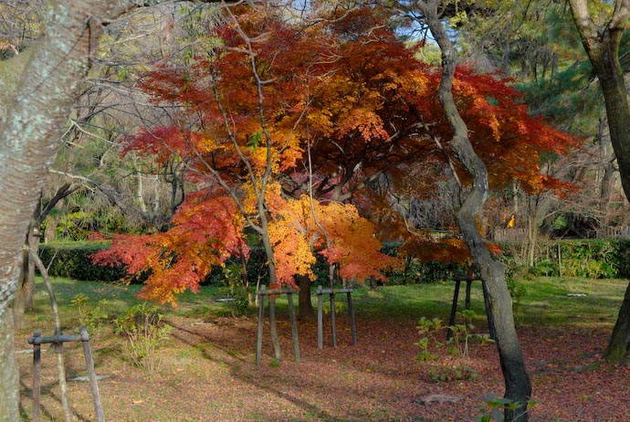
Nikon D200 + Nikkor 17-55 f/2.8 @ 40mm — 1/125 sec, f/5.6, ISO 100 — map & image data
Testing, Testing, is This Mic On?
Turning my attention back to the foliage, I was in awe of the effect the sun had. I wrote the other day about photographing fall colors in too much sun, but here, it seems that the leaves just drank it up and spit it out in pure, chromatic splendor.
This next shot looking up though various layers of branches with and without leaves isn't really very interesting, but it shows a bit of the dynamic nature of the weather, with some branches in the sun, and a dull gray overcast above...
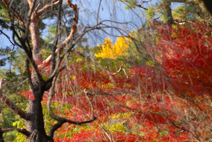
Nikon D200 + Nikkor 85mm f/1.4 — 1/1250 sec, f/2.8, ISO 400 — map & image data
“It Was A Dark and Stormy Night....”
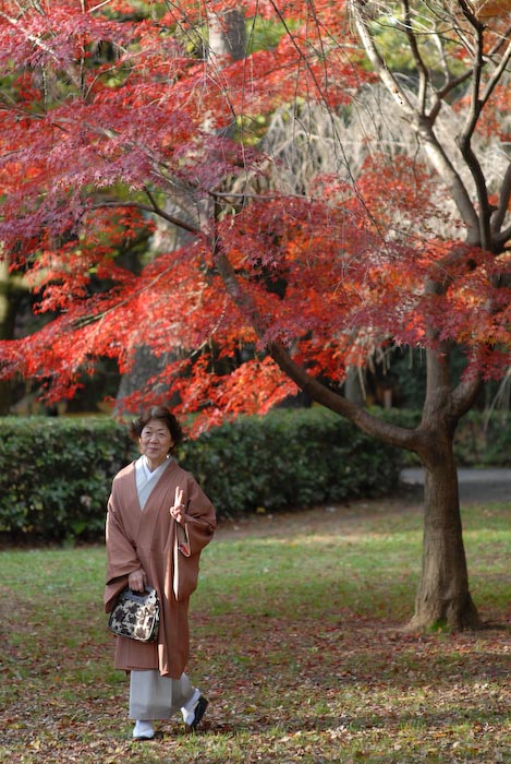
Nikon D200 + Nikkor 85mm f/1.4 — 1/500 sec, f/2.8, ISO 400 — map & image data
Taking Advantage of the Momentary Sun
My tale of woe was not over. Although the camera was taking pictures again, I hadn't realized that one effect of the reset option was to downgrade the image quality from “raw” (by far the best) to “regular” quality JPGs. Ugh.
I realize now that the “two-button reset” I'd used resets all electronic settings that you can make by pushing and twiddling buttons on the camera itself (as opposed to via the menu system). This can be convenient if you know what you're doing. At least in this respect, I now do.
Even as middle-quality JPGs, I was happy to be able to get the images
shown above, and this next one of Anthony waving as he climbs a slide. The foliage in the background has been left lackluster without the sun,
but this daddy still likes the picture ![]()
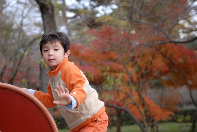
Nikon D200 + Nikkor 17-55 f/2.8 @ 55mm — 1/250 sec, f/2.8, ISO 640 — map & image data
Waving to Daddy
The sun never came back, so we eventually went home. Wondering what might be in the “black” files, I loaded them into Lightroom and was thrilled to find them intact! The problem was apparently something to do with the camera's JPG processing engine, because although the raw data was fine, the two JPG versions embedded in the raw file were both completely black. It's those, of course, that are used for the on-camera display.
Here's one of the “lost” images with a desktop-background bonus...
Here's another...
Later, after the sun was long gone and I'd put my camera back to its normal settings, I stepped back and took a wide-angle shot of the area through the many bare branches of a cherry tree (which itself must be absolutely stunning in early April, I'm sure). While I take this shot, a passing business man pauses to snap a picture with his cell phone.
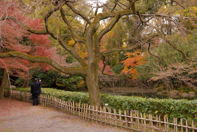
Nikon D200 + Nikkor 17-55 f/2.8 @ 28mm — 1/125 sec, f/3.5, ISO 1000 — map & image data
Wide-Angle View
I'd like to say that the story ends on this still-not-understood but
seems-to-be-fine-now note, but sadly, it happened again today. Again, the reset fixed it,
so at least I can recover quickly, but I wish I didn't have to, so I guess I have to contact Nikon.
![]()
From The Elements of Typographic Style (third edition):
| “ | In a world rife with unsolicited messages, typography must often draw attention to itself before it will be read. Yet in order to be read, it must relinquish the attention it has drawn.”— page 17 |
For the four-and-a-half hours in the bullet train on my trip to see a friend the other day, I brought with me this excellent book by Robert Bringhurst.
When most people read a book (or a sign or the classifieds or a menu or...) they don't give even the slightest thought to the typography – the shapes of letters and punctuation, and their layout relative to each other and to the page as a whole. Yet, since the typography is responsible for 100% of the information you get from the printed word, its clearly extremely important to think about when writing. Even when writing a simple web page like this, the writer makes may typographic decisions: how to distinguish paragraphs, when/if to use italics or bold, etc.
I was enthralled by the first edition of this book while working on the first edition of mine back in the mid 90s, not only because of its information content, but also due to Bringhurst's writing style. He is also a poet, and while I don't have much stomach for poetry (see my thoughts here), that aspect of his nature lends a wonderful lilt to his typographic writing.
It's a completely different kind of “great writing” than, say, Bill Bryson (about whom I've written here and here), or Light — Science and Magic, the clearly-written book on photographic lighting I've posted about. So, here are some examples of Bringhurst's writing...
While discussing how the design of each letter in a font can visually bond – or not – to other letters, he brings up...
| “ | ...other unserifed faces, such as Helvetica, in which nothing more than wishful thinking bonds the letters to each other. ”— page 32 |
In talking about how to use whitespace, he writes...
| “ | Lists, such as contents pages and recipes, are opportunities to build architectural structures in which the space between the elements both separates and binds. The two favorite ways of destroying such an opportunity are setting great chasms of space that the eye cannot leap without help from the hand, and setting unenlightening rows of dots (dot leaders, as they are called) that force the eye to walk the width of the page like a prisoner being escorted back to its cell. ”— page 35 |
Of title pages, he says...
| “ | It is not enough, when building a title page, merely to unload some big, prefabricated letters into the center of the space, nor to dig a few holes in the silence with typographic heavy machinery and then move on. Big type, even huge type, can be beautiful and useful. But poise is usually far more important than size – and poise consists primarily of emptiness. Typographically, poise is made of white space. Many fine title pages consist of a modest line or two near the top, and a line or two near the bottom, with nothing more than taut, balanced white space in between. ”— page 61 |
In talking about the blank pages one often finds before the first page and after the last...
| “ | A brief research paper may look its best with no more space at the beginning and end than is provided by the standard page margins. The same is rarely true of a book, whose text should generally be, and should seem to be, a living and breathing entity, not aged and shrink-wrapped meat. [Some short books] can begin directly with the title page. Otherwise, a half-title is customary, preceding the title page. It is equally customary to leave a blank leaf, or at least a blank page, at the end of a book. These blanks provide a place for inscriptions and notes and allow the text to relax in its binding. ”— page 72 |
Yet, he goes on to note...
| “ | A wad of blank leaves at the end of a book is a sign of carelessness, not of kindliness toward the readers who like to take notes. ”— page 73 |
Kerning is the subtle adjustment of space between specific pairs of letters to create a more pleasing result. Compare the letter placement on these three lines:

The first line is unkerned, so each letter takes up its default amount of space. In the others, the letters have been “tucked” into each other to varying degrees. It might not seem important in this large display of just four characters, but it can make a big difference in the overall “feel” of a book, for better or for worse...
| “ | Computerized typesetting makes extensive kerning easy, but judgment is still required, and the computer does not make good judgment any easier to come by. ”— page 33 |
Indeed. Kerning can be particularly important with letter-punctuation and punctuation-punctuation pairs, so I did a lot of detailed hand kerning in my punctuation-heavy book on regular expressions. It's one of the reasons that my book garners an inordinate number of “it's beautifully typeset” comments. (I mean, really, how often do you ever see comments about a computer book's typesetting, and at that, complimentary comments?)
Most people never notice typesetting in what they read, and that's as it should be because good typesetting is the kind that doesn't get noted consciously, but instead subconsciously guides and sooths the reader. One only needs to see poor typesetting to bring this to mind, such as any page on MySpace, or Wired Magazine. (I read a few issues of Wired back in the mid 90s, but although I enjoyed the content, their typography and page design – such as bright red lettering on bright blue paper – caused me to become physically ill after just a few minutes. I decided that the content wasn't worth a headache, so I quickly stopped reading it.)
As much as I enjoy Bringhurst's book, a few things bother me about it. He uses tall, thin pages and a tight binding, so you have to really work to crack the book and hold open. It's not as bad with this third edition as it was with the first, for which I'm thankful, because I kept getting cramps when reading the first edition until I concocted a way to use a coat-hanger to jam open the book to the page I was on.
About footnotes he says...
| “ | Long footnotes are inevitably a distraction: tedious to read and wearying to look at. Footnotes that extend to a second page (as some long footnotes are bound to do) are an abject failure of design. ”— page 68 |
I agree completely, but I don't think what he's done is much better. He puts side notes into the generous outer margins he's put on each page. The problem is that there's nothing but vague proximity to tie the note to its text, so I often find myself reading right past until I realize that I haven't looked at any sidenotes recently, and turn back the pages to see whether there were any.
Perhaps even worse, when I do find a sidenote this way, I can't scan the text for what it relates to because he does not use note markers. Thus, I actually have to read and comprehend the text just to find the part related to the note. Ugh.
As I said, I really enjoy his writing style, but sometimes it gets in the way of understanding. For example, I have no idea what this is supposed to really mean:
| “ | In a badly designed book, the letters mill and stand like starving horses in a field. In a book designed by rote, they sit like stale bread and mutton on the page. In a well-made book, where designer, compositor and printer have all done their jobs, no matter how many thousands of lines and pages they must occupy, the letters are alive. They dance in their seats. Sometimes they rise and dance in the margins and aisles. ”— page 19 |
It sounds pretty and all, but it seems meaningless in any kind of practical sense.
One final comment in case Mr. Bringhurst is reading. I've seen books with their edition labeled with “version” (e.g. “version 2” instead of “second edition”). When this is done on a book related to computer science, it's childish and cliché enough to make me cringe. For other types of books, it's only worse. For a book with the style and grace of The Elements of Typographic Style, the “version 3.1” on the cover is almost pornographically out of place. What on earth were you thinking?
I don't want to end my post talking about the book's few shortcomings, because it's truly an excellent resource and an enjoyable read. Its target audience is much larger now than when the first edition came out in 1992, because there's a lot in there even for someone whose typesetting is limited to writing web pages.
And I'll end with a shout-out to Ken Lunde, who wrote the most-excellent CJKV Information Processing: Chinese, Japanese, Korean & Vietnamese Computing. It's Ken who first sent me a copy of Elements of Typographic Style back in 1995, and now I notice Ken's name in the Afterword to the Third Edition. Thanks Ken!

Nikon D200 + Nikkor 70-200mm f/2.8 @ 70mm — 1/500 sec, f/9, ISO 200 — map & image data
Crisp and Clear, Blazing Sunshine
Every day this week I've really enjoyed each morning's trip to drop Anthony off at school, as the cornucopia of rich colors along the way are mentally enriching, spiritually uplifting. They give me yet another reason to count my blessings to be able to live where I do. And this, mind you, is while it's been a depressingly overcast and hazy week.
So, consider what it was like in the brilliant and crisp sunshine that greeted Kyoto today. It was simply glorious. Words or pictures can never do it justice.
Today was the epitome of a perfect autumn day at the peak of Kyoto's fall colors. It was cool but not cold, few clouds, and blindingly bright sun that somehow seemed about 10% brighter than on a normal clear sunny day. The timing was perfect. The colors on the mountains are still a work in progress, but here in town, the colors are at their peak. Some trees have not yet started to turn, and some have mostly shed their leaves, but many types of trees are deeply blushing with every fall color nature can cook up.
The picture above, which I took from our front door this morning, shows a lot of bare branches at the bottom. Those are cherry trees, which are in the aforementioned “have mostly shed their leaves” group that are a bit ahead of the rest of the pack. Color-wise, cherry trees have been doing much of the heavy-lifting for the past couple of weeks, but now the show moves on to the main event.
(Perhaps cherry trees need to rest early, to prepare for their cherry-blossom curtain call; compare the shot above with these blossom-laden shots from last spring.)

Nikon D200 + Nikkor 70-200mm f/2.8 @ 98mm — 1/800 sec, f/4, ISO 200 — map & image data
Heavy Sunlight, Heavy Contrast
As wonderful a scenario it makes for enjoying the fall colors, the blinding sunshine adds real challenges to photographing those colors. Compared to a digital camera, the eyes are phenomenally better at coping with the high-contrast situations bright sunlight creates, so the photographer has to be creative to eek out a pleasing shot.
The first picture above – the main gate of the Heian Shrine, with
a great blue heron flying by (perhaps Aotan the Heron?) –
benefits from the stark lighting, but the second shot is diminished by it. It's just too contrasty. The bright light actually seems to have muted the
colors, which felt more vibrant than this picture shows. (Sadly, if you're
using Internet Explorer or Firefox, you're likely seeing even more muted
colors, because those browsers aren't color managed, so color rendering is
left to chance.) ![]()
So, What's a Good Photographer to Do?
I don't know what a skilled photographer would do in these situations, although it's on my list to ask should I ever meet one. For my own part, I've come up with a few ideas that sometimes lead to pleasant results. I spent an hour this morning on a short walk to try them out....
Defocus shadows – compose such that shadows are in the background, and are out of focus.

Nikon D200 + Nikkor 70-200mm f/2.8 @ 90mm — 1/1500 sec, f/3.2, ISO 200 — map & image data
Out-of-Focus Shadows are Less Distracting
Shoot in the shade — it's pretty obvious, but I should mention it.

Nikon D200 + Nikkor 17-55 f/2.8 @ 22mm — 1/125 sec, f/5, ISO 200 — map & image data
Rickshaw Parked in the Shade

Nikon D200 + Nikkor 70-200mm f/2.8 @ 150mm — 1/125 sec, f/4.8, ISO 200 — map & image data
“Shade” Doesn't Mean “Bland”
Go full-on sun – put the sun behind you and the shadows out of frame. “No shadows” means no harsh contrast.
These cherry-tree leaves appear bland in the photo because... they were bland. I'm not even sure why I took a picture of them; perhaps it was out of sympathy....
Backlight – shoot from behind, letting the sun show through the leaves.

D200 + 1.7×TC + 70-200mm f/2.8 @ 340mm — 1/640 sec, f/8, ISO 400 — map & image data
Backlit, Semi-Transparent Redness
(The same technique was used in the last of the fall-foliage desktop backgrounds that I posted last week.)
If you look at the larger version of the picture above, you can see the crisp, clear veins in the leaf. You can also notice an almost glowing white edge around the leaves, which, if you're into digital imaging, you might think is a sign that way too much sharpening was applied during post-processing. Indeed, one often sees such a “glowing edge” effect when sharpening has been overdone, either by an over-eager amateur, or purposefully as an artistic tool, as I did in the lead image of my First Taste of Kyoto's Autumn post.
In this case, though, the “glow” is natural (the image has had no extra sharpening added in post processing), as light escapes from the edges of the brightly-backlit leaf.

D200 + 1.7×TC + Nikkor 70-200mm f/2.8 @ 340mm — 1/320 sec, f/6.3, ISO 400 — map & image data
Backlighting, but more Subtle
Embrace the Contrast – make the high contrast part of the composition.

Nikon D200 + Nikkor 17-55 f/2.8 @ 55mm — 1/250 sec, f/5.6, ISO 200 — map & image data
This Looks Better When It Fills Your Screen
This is of a similar ilk to the second of the bonanza
desktops that I took at a different location, but in today's shot I
made sure to keep the sun out of frame (to make some people happy. ![]() )
)
Look for low-contrast shadow – mild shadow makes direct sunlight feel softer.

D200 + 1.7×TC +70-200mm f/2.8 @ 340mm — 1/320 sec, f/8, ISO 400 — map & image data
Bed of Ginkgo Leaves
Shadows that can be filled in by other light (such as from the wide expanse of sky) are softer, and make for wonderful photography, especially when punctuated by soft areas of direct sun.
When I got home from dropping Anthony off at school this morning, I just could not resist going out for a short walk – I went less than a quarter mile in one direction, and returned – to take a few shots.
Of course, today's time budget had nothing reserved for this, so again, this is a good example of why I hate living here... Kyoto just doesn't let me get anything done!
I'd earlier decided not to post any more fall-foliage pictures this year because most of the hemisphere is already well past the season, so I assume interest is waning. And truth be told, I have so many great shots from the past couple weeks that I wouldn't even begin to know where to start in posting them. I figure I'll save them for next September, when I can then match the growing “getting into the fall spirit” feelings with an increase in related posts. Anyway, today's post is not a fall-foliage post, but, rather, a photo-technique post. Yeah, that's it, a photo-technique post.
Speaking of fall colors, chatting with the 70-year-old taxi driver taking me to the station yesterday (on my way to visit my friend Ram in Tokyo), he lamented that the colors have been getting worse over the years, particularly over the last three to four. He said that this year is just pathetic. Fumie's mom has echoed the same sentiments. All I can say is that if this is pathetic, I can not possibly imagine what a “good” season would be like.....

Nikon D200 + Nikkor 85mm f/1.4 — 1/60 sec, f/1.4, ISO 800 — map & image data — nearby photos
Ram Kulkarni
I was thrilled to get a call yesterday from my best friend, Ramchandra Kulkarni, whom I had not seen in years (perhaps since he was Best Man at my wedding 10 years ago!?). He happened to be in Tokyo for a few days, so I zipped up on a shinkansen (bullet train) to visit with him during a few hours he carved out of his schedule.
Ram and I both entered the University of New Hampshire at the same time, for a Masters in Computer Science. For the duration, we studied along side each-other in Kingsbury Hall, and lived on the same floor of Babcock Hall. Ah, heady days full of good memories.
Fumie and I traveled to India for his wedding in 1997, after which he and his wife, Julia, then moved to Japan to work for Fanuc Robotics, where he quickly rose through the ranks to become one of its top executives. Earlier this year, he moved to Helsinki, now working at the Finnish National Fund for Research and Development (SITRA). The person he currently reports to used to be the Prime Minister of Finland.
Ram and I are the type of friends who can go years without talking, yet immediately fall into the most wonderful, fulfilling discussions when we do meet, because neither time nor distance has any effect on our closeness. I respect him greatly, only regretting that our families don't get to spend time together. I tried to convince him that he and Julia (and Shiv, now two and a half) should move to Kyoto.
I'd brought along my camera, thinking I might try to take some shots along the lines of the impromptu portraits I posted about a few weeks ago, but we got to talking so much that by the time we got around to do it, it was dusk and there was almost no light down in the cavern made by the closely-spaced tall buildings. I didn't have a tripod or much skill, so the results are only so-so photographically, but I'm thrilled with them because Ram is so dear to my heart.

Nikon D200 + Nikkor 85mm f/1.4 — 1/125 sec, f/1.4, ISO 800 — map & image data — nearby photos
Executive Pose
One of the few shots I was able to get without his beaming smile
I also really like how the deep, rich blue of the overhead sky at dusk is reflected from the background. Our brains automatically compensate for the overly-blue ambient light, such that we don't normally notice it, but a digital camera makes no such compensation unless we tell it through its white-balance setting.
In this case, I ignored the background colors and adjusted the white balance to compensate for the decidedly orange tint lent by the incandescent lights directly above Ram (another compensation that our brains automatically do for us when we're actually there). As such, the true blue of the background actually does show through in the photo, which in this case I find appealing alongside the red plants.
(As an aside, another use of the white-balance setting – one involving judicious amounts of “creative license” – can create colors that were never there in the first place, such as the blue background in this water-glass photo).


