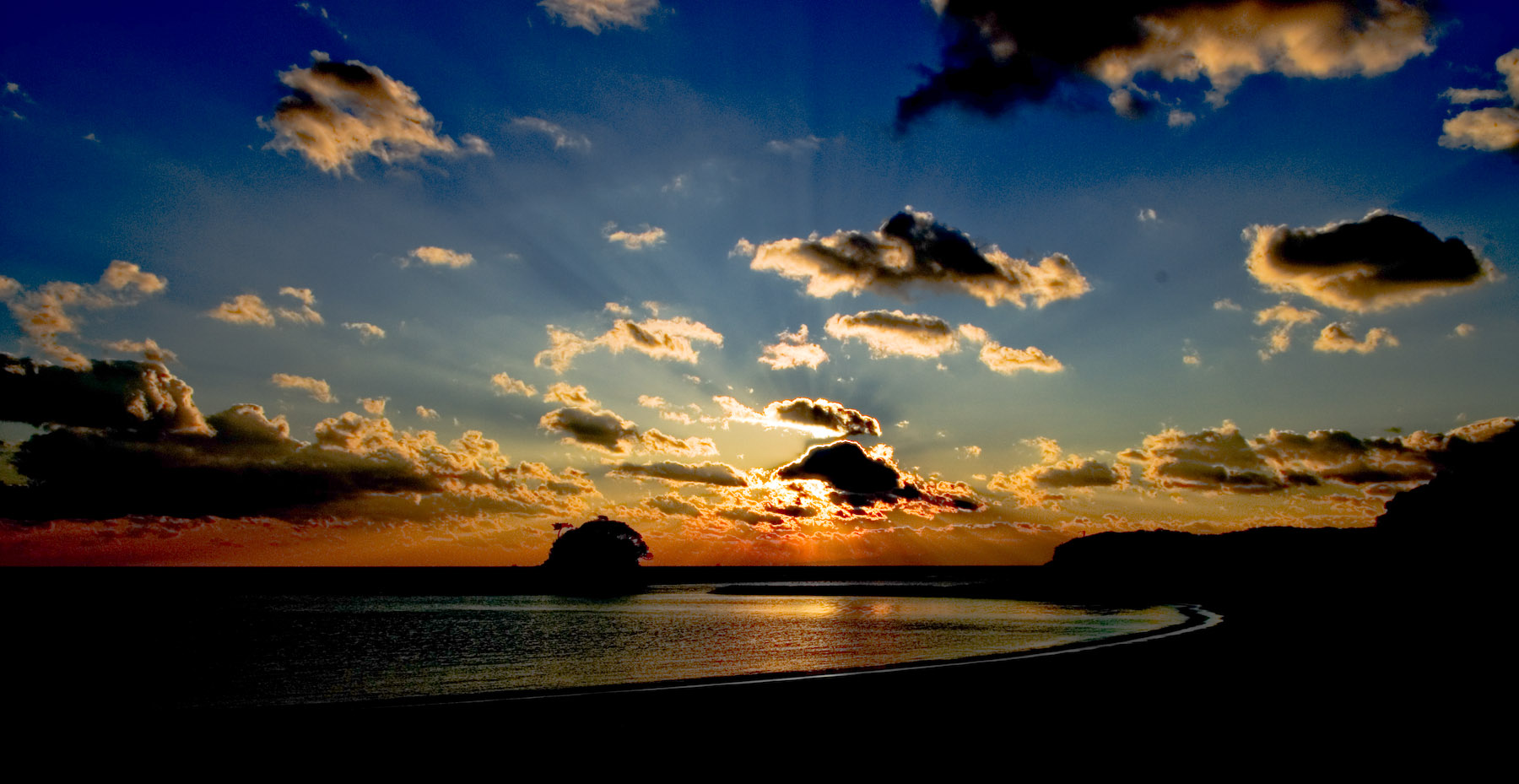
Nikon D200 + Nikkor 17-55 f/2.8 @ 19mm — 1/350 sec, f/13, ISO 100 — full exif & map
Another Sunset View
from our New-Year's trip, from the set shown in the post the other day
When a digital camera produces a standard JPG image file, it does so after internally processing its sensor's raw data. This processing includes the mathematical application of various settings for exposure, white balance, sharpness, color saturation, and other algorithms that massage the image data in an attempt to achieve a particular look.
Many cameras offer “scene” settings that can impact how this processing is done. For example, a “portrait” setting may reduce the amount of sharpening applied.
Raw
When shooting in a raw format, this processing is taken out of the camera, and left to your image-processing software. I use Adobe Lightroom to catalog and process all my images, including raw ones. Lightroom offers a myriad of settings for adjusting the raw sensor data, many of which are comparable to those done in camera, and others allowing finer control.
Creative Control
Making adjustments to these controls (again, controls such as white balance, exposure, sharpness, etc.) can be done to some extent without breaking the “honesty” of the result. For example, adding a bit of exposure boost to correct for an underexposed shot, or to adjust the color balance so that skin tones are realistic.
It's quite acceptable, even, to adjust the white balance to add an overall red/blue tinge to achieve a “warmer” or “cooler” look to the result. These effects are well within the limits of what the on-camera settings can do, so they fall under “creative adjustment” of the image.
Creative License
However, at some point, making these changes leaves the realm of “creative adjustment” and enters the realm of “creative license,” producing a result that can be quite far from reality. There's absolutely nothing wrong with this, so long as one realizes that the result is no longer “honest,” but rather “artistic.” (Hah, as it turns out, today's “What the Duck” cartoon applies perfectly.)
Frankly, I'm not happy with my choice of “honest” and “artistic” here, because one can certainly be both honest and artistic at the same time — heck, that's the ultimate goal of many types of art — but I can't think of anything better at the moment.
Playing in Lightroom
Lightroom offers many image-processing settings. The most basic set of controls are in the aptly-named “Basic” group, but there are many other groups, some of which have with names like “Tone Curve,” “Lens Corrections,” and “Split Toning.”
In playing with some of the “Basic” controls, I found some really interesting effects when I combined them in extreme ways, so I thought I'd share a few of the results. The version above is replicated as the “A” version in the set below.Mouseover the boxed letters to see various versions, and Lightroom's Basic group of adjustments used to create them.
Stylized/Idealized
Inspirational

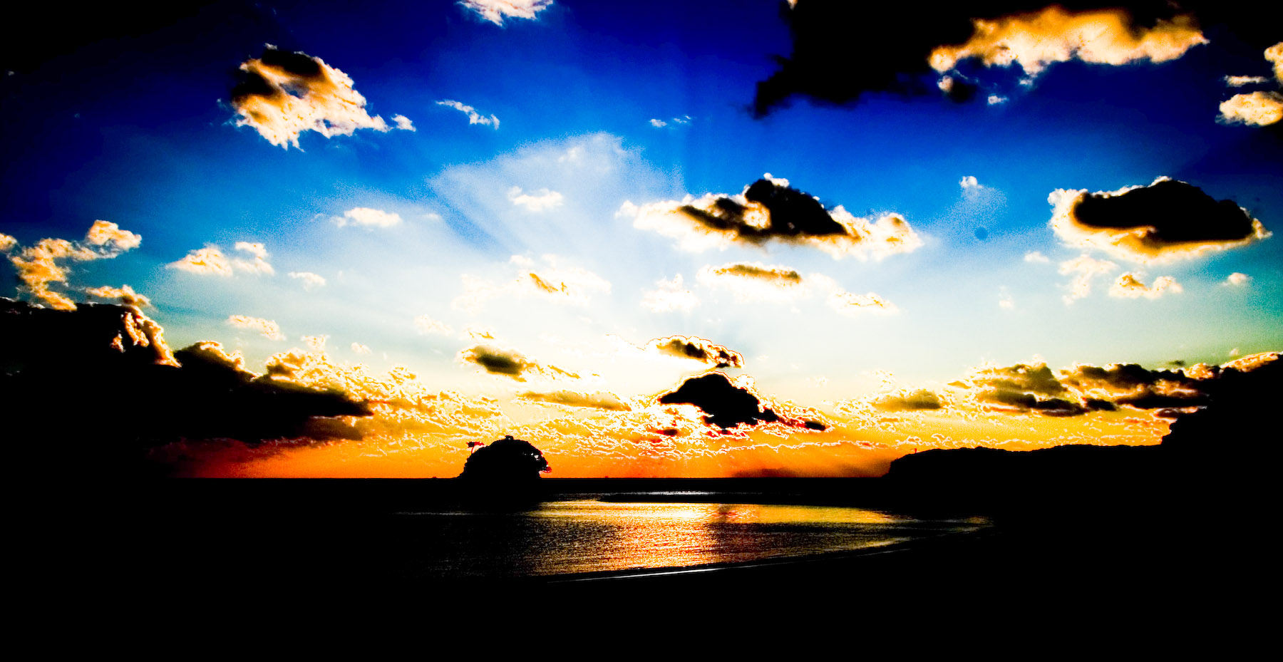
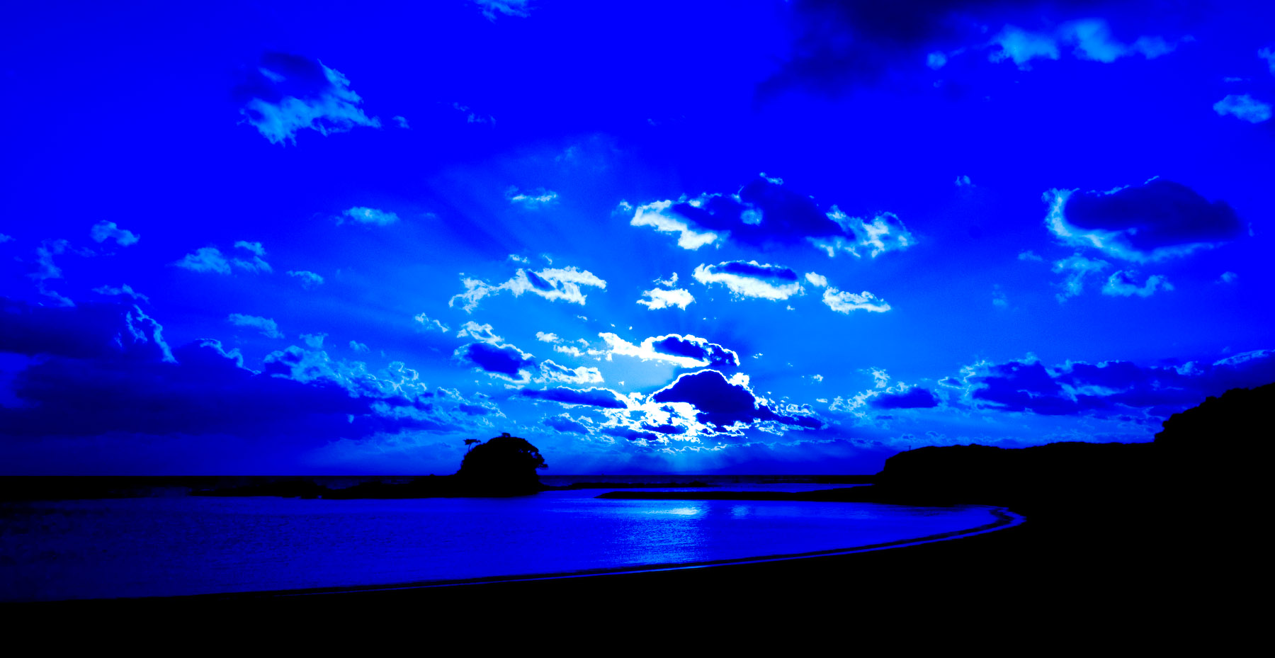
Nuclear Winter
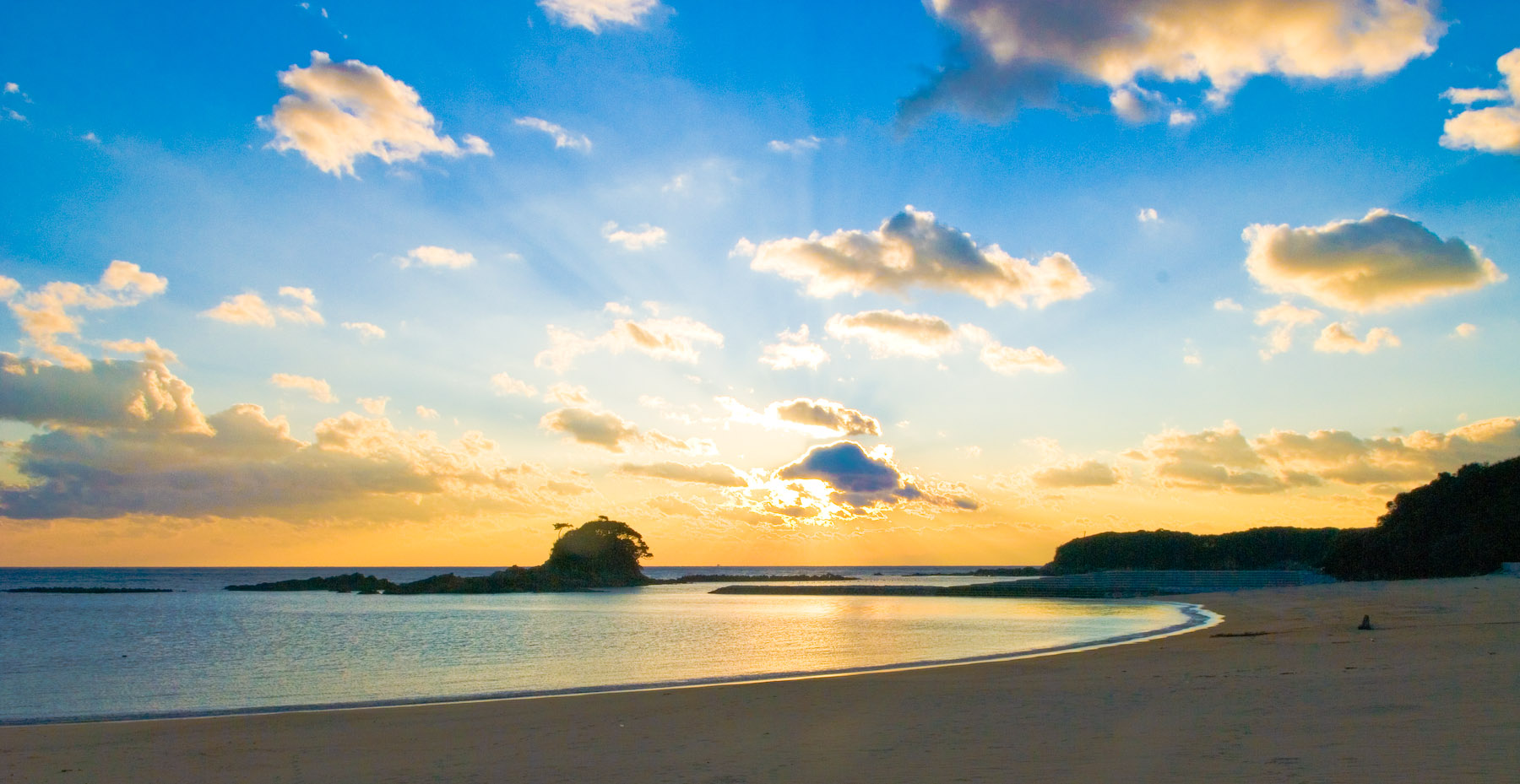
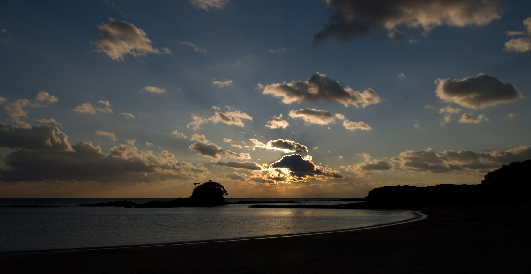
Closer to Reality

Martian Sunset?
“Elvis Velvet Moonrise” Painting
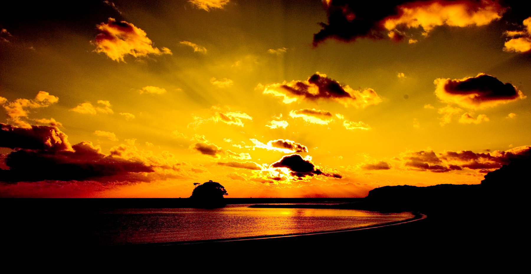
Vibrantly Golden

Moonrise
All controls at their default settings
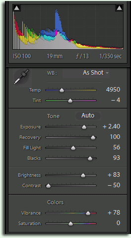
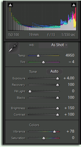
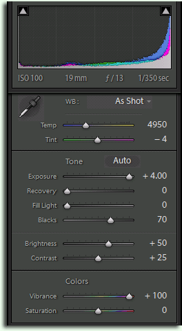
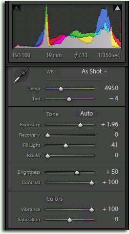
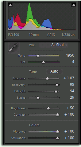
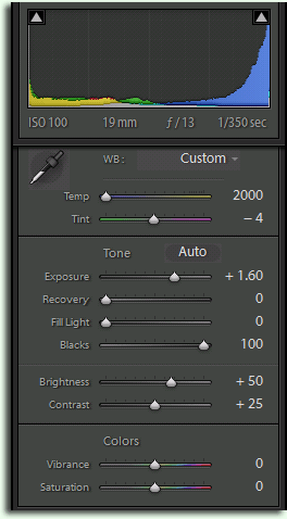
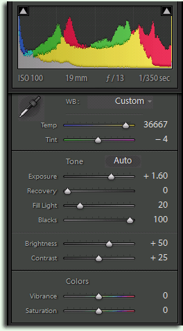
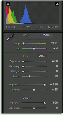
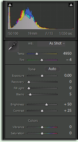
Develop Controls
mouseover a button to see that version
Remember, all these versions are built from a single image's sensor data, differing only in which generic mathematical adjustments are applied. There is no “painting” or other free-form image manipulation going on, as one might do in Photoshop or Paint Shop Pro.
I find the range of results to be just amazing. Which do you like best?
This is only the tip of the iceberg, even using only the “Basic” controls. For example, only three versions (“F”, “G”, “H”) adjust the basic white-balance, and none adjust the tint, which would result in all the more crazy results.
The “X” version is the result with Lightroom's settings at their default, which is fairly close to the JPG my camera would produce with its own settings at their default. Although this is the most “honest” version in the “straight from the camera” sense, it doesn't reflect reality well because the image is much darker than the scene actually appeared. The human eye has much more dynamic range than film or digital sensor (that it, it can distinguish detail throughout a much wider range of concurrent brightnesses), so while we could easily see the sand and island and all around, they look very dark in this “X” version because the camera adjusted the exposure based on the overpowering brightness of the sun.
(It's on my list to play with high dynamic range photography, as Madhu suggested the other day.)
Anyway, I caption version “D” as “Closer to Reality” because, well, the result is closer to what we actually saw that day.
Even more interesting/bizarre effects can be achieved with the “Split Toning” and “Color” controls. If you have Lightroom, Aperture, or another application that can process Nikon “NEF” files, feel free to download the original by right-clicking and selecting “save as” with this link: JEF_024582.NEF. If you come up with something interesting, post to your own blog and leave a comment here!
(I guess this post sort of qualifies to be among my photography tech posts.)
While “D Closer to Reality “ and “H Moonrise” are my favorite variations on your photo, I’m going to have to vote for “C Nuclear Winter” and “F “Velvet Elvis Moonrise” Painting” as my favorite titles.
Oh, you’re right about the duck cartoon. Gotta love it!
I would vote for H – Moonrise and A – Stylized. Martian sunset has a weird but not unpleasing atmosphere to it.
Nice post. I like the A and D, since I’m not into visual FX. One thing: from D, it seems that a little sharpening would do good to the image (you don’t mention any in your post), since the silhoutted part would be more in evidence. In fact, A looks sharper, but it could be just the result of increased contrast.
Going back to the diagrams and settings I realized that, in fact, D has much more contrast applied to it, so what I think I was mentioning above is the higher silhouette “contrast” in A, similar to some “unmasking” effect. As we can see from this example, techs FX do not necessarily translate into (subjective) visual FX as expected (my case, obviously, others may have seen immediately that D was more contrasty).
I have to say, i love your site, it’s one of the ones i poke around when i have downtime at work, somehow i missed this post. The results you got were wonderful, and let me realise how much i’m missing in lightroom, any “over the top” post i was doing in 16bit psds, now i have a few presets to give similar results in lightroom (similar to your settings actually)
The “uber warm sunset” shot is an effect i do alot by hand in photoshop, i massaged your settings and came really close to something perfect. It’s the type of effect that lends itself really well to a photo of a brightly coloured, expensive car in a not-so-good neighbourhood.
http://www.flickr.com/photos/grahamrose/2230245067/
http://www.flickr.com/photos/grahamrose/2230245903/
http://www.flickr.com/photos/grahamrose/2231038738/
are three shots i gave it a go on.
“Frankly, I’m not happy with my choice of “honest” and “artistic” here, because
one can certainly be both honest and artistic at the same time —”
One suggestion about your struggle of what to call the original photo would be “Reality”. That expresses what the scene, person, etc. actually look liked (assuming we took it right, or adjusted it to reflect the original reality). But another thought on this… a lot of photography is in some range of “artistic”. The tools we use in Photoshop & Lightroom give us a range of creativity to make that sunset scene above really grab the viewer, just as you did for me with “A”. Look at Ansel Adams. Despite all his lighting charts he developed, which were essential, his work would not have been what it is if it were not for his dodging & burning and other creative effects he did in the darkroom. So is his picture of half dome
“Honest” (or I like “Reality”) or is it “Artistic”? When we see it it feels and grabs us as reality alive! But it is certainly a great artistic work once one understands all he had to do to create that shot. Obviously there is a range as you say and some photographic works are clearly artistic. Even wedding photographers create a sense of the joy and beauty and wonder of that special day in the way they take the photos AND in the way they process them artistically with special tools. That’s the wonder and beauty of photography. Bringing people into a certain space, place & time the grabs the mind, heart & soul. Thanks for all your resources. I look forward to using this one.
I must be blind or lost… where is the download for the “Freaky Raw Processing”?
There is no download, unless you haven’t downloaded Adobe Lightroom. You can see the Develop settings for each version in the associated screenshot. My point was not to package certain looks into precanned presets, but to encourage play with the sliders. The same settings that worked out interestingly for this photo may fall flat on another, and vice-versa. —Jeffrey
I actually like the X version best followed by A and F, tho all are interesting. I tend to like the more realistic color schemes. I live in Marina del Rey, CA, and see some pretty spectacular scenery right out my windows. Thank you for an informative post!
Jeffrey, one trick to make really cool LR developing settings is to pull a slider well far into the right or left, then try to ‘fix’ it by balancing out with another slider. Keep on doing this throughout the develop settings. It’s crazy what happens. Like for example pull blacks up to 75% then balance out with fill light, then screw up the exposure, try to fix it with recovery. Then mess up the white balance, try to fix it with HSL controls or split tones. Then mess with color calibration… etc etc.
I created this image of statue of liberty using this technique. All the colors came from lightroom, but I took it into Photoshop after for noise control. http://www.flickr.com/photos/nyer82/2575020438/
Hi Jeffrey,
I live in Markham, just north of Toronto. I have Lightroom 3, but am unable to import my raw files (rw2 ….. from my Lumix FZ150) to Lightroom. Am I missing something; or is there a plugin that will allow me to do this?
Thanks,
….. john
Lightroom has to know about the sensor properties of every camera it supports (at least for non-DNG raw files), and I suspect that camera came out after Lightroom 3 was released. I suspect your only option is to upgrade to a modern version of Lightroom (which at $80 for an upgrade license is cheap for what you get). —Jeffrey