My Tech-Related Photography Posts
- My Lightroom-to-iPad Workflow
- Lightroom Goodies (lots of plugins)
- Digital Image Color Spaces
- Online Exif (Image Data) Viewer
- Jeffrey's Autofocus Test Chart
- Photoshop Calendar-Template-Building Script
- How to Prepare Photos for an iPad
- A Qualitative Analysis of NEF Compression
- Tripod Stability Tests
more...
Have you ever noticed that some parking lots have yellowish lights that make things look crazy colors at night? A movie theater in Santa Clara, CA we used to go to made Fumie's silver car look perfectly green, or something like that.
Such situations are an extreme example of the simple fact that all light is not created equal. Any middle-school student can tell you that perfect white is an even dose of all colors across the visible spectrum, but it's only common sense that if the light shining on something white doesn't contain that even dose of all colors, then neither can the light reflected from that white object. (And hence, it won't appear to be white.)
What may be surprising are the striking differences among the types of light we find ourselves in every day. Women, with their daily makeup ritual, know there's a tangible difference in how “natural” colors appear between the light from an incandescent (“normal”) light bulb and fluorescent one, but did you know that the difference in spectrum between direct sunlight and shade is much larger still? (To be clear, I'm not talking about the intensity of light, but the color makeup of light).
Yet, unless we're really paying attention (such as when applying makeup, I guess), we don't normally notice these differences, and so those objects that shouldn't in theory appear white do seem white. Why?
To quote Michael Briggs from a photo.net forum post three and a half years ago:
The human visual system is designed to define the ambient light as white and so people tend not to notice differences in the color of the ambient light. Photographic film doesn't have this ability.
Nor, for that matter, do the sensors of digital cameras.
In order for a digital camera (still or video) to come up with the proper digital value for “white” for something that's indeed white, it must know the kind of light reflecting off it. It must either figure this out for itself (color averaging across the scene? -- I don't know) or be told by us, which brings us to the subject of white balance. Setting a camera's white balance is all about setting the camera's color perception to match our own.
Of course, the perception of all colors are affected, not just white. In the face of an incorrect color-perception setting (the wrong white balance), images take on an overall color cast (often bluish or reddish/orange).
With my camera (Nikon D200), I can choose from among these white-balance settings:
- Auto (will try to figure it out itself)
- Incandescent
- Fluorescent
- Direct Sunlight
- Flash
- Cloudy
- Shade
- Preset
The last one, preset, allows me to take a picture of something gray and tell it “this is supposed to be gray”, and the color perception for future pictures will be adjusted accordingly. This works because something truly gray (or white, for that matter) has an equal amount of each of the primary colors (red/green/blue), and so if the camera's sensors actually detect an excess or lack of any of them, it can adjust them so that they all even out. The same adjustment is then applied to the entire picture, and (in theory) all colors should then appear natural.
The other settings are just ballpark guesses for commonly encountered scenarios. For example, there's not one “incandescent” light type -- heck, the light from an incandescent light bulb changes depending on the voltage applied. Maybe this is why the D200 has such abysmal incandescent white balance (images taken in “incandescent light” with the incandescent white-balance setting tend to look a bit unnatural)
So here's a question: what should you do when there's a mix of light sources?
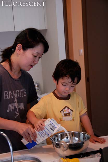
I took the picture below, of Fumie and Anthony making waffles, in our kitchen. The general kitchen lighting is fluorescent, but there are incandescent spot lights directly above (shining straight down to the counter surface), and the 9am sun was drifting in from the windows behind me.

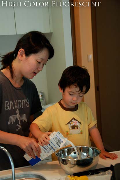
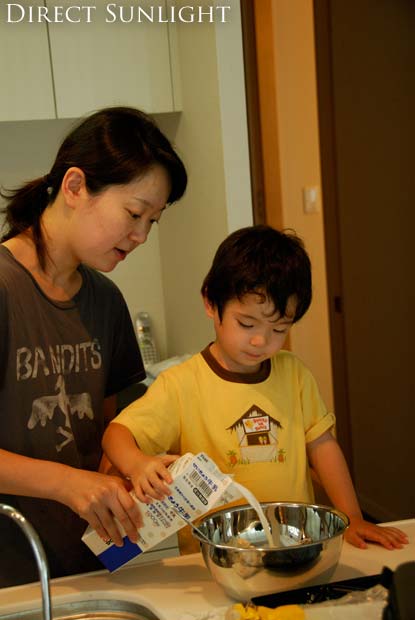
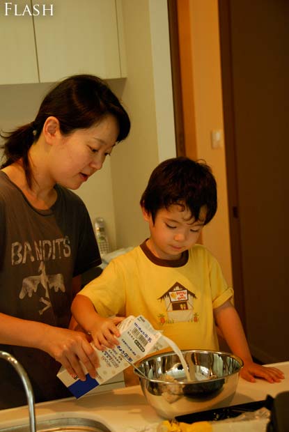

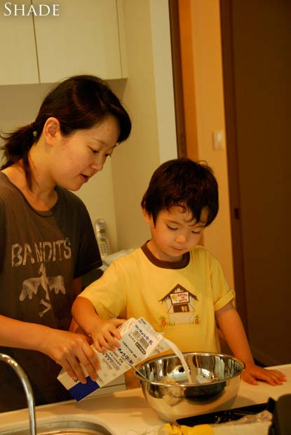


Cloudy - Shade - My Result - Jason's WB - Jason's Result
mouseover a button to see that image
Although they don't apear so, the wall and cabinet behind Fumie are white, as is the countertop, milk carton, and, of course, the milk itself.
Mouseover the buttons below the image to see the different color-perception interpretations. Note, in particular, the wall behind Fumie and the countertop (again, both of which should be white).
The countertop is primarily lit by the incandescent spots, so it appears the whitest via the “incandescent” setting. (But the parts of the countertop in the shadow under the carton and bowl are lit primarily by the ambient fluorescent, they're the most properly gray under that setting.
The walls behind Fumie are white and mostly lit by the ambient fluorescent, but the flat surfaces facing forward are also getting some sun, so they have a different cast than the side wall appearing between Fumie and Anthony.
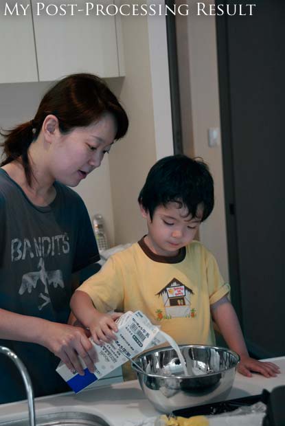
What got me thinking to write this post was the horrible time I had in post-processing this image to create something appearing vaguely natural. At the time I took it I was well aware of the different lighting and of the trouble it would bring-- if I'd had the time, I would have turned off one of the types of light, but it was one of those catch-it-or-lose-it moments.
What I eventually came up with is shown via the “My Result” button above. I didn't do a very good job -- the skin tones are still way off (compare Anthony's arms to his face -- his face is not getting much incandescent light, but his arms are). Mostly, I isolated areas that were generally lit by one type of light and performed a color balance adjustment in Photoshop. I also used the desaturate tool to clean up things that should appear white/gray.
UPDATE (This section added five days after the initial post)
My friend Jason took a quick whack at this
image. The “Jason's WB” button is his rough attempt to
whitebalance the image for proper skintone.
He took a few more minutes
(a total of four, he says) to make a few other adjustments
(“adjusted the tint to 3; exposure +0.96 EV, Saturation 1.09,
added a little sharpening, straightened it by -2.9 degrees, cropped it a
bit.”). His final
result certainly has a more pleasing composition, although it looks odd
in the “Jason's Result” view above, because I had to reposition
it to make it match the others for this post.
By the way, in case you're wondering how I came up with the seven white-balance-specific versions of the image, I did so by going to the raw file I have my camera set to produce. It contains the pre-white-balance raw sensor data, and so any of the white balance settings can be mimicked after the fact in software (in my case, when loading it into Photoshop).
So, I loaded it seven times, using a different white-balance setting each time. (The “HC Fluor” setting is for a special kind of fluorescent light that has less holes in its color spectrum than common consumer fluorescent lights, and so is better at accurately lighting a scene.)
Now that I have all these setting-specific versions, I should go back and redo my post processing to see if I can use them to get a better result. But considering that I just spent three hours writing this post, I find that I don't have the time!
Some links for further reading:
- white balance at Sean McHugh's site
- white balance at Wikipedia
These tend to talk more about “color temperature”, “black body radiation”, and other things that are of no practical use to the photographer, but they explain the science behind it.
Very well-written. While I am not a novice regarding white-balance, I appreciated the clear and concise way you presented the information. I will forward your site to other friends whom I know and who are novices. Actually a few have never heard of white-balance…..lol…There living rooms are just naturally orange at night…or so they say…
In case you were wondering why the lights in Santa Clara and many surrounding cities are the funky color you mention, it’s due to the observatory atop Mt Hamilton. More information is available here: http://mthamilton.ucolick.org/public/lighting/Pollution2.html
Thanks. Your explation helped alot. Now I just have to try the changes
Under such difficult lighting situations do you believe a Whibal or ExpoDisc would have helped rather than rely on the wb presets within the camera?
Good article – thanks.
I have to say, your version is basically just desaturated (compare to HC Fluor), an operation which, while it does make neutrals look neutral, also tends to degrade the rest of the image too!
Very well written article. Thanks!
Best explanation I have ever read, and there are tons of attempts on the web- one quick question (or 2): have you ever used the different white balance lenses/devices such as Whibal to correct you camera before shooting? Do you think a grey card absolutely the best approach?
Thanks again for your excellent article!
Ches Smith
Columbia, SC
Of all incarnations, I prefer the regular fluorescent one. It looks the most natural to me in terms of white walls, white milk, yellow shirt and natural skin tone. Perhaps it’s my monitor though, which is calibrated by eye only.
I like your demonstration of different white balances on the photo. I have been trying to understand what kind of light different situations produce, and the internet has not been very helpful so far, as many sites seem to want to explain things like colour temperatures, or even the maths of it. Too much for my little brain. At least I can see clearly now what different settings do, so thanks!
I must say my favourite is the HC-Fluor one. It’s warm without being sickly (unlike the sun and shade ones). Whether it’s ‘right’ or not, I don’t know, but I feel it looks nicest.
Buy a Whibal and ALL your White Balance problems will just go away.
There are GREAT videos on the Whibal site comparing a Whibal to a Grey Card and why a Whibal is so much better.
I have been using one for 2.5 years and it really makes the whole PP effort so much easier.
I’ve had a WhiBal for years and carry one with me all the time (at least when I’ve got the camera 🙂 ), but to suggest that WhiBal or anything can make white-balance problems go away is ridiculous.
Properly understanding the color of the light illuminating the scene is just one part of a solution, but only part. To take the next step you’d need to know the color broken down by wavelength and relative intensity (that is, you’d need a light spectrum analyzer), but even with perfect information you wouldn’t necessarily have enough information to recover proper colors because frequencies not present in the ambient light are not present in the the view received by the camera, even if objects in the scene would normally reflect that color. An easy example of this is the freaky colors of cars parked under those strong yellow vapor lamps that some parking lots have, but there are less noticeable instances in every day life. Many florescent bulbs have holes in their spectrum, for example.
I whole-heartedly recommend WhiBal and grey cards and the like, but you have to understand their place in the puzzle. —Jeffrey