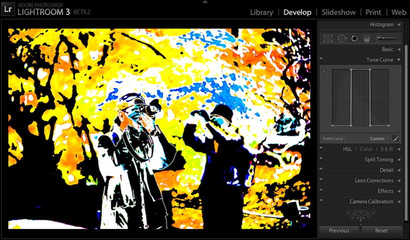
Gettin' Freaky Wid'it
So, in my previous post, “Stupid Tone-Curve Tricks”, I presented a few odd tone-curve presets for Lightroom that were of marginal utility. In this post, I present additional presets that are even more useless, if that's at all possible. (If you're not familiar with tone curves in Lightroom 3 beta 2, the aforementioned previous post has an introduction and useful links.)
Two separate downloadable ZIPs of presets are available at the end of this post, one for “Process Version 2012”, the standard develop engine to use for photos newly imported into Lightroom 4, and a ZIP of presets for “Process Version 2010”, which was the standard for Lightroom 3 (and remains the develop engine for those photos even in Lr4 and later, unless you explicitly change the process version in the Develop Module).
Be sure to use the preset appropriate for the photo's process version; otherwise, the preset appears to do nothing.
For more on Lightroom's “Process Versions”, see Laura Shoe's article: “What is that Exclamation Mark Below My Photo in Lightroom 4? If, When, and How to Upgrade to the New Process Version.”
In the presentations below, mouseover the little tone-curve squares under each screenshot to bring up an example of the preset to the screenshot. All the screenshots for a particular section are loaded upon first mouseover in that section, so there may be some initial delay with each if you're on a slow connection.
Like all “wild” tone curves that target specific parts of the histogram, the result for each is highly dependent on the specific photo and its current develop settings — tiny adjustments to a slider can have sweeping, dramatic impact — so the screenshots below show just one view that's likely not at all representative of what you'll see with your photos and settings.
Also, these kind of tone curves are probably more appropriate for black & white images (press “v” while in Lightroom's Develop Module to toggle the color treatment), but I show them here in color because they look more flashy and wild in color. (Hey, if you're going to waste time on something useless, may as well have some fun!)
Wave
These tone curves look sort of like a waves...
(They actually look more to me like hacksaw blades, but we won't go there.)
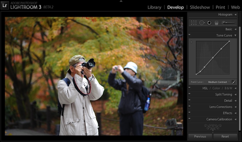
Normal
 Normal |
 Wave 3A |
 Wave 4A |
 Wave 5A |
 Wave 6A |
 Wave 7A |
 Wave 8A |
 Wave 3B |
 Wave 4B |
 Wave 5B |
 Wave 6B |
 Wave 7B |
 Wave 8B |
Zebra
Zebra stripes...

Normal
 Normal |
 Zebra 2 |
 Zebra 3 |
 Zebra 4 |
 Zebra 5 |
 Zebra 6 |
 Zebra 7 |
 Zebra 8 |
Tiger
Tiger stripes...

Normal
 Normal |
 Tiger 2 |
 Tiger 3 |
 Tiger 4 |
 Tiger 5 |
 Tiger 6 |
 Tiger 7 |
 Tiger 8 |
 Tiger 9 |
 Tiger 10 |
 Tiger 11 |
 Tiger 12 |
 Tiger 13 |
 Tiger 14 |
 Tiger 15 |
Cliff
Sort-of cliff shaped curves. These are the most likely to be the least useless...

Normal
 Normal |
 Cliff highlights 1 |
 Cliff highlights 2 |
 Cliff lowlights 1 |
 Cliff lowlights 2 |
 Cliff lowlights 3 |
EKG
Monitoring the heart of your photos...

Normal
 Normal |
 EKG1 curve |
 EKG1 square |
 EKG2 curve |
 EKG2 square |
 EKG3 curve |
 EKG3 square |
 EKG4 curve |
 EKG4 square |
 EKG1 curve inverse |
 EKG1 square inverse |
 EKG2 curve inverse |
 EKG2 square inverse |
 EKG3 curve inverse |
 EKG3 square inverse |
 EKG4 curve inverse |
 EKG4 square inverse |
Notch
Filters to let in only a slice of a certain brightness...

Normal
 |
 |
 |
 |
 |
 |
 |
 |
 |
 |
 |
 |
 |
 |
 |
 |
 |
 |
 |
 |
 |
 |
 |
 |
 |
 |
 |
 Normal |
Sliver
Like “notch”, but as absolutely thin as possible...

Normal
 Sliver 1 |
 Sliver 2 |
 Sliver 3 |
 Sliver 4 |
 Sliver 5 |
 Sliver 6 |
 Sliver 7 |
 Sliver 8 |
 Sliver 9 |
 Normal |
By the way, the photo is from my autumn “Teeming Throngs Enjoying the Colors at Kyoto's Eikando Temple” post.
Here are zips with all these presets, one for Process Version 2012 (Lr4 and later), and another for Process Version 2010 (Lr3 and later):
FunkyToneCurvePresets-2012.zip
FunkyToneCurvePresets-2010.zip
Install instructions are in my previous post.
In coming up with these presets, I tried not to be limited by what might be useful, though I did draw the line at a set of randomly-generated curves (after giving it a few trys 🙂 ). This was all a monumental waste of time to build and writeup, but it was fun. On the odd chance that you find any of them to be actually useful, leave a comment with a link so everyone can see.
So many possible responses to this post…
1) I’m glad you didn’t use my kid for these (like you did for the previous preset post),
2) To think of the amount of productive work that could have been done,
3) I think this is what Adobe was trying to prevent us from doing by not including this functionality in the first two versions, or
4) “Tiger” is actually very cool! I’m going to have to download these
Its not so much the results, its the presentation. These items really make us cringe when they are presentedas photographs. (And you’re not doing that.) In the right context these could almost be bearable…
“What?” “No, I have no idea what the right context would be :o) “
Neither do I.
I think Ron and Grandma are completely missing the point.
A context? “Notch” and “Silver” can be useful to make isophote maps of nebulaes in astronomical imaging… 🙂
“Most likely to be least useless….”
I don’t even care what you do with Lr, et.al. Jeffrey, I just love the way you write. 🙂
Reminds me of a graffito I saw in the Math department 35 years ago in college.
“Almost everywhere, is everywhere, except for almost nowhere.”
Ah!
Your last Sliver series reminds me of my earlier work with Agfa Contour film.
Needless to say a lot easier in Lightroom or combined in Photoshop.
thanks,
Douglas
strange things to do with your photos highly psychadelic and lots of fun!
WOW!!! You opened my eyes. Never thought there was that much flexibility in the tone curves in 3!
Very interesting effects and great usage of tone curves. I liked them all (in spite of what Grandma and Ron said!!). One idea that came to mind is to use those effects in a video. I enjoyed “scrolling” thru the curves and watching the “precession” of views – if I could just automate that and create a short clip…
Side Note: I want to thank you for all the amazing tools you have created!
how do you move the end points (black and white) up and down? the curves.
Are you asking about how to do it in the UI? I generated these computationally, so came up with results that are not likely possible in the UI. —Jeffrey
This was one of the most educational posts I’ve seen in a long time. Love it!
All of the presets may not be useful for photographers’ workflows, but they are immensely useful to convey the ways and extremes in which digital pictures can be manipulated.
Great idea. Very inspiring!
Thanks
Great Work. And much thanks for sharing it…
I would love use these effects on my pictures…
Hi, my 15 year old granddaughter has started a 2 year photography course as part of her GCSEs (age 16 final exams in the UK). She was having trouble understanding tone curves, but these presets are a fabulous educational tool, demonstrating the tone curve in an entertaining way!
Thank you…
Thanks Jeff, had a lot of fun with these. I had a close up of a cow’s nose that is now wow! 🙂
Melbourne, Australia
And here’s the cow: http://www.flickr.com/photos/john27rg/10767923215/
Freaky! Looks like it could have been taken with an electron microscope. —Jeffrey
Hi,
Really enjoyed your blog. Many thanks for taking the trouble to do this. I just do not understand those with their negative comments.
You are really helping an awful lot of folk here. Really inspired stuff and I’m so grateful for these great ideas.
I’m a keen photographer / artist and will definitely keep my eyes on your blog.
Thanks again from Loughborough (Leicestershire UK)