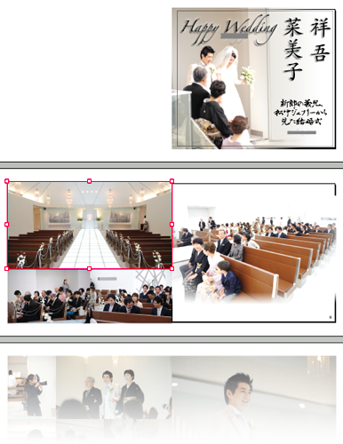
Pages Being Laid Out in Adobe InDesign
In my “Namiko Candid Bride Portrait” post the other day, I mentioned that I'd made a photo book for my brother-in-law Shogo's wedding, and showed a two-page spread of a photo of his bride that I was proud of. You can see in the last photo of that post a bit of the 80-page book I created. In this post, I'll talk about the workflow I use to create photo books with Lightroom, InDesign, and Blurb.
This workflow requires Lightroom 3. As for InDesign, I use CS5, but the same workflow should work with older versions of InDesign (at least back to CS3 when I created this workflow).
Before I go into the details, I must give some disclaimers:
I'm no expert in this, so this is what I happen to do, but I don't claim that it's the best method. I'll describe why I've made some decisions, which may help you evaluate it for yourself. This workflow does not, for example, incorporate soft proofing because it would add a great deal of complexity to an already kludgy workflow, and my monitor's not calibrated at the moment anyway (because my monitor-calibration tool suffered an ill-timed breakdown).
My photo books tend to be complex, with each page laid out specifically for the photos. Sometimes I'll have one photo across a two-page spread, one photo per page, or a mix of a bunch of different sizes all on the same page. I tend to be guided by an idea of the story I want to tell, hemmed in by the reality of what photos I have available, and what photos visually “fit” the space constraints of the page and each other. If you do a simple one-picture-per-page book, you might not even need InDesign.
As much as I love Adobe Lightroom, I hate Adobe InDesign. It's a poorly-thought-out kludgy inefficient troublesome bundle of frustration wrapped in a bad user interface. Maybe it's just not meant for building photo books and I'm using the wrong tool for the job. I hate it, but I have learned how, with great effort and much grinding of teeth, to use it to get the job done.
Books printed with Blurb can be very nice, and the experience can be very smooth. However, if the experience is not smooth for whatever reason, woe be to you, because Blurb is a horrible company that just doesn't get the concept of customer service, and they proactively find ways to screw their customers. When things go well, the quality/cost ratio is very good, which is why I use them, but it's also why they can afford to be so atrociously arrogant. Before embarking on a project with them, realize that you are rolling the dice and that much pain may await you.
Overall Workflow
My Tech-Related Photography Posts
- My Lightroom-to-iPad Workflow
- Lightroom Goodies (lots of plugins)
- Digital Image Color Spaces
- Online Exif (Image Data) Viewer
- Jeffrey's Autofocus Test Chart
- Photoshop Calendar-Template-Building Script
- How to Prepare Photos for an iPad
- A Qualitative Analysis of NEF Compression
- Tripod Stability Tests
more...
The whole reason that a post like this is necessary is because there is absolutely no integration between Adobe Lightroom and Adobe InDesign, so we have to figure something that sort of halfway maybe hopefully works.
The overall workflow is to select / prepare photos in Lightroom, export them as developed images to new files on disk via a publish service, then link to those images from InDesign. Because you're using a Lightroom publish service, you can continue to tweak the photos in Lightroom as you craft your book, republishing them from Lightroom and having InDesign pick up the changes automatically.
Once you've crafted your book and exported the PDF files for the cover and pages from InDesign, you upload them to Blurb, order your book, and pray. And wait.
Lightroom Setup
My setup in Lightroom is more complex than it may seem to require, but you'll see why below.
First, I create a normal (non-publish) collection of the photos I want to consider for the book. This can be a regular collection into which photos are dragged, or a smart collection based upon keywords, star ratings, color labels, etc. Do whatever works best for you to identify photos that you might use in the book. Name it something along the lines of “PICS FOR BOOK MASTER LIST”.
Then, create a publish service via Lightroom's built in “Hard Drive” publish service. Some of the important publish-service settings are highlighted here:
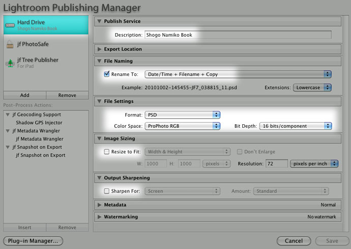
The name you choose in the top section of the dialog is the name for your publish service, so pick something descriptive.
Export Location
Pick any folder on disk that you can also reach from InDesign. Personally, I create one base folder for the book (e.g. “Shogo and Namiko Wedding Book”) and within it I create the InDesign files, and a “Pics” sub-folder for the intermediate Photoshop files Lightroom will create. It's that “Pics” sub-folder that I specify as the export location.
File Naming
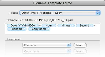
For the file-naming template, I use one that preserves the chronological order of the images because that's how I tend to work with images in Lightroom, and the books I create tend to be stories about some event for which photos are best presented in a generally-chronological order. Thus, I find it convenient to ensure that the files created by Lightroom, which I'll then drag into InDesign, are presented in chronological order by Finder/Explorer.
If I were doing a one-time export, I could simply use a filename template with a sequence number, but the publish collection creates an ongoing relationship between Lightroom and the folder collecting the Photoshop files, and I'll add and remove photos over time, and will re-export photos as I tweak develop settings, so this export churn makes any kind of sequence number unworkable.
What I do use involves creating filenames that incorporate the image date and time, the image filename, and the copy name (because I may use multiple virtual copies of the same image with different develop settings, such as color vs. B&W renditions).
File Settings
I've chosen to create Photoshop files in the past, but in writing this post I tested creating ZIP-compressed TIFF files, and found that they're about 20% smaller, so I may choose TIFF files next time (assuming that InDesign can handle them, which I would expect). In either case, I choose ProPhoto RGB as the color space, which is the closest standard color space to what Lightroom uses internally, and I choose 16 bits/component. These choices conspire to preserve as much image quality as possible during the transfer to InDesign.
The resulting files are big... the 200 temporary files for the images I used in the wedding book take 14 gigabytes of disk space. But it's temporary; now that the book is done, I can delete them. The master image files (the out-of-camera raw files) and the Lightroom catalog can be used to recreate the temporary files any time, so they'll be archived along with the InDesign files.
Resizing and Output Sharpening
You'll note that both resizing and sharpening are disabled, because I want to limit that kind of processing until the image is fixed within InDesign. InDesign will re-render and resize images anyway, so no need to do in Lightroom what will eventually be negated anyway.
Metadata and Watermarking
You won't use any of the image metadata (Shutter speed, caption, etc.) in the temporary files, so it doesn't hurt to minimize metadata. You'll save a tiny bit on disk space, but not enough that I bothered to even think about it when doing my most-recent book. Doesn't matter one way or the other.
Of course, you don't want to watermark photos being prepared for the book; if you want to add annotations or watermarks to the in-book result, you can do the watermarking within InDesign once you know exactly how the image will appear in the layout.
Once the Hard Disk publish service has been created, we then create a smart collection within it via the context menu's “Create Published Smart Folder” item. Define it with one rule, “Collection contains all PICS FOR BOOK MASTER LIST”, where the italicized portion reflects the name of the non-Publish collection you created earlier. This will cause the new Hard Disk publish collection to mimic the non-Publish collection. (Note: don't use “... contains words...” when defining the smart-publish-collection rule because it doesn't work in this situation; either it's a bug in Lightroom, or I don't understand what “contains words” is supposed to mean.)
When interacting with the book-related photos in Lightroom, use only the non-Publish collection... add photos to it, subtract photos from it, tweak develop settings, etc. Only when you're ready to have those changes reflected to the Photoshop files available to InDesign do you need to visit the Hard Disk publish collection and “Publish” it.
It first glance it may seem silly to use this two-collection approach, as opposed to just creating a publish collection and dragging photos into it, but Lightroom's segmented grid in a publish service — the partitioning of photos into separate grids for new photos, modified photos, unchanged photos, and to-be-deleted photos — makes an interactive back and forth among images really painful. For example, you might be in the “Published Photos” grid comparing three similar shots being considered for a spot in the book, and decide that one will stand a better chance with a bit of extra brightness, but after returning from develop where you made that change, the image is no longer in the “Publish Photos” grid with its compatriots; it's been changed, so now it appears all alone in “Modified Photos to Republish”. This will drive you crazy, so it's easiest to do all the real work in the non-Publish collection, publishing as needed from a publish collection whose rules cause it to mimic the non-Publish collection.
InDesign Setup
Download the color profile for the printers that Blurb uses, Blurb_ICC_Profile.icc, and install it on your system. See “Installing the Blurb ICC Profile” on Blurb's color-managed workflow page. Restart InDesign if it had been running.
Then visit Blurb's inadequately-complete “Using Adobe® InDesign® to Make a Book” page and download and install the “Blurb PDF/X-3 Export Preset”. Also download the appropriate InDesign templates you'll use for your book pages and book cover.
InDesign Color-Management Setup
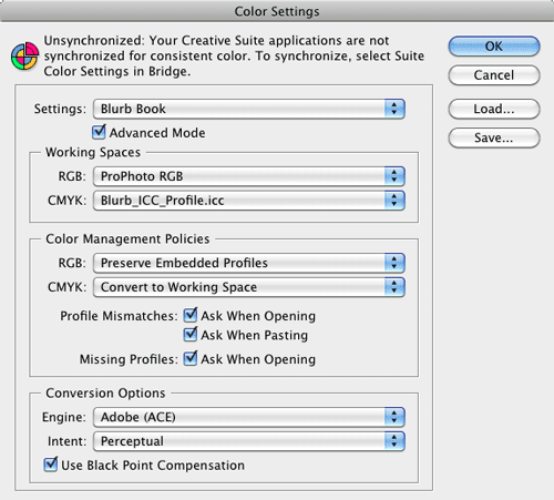
Within InDesign, bring up the Edit > Color Settings dialog, and set options as shown at right. Blurb can handle two common approaches to color data, the RGB model that camera hardware and Lightroom use, and the CMYK model often used by printers (including Blurb's).
The general goal when converting between these models, or among different profiles within a model, is to convert as few times as possible because quality is lost with each conversion. In the end, everything will have to be converted to Blurb's CMYK profile because that represents the final result: ink on paper.
The “Working Spaces” settings define what specific profile InDesign should use for each color model while you build the book. I chose ProPhoto RGB for the RGB working space because that's the same space that Lightroom uses, and the space I chose for the temporary image files created by Lightroom. This means that the color data won't have to be converted between or among spaces while it's being worked on in InDesign. No extra conversions means no extra loss of quality.
For the CMYK working space, I choose the actual space that will be used for printing, the “Blurb_ICC_Profile” that I'd installed above. This means that color-related items that I create within InDesign (page backgrounds, text, etc.) won't need color conversion when being prepared for shipment to the printer.
The “Color Management Policies” section defines what should be done when an image is imported into InDesign with color data that doesn't match the working space chosen above. I won't have any such files (all my image files are being created by Lightroom with the specific intent to match my working spaces perfectly), but if I were to import some random JPEG image that wasn't already in my RGB working space, I wouldn't want it converted to some intermediate RGB space (my RGB working space) because it'll have to be converted later to the output CMYK space for printing, so by having its profile preserved, it'll get converted directly to the output space when the book is exported for print. That's one less conversion, so less loss of quality.
On the other hand, if I were to import a CMYK image, I'd want it converted directly to the output color space. There's no problem of the intermediate “RGB working space” as in the previous paragraph, so if I have it converted right away, it'll then be at the final output color space and it won't need further conversion.
InDesign Export-Template Setup
Blurb provides the export preset we installed above, but it requires some changes to be useful. Invoke “File > Adobe PDF Presets”, select Define, then select “Blurb PDF X-3 Export Preset”, and then press “Edit”. Then select the “Output” tab, and you'll be presented with this dialog:
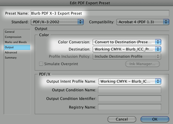
Ensure that Color Conversion is set to “Convert to Destination (Preserve Numbers)” and that Destination is the Blurb ICC profile (which because of our earlier settings is also our working space, so the selection is “Working CMYK - Blurb_ICC_Profile.icc”).
Also be sure that the “PDF/X Output Intent Profile Name” is the same “Working CMYK - Blurb_ICC_Profile.icc”.
Perhaps update the Preset Name to indicate that you've made changes (e.g. “My Useful Blurb PDF X-3 Export Preset”) and press OK to save your changes.
InDesign Output Preflight Setup
InDesign has a “preflight” feature such that it'll check for common problems before you generate and upload your multi-gigabyte PDF to be printed. The default preflight profile is mostly fine, but I make a few changes. Open “Window > Output > Preflight” and create a new profile, “Blurb Book”, and make changes as you feel appropriate. I tend to enable:
| LINKS | — | Links Missing or Modified |
| IMAGES AND OBJECTS | — | Color Image Minimum Resolution: 150
Non-Proportional Scaling of Placed Object |
| TEXT | — | Font Missing
Glyph Missing |
I've printed huge two-page spreads at 90DPI and had it come out just great, but 150 DPI seems to be a good general-purpose lower bound. If an image ends up being scaled in the final output to 149 DPI or worse , Blurb will issue a scary-sounding warning, but will let you print anyway. So, having the preflight check let you know before Blurb tells you at least prepares you for the scary warning.
Build Your Book
Now that things are set up, I publish the Photoshop files from Lightroom for images I might use in the book. I then look at the thumbnails in Finder (“Explorer” on Windows) and drag images to InDesign and see how they work at that point in my book. I won't use every image that I include in the Lightroom collection for the book, but every image I want to use finds its way to the book via the collection. When preparing the wedding book, I'd started with 700 images in the book-related collection, but only 200 ended up actually being used in the book.
The InDesign templates from Blurb contain “page bleed” areas a smidgen beyond the edge of the page so that there's no chance of having a sliver of white paper show through after the paper is cut where you intended to have an image run to the edge of the page. Thus, a little bit of these images is necessarily lost, and for that reason I prefer to leave all images uncropped and unrotated in Lightroom, cropping and rotating within InDesign in a way that suits the specific photo's specific placement on the specific page. Because of this, I end up making a lot of virtual copies for the book-related collection, because photos I've also used elsewhere (e.g. published on my blog) may have display-ready crops already applied.
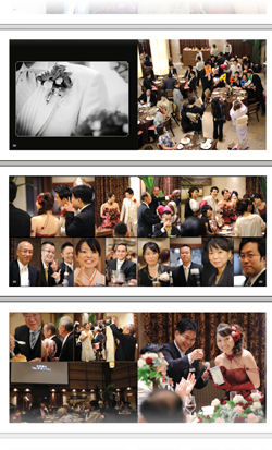
Designing the pages is the most time-consuming part for me. Again, if you do a simple and elegant “one photo per page” layout, as is common with photo books, this'll be the easy part for you. My books are visually complex. (“Noisy” some might say, but they're my books, not yours. ;-)) They're also big... so far I've always made Blurb's 13”×11” Large Landscape books, which means that the screenshot at right represents more than two feet of printed width: each of the three two-page spreads shown in the screenshot represents two printed pages totaling 26” (66cm) in width.
So far, I've always gone with premium paper, and with ImageWrap hard-cover binding. I've been very happy with the quality of Blurb's printing and binding.
(Blurb offers three types of paper to choose from, but offers only one printer color profile. You don't need to know much about color management to know that this indicates that they have no clue about it, or that they have a clue and just don't care. But hey, they're printing your books, not theirs, so why should they care?)
Be sure to keep in mind that except for the first and last page, every page is part of a two-page spread, and so design each page realizing what else will and won't be visible when the reader is viewing the page. For someone like me who lays out each spread depending on what story and images are in play at that point in the book, I try to have natural breaks in the story happen at a page turn, not between two pages that are visible at the same time. In the wedding book, transitions between events of the day — the chapel ceremony, the outside flower-petal toss and photo op, the small welcome reception, the start of the banquet, the cutting of the cake, etc. — all happen at the turn of a page.
And because I really do like the bride portrait that I posed the other day, I'll show again here how it appeared as a two-page spread in the book...
... and in the InDesign page-layout window, as the last full two-page spread:
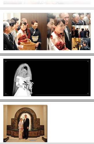
(For the final page of the book, I threw in a picture of Fumie and me that we had enlisted a passer-by to take as we returned to our hotel after the wedding. Not being in any of my own photos that I took at the wedding, I wanted to appear in the book at least once.)
Build Your Cover
One thing I've learned when creating the PDF for the cover is that the marks for the spine are fairly vague. Unlike the edge of the paper, which is a clean crisp well-defined cut, the spine-to-cover transition is a general curve over a couple of millimeters on either side. Furthermore, the part of the cover right next to the spine can have a centimeter-wide concave indent running down the height of the cover... it's hard to describe, but I suppose it's part of the binding, and it lends a nice “real book” feeling to the result, but you've got to be prepared for it and not put the title text or anything else important there.
Here's what the cover design for the wedding book looks like in InDesign:
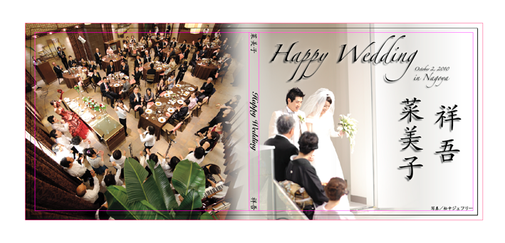
The front cover is on the right, of course, with the back cover on the left. The outer-most red box is the edge of the page-bleed area, and represents the edge of the information sent to the printer. The black box just inside represents about where the paper will be cut (I've found this to be very accurate with Blurb), while the pinkish inner lines represent “safe text” areas that absolutely won't get lopped off during page cutting. All of these guide lines are within InDesign, and won't actually be sent to the printer, of course.
Because there are no specific borders that clearly separate the front cover from the spine from the back cover during actual printing, I have the front-cover image overlap to the back cover, and then blend into a second back-cover image. Or, I use one large image that spans the whole thing in such a way that it also looks good as just the front cover. Either method ensures that the front cover, when viewed by itself, is whole and complete, and doesn't have a sliver of some separate spline image on it.
Just for a change of pace, here's an example of a cover that uses one image to span both front and back, from a book I made last year to commemorate the first-time gathering of all my folks' grandkids (which, to my boy Anthony, means all his cousins, at least until Shogo and Namiko get busy).

The “half” in the title refers to my brother's wife being pregnant at the time with their #3, who turned out three months later to be Claire. The lake is behind my folks' place, where the kids spent much time throwing rocks, and occasionally going for boat rides.
When you first pick up the book, you see only the front cover with the bench and the oars, but when you eventually notice the back cover, you realize that you can open it wide and view the whole thing. It's a nice effect if you can find an image that works.
Export, Upload, and Order Your Book
Once you've got things squared away in InDesign, you'll export the cover to one PDF file, and the pages collectively to another. These can be very large... I was pushing the two-gigabyte PDF file-size limit with the 600 images in the 160-page “cousins” book.
Once you order your book from Blurb, the order sits in a queue doing nothing until your turn comes around for the printing to happen, and in my experience that queue-sitting lasts about a week. Blurb gives you an estimate before you finalize your order.
Blurb makes it very clear that once the order has been submitted, nothing short of the heat death of the universe can cause any change to be made. Make sure you understand this before placing your order. It's just one example of Blurb's arrogance... the order is just sitting in a queue and one would surmise that, say, updating the ship-to address would not be a difficult enterprise. I would have liked to have had that option: when I ordered the “cousins” book last year, Blurb missed the expected-print date by a couple of days, and in the end it arrived at my folks' place a few hours after I had left to return to Japan.
Or, perhaps, a reasonable company would allow you to cancel an order (even if only for future credit)... doing so would mean that everyone behind you in the queue gets bumped up a notch, so everyone would be pleased, but Blurb doesn't allow it. They don't allow you to replace a PDF file to correct a misspelling you notice a bit too late, even if the page-count remains unchanged. Once an order has been placed, you have absolutely no further control until the book arrives in your hands.
[ Update Jan 7, 2011: Blurb's director of customer service let me know that they actually have a one-hour window in which the order can be canceled. I would be curious to know why the order can be canceled during just that first hour (because they hold it back for an hour?) and not right up to the moment when it's loaded into the print queue.. ]
Again, they make this clear ahead of time, so you can decide to take your business elsewhere if you don't like it. No one likes it, of course — Blurb has absolutely no clue about good customer service — but there aren't many other options for a large portion of their product selection.
Receive Your Book
So, the angels have finally sung and the book is in your hands. Depending on which back-end printer Blurb used, the book might come with a bar-code sticker on the back cover and shrink wrapping all around, or not.
The wedding books I ordered last month had the bar-code sticker and the shrink wrap. The shrink wrap is sort of nice for something you'll be presenting as a gift... it really makes it feel new and special... but the bar-code sticker is inside the shrink wrap, stuck to the newly-printed image-wrap cover of your book.
You're supposed to lift up the corner with your fingernail to remove it, but the mere act of trying to get under the corner of the sticker can ruin the cover. This comment from a couple of years ago pretty much sums it up:
But it's not an “oversight”... Blurb has been doing this for years, and their own forums are filled with customers blowing gaskets over this mind-numbingly stupid move. Blurb doesn't warn you ahead of time about the potential for a cover-ruining sticker, and since not all their printers put the stickers, you never know whether your order will be cursed with them. It's like a top-level chef preparing a fine meal for you, right at your table, but then sneezing on it with a smile while presenting it to you.
When I first got the wedding books, I was surprised by the stickers because they were my first order to have them, but I wasn't fazed by them until I realized that they were under the shrink wrapping. I didn't want to give the books as gifts with the sticker (and hence the potential for damage) still attached, but I also didn't want to remove the shrink wrapping because I felt it added a nice touch as a gift.
So here's what I did: I made a small hole in the shrink wrap and used a sharp box cutter to very carefully grab the edge of the sticker — never touching the book cover — lifting it up and very carefully drawing it away from the cover and through the hole, like a surgeon removing a gall bladder.
I'd ordered six copies, one for myself and five as gifts, so I had to repeat that procedure for five copies. Thankfully, it came out okay for each one.
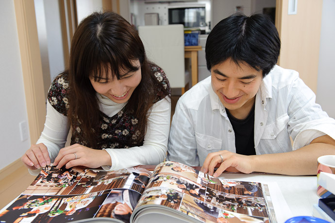
Nikon D700 + Nikkor 24-70mm f/2.8 @ 36 mm — 1/125 sec, f/5, ISO 2000 — map & image data — nearby photos
Checking Out Their Own Wedding
So, for better or for worse, this is how I currently produce photo books. I hope this explanation is useful to someone.

Your way is very complicated. Life is so much easier when you lower your standards! 🙂
My books are not at your level of awesome ( the 6 ½ cousin book is spectacular), but they’re pretty darn good. I use Blurb’s own software – “Booksmart”. It’s not great – you can’t really make a photo cross two pages unless you divide it in Photoshop. But it’s much cheaper (free) than InDesign, and the learning curve is a heck of a lot lower. The part that I like the least about it is that there is always uncertainty on the cut line – they mark the absolute cutting line, but you have about ¼ inch where it might be cut. I don’t know if that’s the case when you send in a PDF, but that bugs me every time.
As for Blurb’s customer service, I’ve been lucky. I’ve never gotten the bar code sticker on the book, and my books have always been shrink-wrapped. The books have ALWAYS come in much sooner then anticipated. I’m pretty sure they use a printer within 20 miles of where I live based on the fedex tracking trail. In fact, I’ve occasionally gotten the email from Blurb saying “Your Package is On the Way” the day AFTER I received it at my door.
One thing I’ve been wondering – since you can save your photobook as a PDF, have you ever tried to load one into ibooks and see how it looks on the ipad? It would take about as much space as a movie, but I bet it would look pretty cool!
Yes, Blurb’s Booksmart is just fine for many… I’ve seen lots of books done with Booksmart (a friend’s done a stack), and it’s great if your layout needs are simple/elegant. As for the iPad, you can load the huge PDF into an iPad PDF-reader app, but you can also export an iPad optimized version of the book (you don’t need/want the page overbleed, for example, nor such high resolution images). Works just dandy. —Jeffy
Thanks for this write-up! I know what you mean about InDesign… I feel the same about it and Illustrator and pretty much everything Adobe besides Lightroom and Photoshop (although PS took some getting used to). I tried a few projects in InDesign CS2 years ago but got fed up with it and put them together manually in Photoshop. That was the end of print layouts for me.
Great post man, thanks for taking the time to write this up. I used Blurb to do a book awhile back and found their program to be antiquate at best. Being able to do more with InDesign will be nice.
Blurb came out with a new version of Booksmart a year or so ago that is supposed to be much better than what they had before. I’ve not used it, but you might want to give it a try if your layout needs are not as insane as mine. —Jeffrey
I just finished my first Blurb book (600+ photos on 240 pages, our vacation to the USA in August… 2009 😉 ), and I must say I was very, very pleased with the Booksmart application, the quality of the book (received it this morning!) and the quality of the service.
Including a 25% “welcome” discount, it costed me about 50 Euro, including shipment by FedEx all the way from Seatle to Belgium.
I do agree with the “sticker” comment however. can’t understand how they can accept that their nice product risk to get ruined by that thing!
Booksmart may not be 100% perfect, but it is by far the best I’ve found up to now.
I might want to give Indesign a try, but I guess the learning curve and the little free time I have will make me stick to Booksmart for a while 😉
Now, what’s really interesting is the “publish to hard disk” trick. It’s so straightforward, I didn’t think about it 😉
Thanks for describing your Blurb workflow in such detail. We have found the InDesign –> .pdf –> Blurb process to be workable, but quite a challenge to have everything come out exactly as we wished. It took us three tries, with the first one using Blurb’s software, to get the placement of photos and the overall book trimming done correctly. We shifted to InDesign because Blurb’s software was not able to offer precise and consistent photo placement. If you are interested, here is our Blurb page: http://www.blurb.com/bookstore/detail/1033813. Regards, Tom (San Francisco)
I’ve used Blurb’s Booksmart for several books. What I normally do is create my pay layouts using Fotofusion, which is incredibly easy and fast for photo layouts. I export each page from Fotofusion and import them in to Booksmart as full page images.
I do appreciate the InDesign description as I want to learn InDesign to incorporate photos with text.
Ken…
Looking at the photos of your book I think your layout is nice but not so special that their own software can’t handle it. You should at least give it a try and save some precious time.
I did give it a try before ever using InDesign, and wasted a few hours struggling with page 1, and gave up. They’ve released a new version since, but by then I’d already figured things out with InDesign, and it still seems like you can’t do simple things like split a photo across a page, so it’s still too limited for my needs. —Jeffrey
Thanks for the write-up. I always enjoy your posts but this one was especially helpful.
Bill
San Antonio, TX, USA
Dear Jeffrey,
thanks a lot for this interesting article! I read it with great interest, as I am currently designing my year-end-Xmas-present photobook 2010, and I also use Indesign for this. Tried as well several software products of printing services, however these layout programs a) never gave me the level of control I have with Indesign (e.g. alignin pictures was always a nightmare, next to impossible, zooming rarely works well, overlaying text is by far not as comfortable and so on) and b) those programs never produced a pdf-file, thus digital archiving of the photobook wasn’t possible; and looking at my old photobooks produced with these proprietary programs I always have a bad feeling — they’ll never be (easily) reproducable, as the software of those printing services surely has changed by now and anyhow the software isn’t on my system any more. So, after early attempts with those proprietary software products I quickly decided that I’d have to move to something more powerful and especially with a longer expected lifetime….
Never stumbled across blurb — they seem to be indeed quite competitive, at least concerning pricing. Might want to try them for the next books…
But I have two questions concerning your workflow. Using a publishing service in one folder helps to better integrate LR and Indesign (now I might start to understand this new feature — never used it before)
However, I see two problem areas
a) One vs. many picture folders
How do you find the pictures you want to add on a given Indesign page? If you have ALL your files in one folder, then there must be hundreds of ’em. And whenever I add a Picture (Ctrl-D) the following dialogue does not remember my previous setting of showing thumbnails. So, I have to change the view menu to thumbnakis and navigation with many pictures in one folder should be painful? In my workflow all the pictures relevant to one spread or a meaningful sequence are in one separate folder. Thus making it easier to identify the relevant one… (However, for your system to work this would probably mean to establish a new publishing service for every folder, which would be complicated as well)
I just leave a Finder window (Explorer window on Windows) open next to InDesign, and drag the thumbnail(s) from it to InDesign. If I drop one thumbnail on a frame, the image will go there, but otherwise I’ll get a prompt for laying it/them out. You can even automatically lay them out in a grid, using some ridiculously long and inconvenient keyboard “short”cuts.
b) Resizing and sharpening
If I understand you correctly you export all your pictures in max resolution and let Indesign perform the resizing. In most cases my pictures need to be downsized, aiming for 300ppi. If I let Indesign do this my pictures will lose sharpness, especially as there is no “Bicubic sharper” option in Indesign.
I hadn’t thought of that. For the kinds of books I do for the kind of people I do them for, none of us would notice, but I can see how this could be important. One idea, at least if your designs are dynamic, is to build the book as I do, but once it’s all laid out, visit the Links window to see the effective DPI for each image, and then return to Lightroom to export it at exactly that DPI. This is a lot of work since you can’t use the same publish service, and I’m not sure it would work properly if the image has been rotated in InDesign, but it’s worth a thought… perhaps. —Jeffrey
In my workflow, I try to approximately go for the correct size when exporting from LR. Which means that when exporting I already know which pictures will be prominent and large, and which ones will be smaller… And the most important ones, where I really want control, I resize and sharpen in Photoshop. So Indesign will not resize my pictures. Only in those very rare cases where I have many many pictures on one page and I don’t care too much about details in those pictures…
My workflow thus means to export pictures dependent from their size in the photobook with differing resolutions/sizes from LR to ONE export folder. From there I drag&drop them to the folders, where they’ll be linked to Indesign. So, whenever I want to adjust a picture after having it placed in Indesign, this becomes a pain in the ass…
Best wishes from Germany!
What do you think in creating pages in lightroom print module. It seems relatively easy to place photos and then export to file as jpeg
I don’t really use the print module for anything but for the very occasional printing of photos, so haven’t investigated it further. My book layouts are pretty complex, sometimes with drop shadows, sometimes with gradient fades, sometimes with colored backgrounds or borders, sometimes with non-rectangular images, etc., so I don’t think it’d cut it for me as a book-layout tool. —Jeffrey
Hello,
I begin with InDesign CS5 and Blurb and I would like to know how you summit to place a photo on a full spread.
Thank you
Best regards
Miguel
Just put the context frame across two pages, and drag the content to fill. There’s nothing special about it… basic InDesign stuff. (I don’t know more than the basics.) —Jeffrey
Hello and happy New Year!!
OK but now I meet with the following problem.
I saw that many persons had problems with the margins of the gutter to obtain one correct overlay during the use of a photo on a double spread.
Leave you a margin and of how much?
Thank you very much
In the books I’ve done, I just have the photo continue across the spread without any worry for the gutter. With 160-page hard-cover image-wrap premium-paper books, there’s essentially nothing lost to the gutter and it looks just dandy. With an 80-page hard-cover image-wrap premium-paper book, I sliver was lost to the gutter, but not enough to matter to me. —Jeffrey
This is the best website I’ve seen so far ! I’d like to see more of japan one day and Korea but that won’t happen until I work hard ! So anyway take more pictures and take care.
Hello Jeffrey
First of all, congratulations for this tutorial which enlightened me about how to process a photo-book with a professional workflow.
I need to create a photo-book, for a wedding. At the beginning, I was thinking of using the photo service provider own software (like booksmart). But after the reading of this tutorial (which I will have to re-read a few, due to my french origins), I thought it would be more rational to directly dive into InDesign, as I plan on doing this- creating photo-books – more than once.
So, how long did it take you to master this software enough to do what you wanted? Or at least dealing with the basics to do a “dandy” job (u taught me a new word) without too much complexity?
Then, I’d like to know if you’ve ever tried another photo provider. I checked Photobox, it seems good but their site is a bit confused. The price are about the same. But the quality?
Thanks for your time, even if u don’t answer, u gave me more than I could expect by writing this tutorial.
Pierre-Edouard
I’ve only done books like I talked about in the article, but I’ve seen a Blurb soft-cover book and thought that the soft cover was pretty low quality (it curled very quickly), so I’d stick to hard-cover, at least with Blurb. Never tried any other provider. InDesign is powerful but the UI is from a different world… if you’re used to Lightroom or Photoshop or any other app where the UI makes sense, you’ll be confused by InDesign’s ridiculously inept design decisions. I’m not all at proficient with InDesign (which makes for a catch-22 for my feelings about the UI design) and just muddle my way through the basic things, making ample use of web searches to figure out how to do things. Just dive in and within a few hours you’ll get some kind of hang of it. Finally, be careful about using “dandy”… it’s a very dated word that (I hope) sounds light and perhaps a tad silly when I use it, but if the use is wrong, it would sound really odd. —Jeffrey
Hi Jefferey,
Thank you for posting up your work flow,
I really like some of your critical opinions about experiencing with Blurb.
I received Blurb couple days ago, and the quality of their premium matte paper was shocking!!
so wondering what did you have for your Blurb book?
My Blurb book supposed to be Premium with matte finish, but it’s not even matte, instead it has slightly shining silky feeling, and it is see-through, I can see through letters and photos from the previous page. Is it the same with yours?
It feels like it was printed on standard paper (135gsm) instated of premium paper. It feels like magazine paper quality.
and the cover printing is also in a shocking status, feel like it has been printed by inject printing.
is this the same with you ?
and by the way, their customer service is shocking too, they don’t even wanna help !!
so frustrating here ……. >,< I made a wedding album for my friend as a gift, but now I can' t even give it to them because the quality is so bad…………..
Regards
Lisa
I got the premium matte paper, and thought the quality was fine. Maybe they gave you the wrong paper by mistake? —Jeffrey
Thank you for this post from Germany! Many of the points I was transferred to a German photo-book service. Now, I create my photo books entirely in InDesign.
If you are frustrated with InDesign for your book design, you should try LumaPix FotoFusion. There are a few quirks and bugs that have never been fixed with this, and the company hasn’t invested in a new version now for a couple years, but it is fantastic easy to use for book designing and other uses where you want a lot of control over your layouts.
http://www.lumapix.com
Download the trial – you will love it. I have used it for 6 years now and it is fabulous.
Jeff, Have you ever tried to develop something for Mypublisher.com? Itwould be great if a plugin was available..
Have you tried the new blurb plugin ?
Not sure if I should go to the effort to try it out , but use indesign instead ?
I have not, nor have I tried the book module in Lr4, but I plan on at least taking a look. —Jeffrey
Hi Jeffrey,
you took a really long way to create the album:)
I am not a big fan of InDesign too, but for AlbumDesign there is no better tool.
To really SPEEDUP the workflow i use the scriptset and templates from http://www.album-pro.com
I am doing about 30-40 Albums during the weddingseason this way.
The best thing is that you can use this with any album company you want to and not only blurb.
Cheers
Juergen
One more thing about the sharpening issue with InDesign.
Try this script to get PERFECT Exports.
****************************** Copied from the facebook website ******************************
http://www.facebook.com/AlbumProDesign
Forget everything you know about sharpening
To make a very long story really short. AlbumPro 2.0 gives you the ability to export your album with perfectly sharpened images for the final album size.
If you start the perfect export feature you enter the size of the exportfiles and the DPI of the output device plus the sharpening method you want to apply in addition to the bicubic resize sharpening. Your album manufacturer can give you this information.
Once you click ok, you can go for dinner or watch the magic going on. AlbumPro 2.0 makes a copy of your album and all images so your original work remains untouched.
Then it resizes the entire album to the output size you entered.
After that every single image is transferred to Adobe Photoshop and is resized to the size it will have in the final album and the DPI of the output device. During the resize the bicubis sharper method is used if the image will be downsized for the album.
After the downsize the additional sharpening or sharpen edge is applied to the image.
Back in InDesign the images are updated.
When all images are resized, AlbumPro 2.0 exports every spread as a single JPEG file that you can upload to your album vendor.
This perfect export feature was implented by a professional prepress operator who does the prepress for many high gloss magazines on a daily basis. IT IS PERFECT!
Check the link and give it a try:-)
http://www.album-pro.com/download/perfectExportBeta.zip
****************************** Copied from the facebook website ******************************
Thank you so much for sharing. I hope Blurb realizes what a huge favor you’ve done them! They really shouldn’t leave it to a third party to offer this kind of guide.
In the Build Book instruction you gave, when you said “export” files from LR to view in the Finder, didn’t you mean to say Publish so that the changes you made in your nonpub collection became live in the destination folder? Or did you really mean to export the files into yet another folder for drag/drop into InDesign (I don’t think so, just checking)
Correct, I was using “export” in a general sense. I’ve updated it to the more-specific less-confusing “publish”. Thanks. —Jeffrey
Hi Jeffrey,
Thank you so much for all the information. I am using the Blurb Indesign plug-in for the first time (although I have used Indesign without Blurb before).
Can you please clarify that you place images as RGB in the layout and they get converted to CMYK when you export?
I thought Blurb says you can only use already converted CMYK images. So I have been trying to work out how to convert my images from Lightroom (which has no CMYK export option). I was guessing I would have to do the conversion in Photoshop but then realised it would take a long time with hundreds of images.
Any advice would be appreciated very much as this book is very important to me.
Thank you.
Lily from Australia.
It’s been a while since I’ve done it, but IIRC I used direct-out-of-Lightroom ProPhotoRGB images in InDesign, which I then configure InDesign to convert to Blurb’s printer-specific CMYK space upon export to Blurb-ready PDF. —Jeffrey
Hi Jeffrey,
thank you for this. I adapted your workflow just a bit to suit my needs and I use for over one year. I has saved me a lot of hassle.
Thanks again!
Radu
Hi, thanks for this, it’s proven very useful! Two years on, is this still the way..?
Great work, thank you!