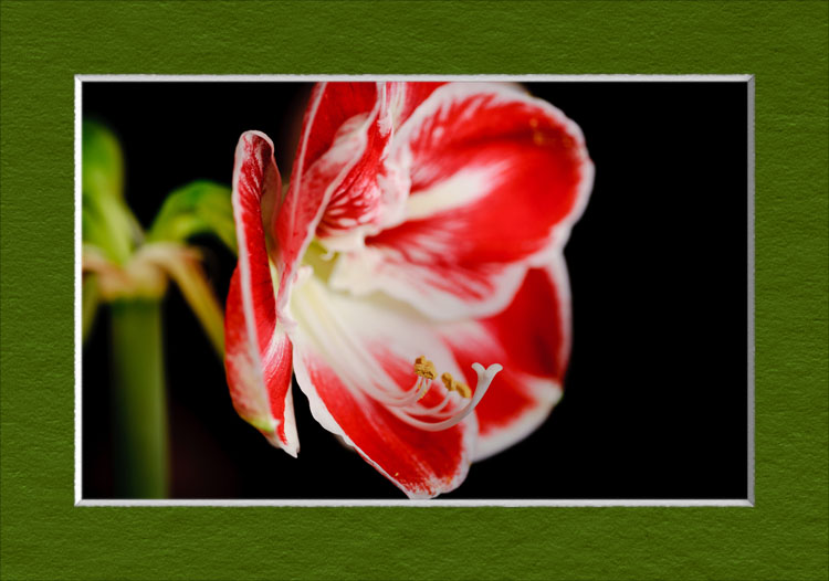
Low-Resolution Example
of a fake-matted photo
This post is a request for ideas from Photoshop-savvy folk, about how to best approach a particular Photoshop issue I'm facing.
So, I'm working on a Photoshop CS5 script to generate photo-realistic fake matting around an image, for when you want to display a print on the wall, but don't want to go to the trouble of having matting custom cut and fitted. Once it's done, I'll join the calendar-template-building script I built long ago, which has been well received over the years.
It's trivial to make a fake-looking fake mat in Photoshop, but it's quite another thing to make a photo-realistic fake mat that fools the eye even upon fairly close inspection. The script I'm working on even goes so far as to take the expected viewer and lighting positions into account for perspective and shading.
The results are great, though I must be clear that you can't tell much from the image above... the proof is in the “printed on good paper with a good printer and displayed in a nice frame” pudding.
Anyway, the problem I've run into is that the process of selecting the color for the mat is not as flexible as I'd like, so I'm wondering whether there's a better way.
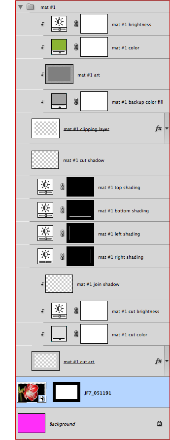
For a simple one-mat, one-cut, one-photo situation, the script makes a 16-layer Photoshop document, as illustrated at right. (The sample document itself can be downloaded here: sample-mat.psd).
After being presented with this document, the user would simply adjust layer #15 to pick a color for the mat, likely plucking one from the photo with the eye-dropper tool. There are many other adjustments the user can make to tweak the look and feel of the mat, but for the most part, only the color needs to be adjusted.
The problem is that layer #15 adjusts only the mat chromaticity, and not its brightness, so to truly pick what humans think of as “color”, you must make a separate brightness/darkness adjustment with layer #16. To make matters worse, that brightness/darkness adjustment layer doesn't allow you to reach the extremes — black or white matting — so that's another problem with the current approach.
Is there a better way?
My goal for the script is to be able to build a Photoshop document that can be color-customized after the fact (e.g. by someone who has downloaded only the Photoshop document, and not the script).
The actual mat texture is in layer #14, and is derived from an actual high-resolution photo of a mat, adjusted to the current document's intended print resolution. It finds itself here as a grayscale of average brightness, but I can build different texture sources if need be.
I can't help but wonder whether there's some combination of blending modes that can do what I want, which is to make subtle adjustments to a base color-adjustment layer based upon whether the mat-photo pixels are brighter or darker than their average. In reading about the various blending modes, I'd think that putting the mat pixels (layer #14) above the color layer (#15) with an “overlay” blending mode would be exactly what I want, but it doesn't work at all, even when I ensure that the mat layer's overall average is exactly 50% gray.
So, if anyone has ideas, I'd love to hear them. Thanks!
Could you make the color a solid color layer in normal mode and layer the texture on top in multiply mode?
Maybe something like this?
https://www.dropbox.com/s/uf1z78gxa9hju54/sample-mat-colorcustomized.psd
ever so slightly different and I like this one a little better (you can still crush your blacks but can no longer blow highights):
https://www.dropbox.com/s/2v2oi1znx59b65h/sample-mat-colorcustomized2.psd
Thanks for these, Eric. The one linked from this comment uses Overlay mode, which doesn’t really give much range, but the one in previous comment using Multiply (as Tony also suggests) really gives a wide range. One could switch between Overlay and Multiply depending on whether a generally-dark or generally-light mat was desired, so that’s not so onerous. This looks promising… —Jeffrey
I can’t help with the problem, but I can tell you how excited I am about this project! I will be able to use this to show my clients what their framed images might look like! Thanks!
Hi !
Maybe ask matt kloskowski ! I’am sure these Photoshop guys have a nice answer (As you so much with Lightroom did 😉 )
FKL
If there is no specific reason for the colour layer + the brightness layer, why not replace them with a single clipped hue/sat layer. As long as the colorised box is ticked, you can change the hue, sat and lightness in a single window without have to toggle between 2 to find the right mix. With the forground colour selected, when adding a hue/sat adjustment layer, when the colourise box is ticked, setting the saturation slider to back to 50 and the lightness to 0, makes it all pretty close to the selected foreground colour.
I hadn’t known about the “colorize” option, and the solution seems really great, except you lose the ability to use the eyedropper to pluck a color from the image. That’s a big deal, to pluck colors and play around with what works. If there were a way to set the adjustment layer’s hue/saturation/brightness via the eyedropper, and change it in real time, it would be perfect. —Jeffrey