I'm trying a new look for my blog....
| OLD: | 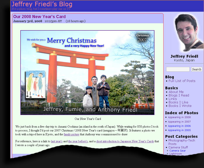 |
| NEW: | 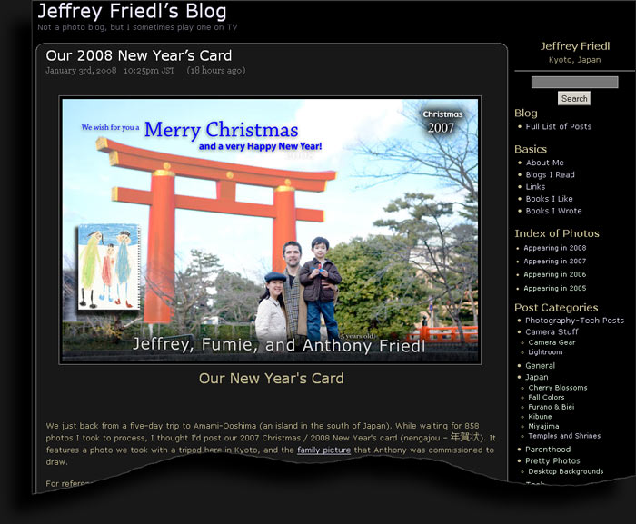 |
It's a look that I hope is more suitable for the photo-heavy content I tend to produce, and lighter and simpler overall.
I've been working on it for the last month or so. Having not really grasped the essential nature of how to use CSS (style sheets) for a long time, my years of content developed a hodge-podge of style markups that changed over time as both my knowledge of CSS and my sense of aesthetics changed.
It was a monumental task to go over all the older posts to try to tidy them up so that they'd at least look okay with the new style. Most were fine, but I had a fair number of specialty posts (like this one) with screenshots that appeared to float above the greenish background I was using at the time, with a drop shadow and all the trimmings. These were not at all amenable to changing the background color, so I had to visit each one and try to fix it the best I could.
The proper solution for these kind of “blend into the background” images is for me to create PNG format images, which allow true transparency. I did this for one of the floating images on a recent post, but it often comes at the high price of a substantially larger image size. That's why I didn't do it for the images on today's post: it would have increased the size of each threefold.
Anyway, I hope you find the new color scheme appealing; it was so much work to change it the first time that I hope to never have to do it again! 😀
I like it but the “view older posts” in bright red on a white background is not pretty
I fully agree it’s not very pretty, but in this case I opted for function over form. It’s easy to miss a “next set of posts” type link at the bottom of a long list (it irks me that I have to hunt for it when I visit others’ blogs), so I wanted something fairly obvious. At least it’s not blinking 🙂 I may try muting the colors a bit…. —Jeffrey
Jeffrey, I like it. Much better.
Mel
I like the new look, but I miss the picture of you, perhaps its time for an updated photo of yourself. I noticed you really like that Burberry muffler, it’s appeared in the last two New Year photos. So maybe you can make a seasonal photo you in with the muffler for winter something else for spring, etc.
I like it better. Normally use an RSS reader – but popped in to look around. I like it – -great work. CSS is f’ing hard !!!
I love it. You’ve really got to admit, there were some fairly odd colors going on in the old design. This one’s great.
I agree with the others — nice upgrade. Unfortunately, I’ve been through the hassle of changing designs on my blog (and having to fix old posts as a result) twice, but my post list was a hell of a lot shorter than yours! Ack!
Yah, Steven, but your posts tend to be much more visually complex than mine, so I can imagine that not having used CSS “properly” from the start made changes challenging, to say the least. Of course, your blog is among
those that I follow, and as it happens, your most recent post reminded me of
one of my own on the same subject from 14 years ago. 🙂 —Jeffrey
Much easier for me to read! CSS Can be a bear — especially if you didn’t start out quite right with it. Glad you’ve gotten it taken care of since this is much easier to read. It also accents your photos which really deserve the attention.
I like it, I think the black background makes it more consistent with Lightroom, one of your many posting subjects.
Thanks for the plugin and other Lightroom work, things like that build momentum in the community and hopefully will encourage some Develop plugins from vendors (i.e. sharpening!!!)
Actually, I miss the Jeffrey-face. If you don’t have a current photo , since you’re almost always on the OTHER side of the lens, I’d be more then happy to PhotoShop the photo you used before to bring it up to an accurate representation. Well, maybe I wouldn’t actually need PhotoShop. Just a black marker…
-your ever so helpful sister.
You have nice stories and photos here. They appear better than in the old theme.
In the page footer is a link to “Jeffrey Friedl’s Blog” which leads to a htpp:// protocol. My current browser is unable to follow it.
Oops, thanks, fixed. —Jeffrey
Hi Jeffrey,
I’ve updated my blog’s look too! In fact, I switched everything over to wordpress and created my own template… took the whole day, but I love wordpress compared to the single file CMS I was using. Anyway, do have a look. Hopefully now it will be easier to post to. I wish I could ask how you handle your images (sizes, uploading) but I dont see an email link anywhere.
Yeah, I noticed the new look earlier in the day — very nice. I like the colors a lot… it’s even more clean and easy-to-read than mine. Hmmm…..
One suggestion on the layout, though, would be to remove the huge left paddings (e.g. 270px on #header) and center the content on the page. As it is now, the right column of your blog gets cut off unless I widen my browser window really wide. I’d rather have the blank space be cut off than the content 🙂
My email address is on my “About Me” page, but you’re the second person to ask about my workflow in as many days, so I’ve gone ahead and written a post describing my photo and blog-writing workflow —Jeffrey
Great suggestion, and thanks for your hard work writing the 3-hour workflow post 🙂 Going to read it now.
I didn’t know that your blog had another look before. I also prefer the new one!