low quality jpeg compression, exaggerated
Introduction
My Tech-Related Photography Posts
- My Lightroom-to-iPad Workflow
- Lightroom Goodies (lots of plugins)
- Digital Image Color Spaces
- Online Exif (Image Data) Viewer
- Jeffrey's Autofocus Test Chart
- Photoshop Calendar-Template-Building Script
- How to Prepare Photos for an iPad
- A Qualitative Analysis of NEF Compression
- Tripod Stability Tests
more...
One of the first things a photographer learns about image formats is that JPEG image compression is “lossy”, meaning that the smaller file produced by greater compression comes at the cost of lower image quality. How much lower — whether low enough to “matter” — depends on the situation. JPEG compression can be remarkably effective at reducing the size of the image, so despite the lowering costs of storage space and bandwidth, the reduced size is still very appealing: storing essentially the same image in one fifth the file size, for example, means uploading five times faster.
The compression setting is usually controlled in camera with a “basic / standard / high” quality setting, each using progressively less compression. Most image-processing applications, though, use a “0-100 quality” or “0% - 100% quality” sliding scale, and Adobe Lightroom Classic is no exception:
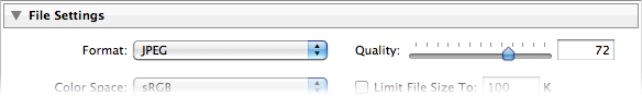
JPEG Quality Setting in the Lightroom Export Dialog
It's easy to figure out that that “Quality: 0” is less quality than “Quality: 100”, but what does it really mean? The JPEG standard is full of complex math that I don't understand, and I suspect you don't either, so it's not exactly intuitive what these “quality settings” (“quality percents?”) really mean. This barrier to understanding is exacerbated by the fact that different applications tend to implement the settings in different ways, so “quality 73” means one thing in one app and another in another.
Adding to the confusion for Lightroom users is the fact that Lightroom's JPEG quality setting is unique: it's different from every other photo-processing app I know, including other Adobe products. “Quality 73” in Lightroom, for example, is not the same as “Quality 73” in Photoshop or any other app that I know of.
Table of Contents
For the rest of this post:
- Lightroom's Two “JPEG Quality” Surprises
- An Example (Sunset and Bird)
- Quality-Inspector Features
- A Totally Different Example (Reed Window Screens)
- Example (Dandelion)
- Example (Bridge)
- Example (Mountainside Buildings)
- Example (Boat at Sunrise)
- Example (Moss and Dandelion Seed)
- Example (Old Wooden Siding)
- About These Examples
- Conclusions
- Additional Resources
- Thanks
Lightroom's Two “JPEG Quality” Surprises
I've been working with digital images for a long time, and have dug around in some aspects to a fairly deep degree (particularly color spaces, raw compression, and white balance), but was surprised by Lightroom's JPEG-quality settings in two respects:
“0 quality” is not zero — With some photos, you get pretty good results even at Lightroom quality 0, more than good enough for web thumbnail use, for example, where the substantial savings in size (often more than a 90% savings!) make the slight tradeoff worth it. “Quality 0” in Lightroom might be roughly comparable to “Quality 50” in many non-Adobe apps.
We'll see some compelling examples below.
“0-100” is really “0-12” — Lightroom maps the 101 points in its 0-100 quality scale to only 13 different quality outputs. Setting the Lightroom quality to 70, for example, results in the exact same output as setting it to 76, or anything in between. 7 is the same as zero, and 93 is the same as 100. The full mappings are shown in the examples below.
Those familiar with Photoshop will recognize 13 as the number of quality settings in Photoshop's Save-as-JPEG option (with 0 being “Low quality”, up through 12 being “Maximum Quality”). I haven't tested whether these are indeed the same except for the numeric scale presented to the user, but I suspect they are.
(For those wondering, Lightroom does not match Photoshop's “Save for the Web” 0-100 scale, either: with “Save for the Web”, a quality of 70 produces a result that is actually different than that produced with a quality of 76, so it can't be the same as Lightroom, where 70 and 76 are identical.)
An Example
Let's look at an example, a lightened version of the shot from this sunset post last month...
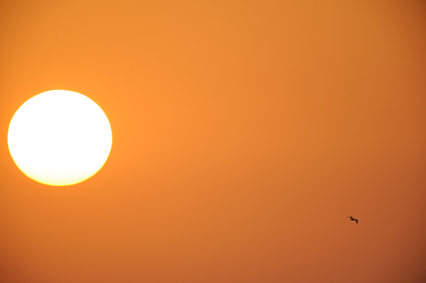
Nikon D700 + Sigma “Bigma” 50-500mm OS @ 1000 mm — 1/1000 sec, f/13, ISO 1250 — full exif & map — nearby photos
Sunset and Bird
In the javascript-powered tool in the gray box below, you can see a full-resolution “actual pixels” crop from the photo created at various export qualities. Initially it shows the highly-poserized “Lightroom quality 0” version, but if you mouse over the buttons at the bottom, other versions load, all the way up the scale to “Lightroom quality 100” (the “93〜100” button)....
As you sweep the mouse over the buttons from left to right, there's an initial dramatic increase in visual quality at relatively small costs in increased file sizes, but these trends quickly reverse so that toward the higher-quality end of the scale, there's little to no improvement in visual quality as the file size explodes by leaps and bounds.
To my eye at a glance the 70〜76 quality is just fine, but if I really look carefully with a critical eye, tipping my laptop LCD screen at an angle, I see uneven gradients even in the lossless version. This might well reflect that the sunset sky was not perfectly smooth(!), but the pixel-peeper in me wonders whether this smooth-gradient challenge was too much even for the basic technology of the camera image sensor.
Quality-Inspector Features
In visually comparing one quality level to another, it's very helpful to swap back and forth quickly between the two samples, as it hyper-highlights differences, revealing details of the difference that one would never otherwise notice. While this is useful, it's important to maintain a sense of perspective about what viewers will eventually see and actually notice on their own. Don't let yourself get carried away by raw pixel-peeping alone.
Comparing quality levels:
Comparing adjacent quality levels — Comparing adjacent quality levels is as simple as panning the mouse back and forth between the adjacent quality buttons.
Comparing a quality level versus perfect — Bringing the mouse just below a button reverts the display to the “lossless” perfect-quality version, so sweeping the mouse up and down into the button then below it toggles between the view for that button and the perfect-quality version.
Comparing any two quality levels — Selecting the small circular checkbox below a quality button makes that button the one reverted to when the mouse is brought under a button, so you can select the checkbox for one quality, then move to the button for the other and pan up and down to toggle between the views.
Again, I'd like to suggest keeping this pixel-peeping in perspective. It's easy to let yourself get carried away to the point that you start to find fault where there's not, or finding importance in some minor fault that won't at all be apparent to your intended audience.
A Totally Different Example
Let's look at a photo with very different compression results. Here's an image of some reed shades hanging in front of the window of an old house near my place in Kyoto (the same window seen in this post from last year). It's a fairly boring shot, but I'd thought it might make for an interesting desktop background photo.

Nikon D700 + Voigtländer 125mm f/2.5 — 1/400 sec, f/8, ISO 3200 — full exif & map — nearby photos
Reed Window Shades
This scene has a lot fine detail in the many thin reeds making up the window shades, so you'd be forgiven if your first instinct would be that this image would require high JPEG quality for acceptable results with all that detail, but it's just the opposite: there's almost no difference in appearance between the “Lightroom quality 0” setting and lossless (perfect quality) TIFF output, but the file size difference is remarkable: the TIFF, even when compressed (with lossless ZIP compression) is still more than 15 times larger, while an uncompressed 16-bit TIFF is more than 50 times larger(!)
Again, here are full-resolution “actual-pixel” crops...
As you sweep the mouse over the buttons from left to right, the file size increases considerably as the “quality” goes up, especially in the last few steps where again the size explodes by leaps and bounds, but you really don't seem to get additional visual quality for the extra bytes. Overall, there really doesn't seem to be much difference at all over the entire range, from the the 174k-byte lowest-quality JPEG version to 1.4 megabytes for the highest-quality JPEG version, except perhaps some halos in the low-quality version near the vertical string lines tying the reeds together, but these are gone by the time you get to the next quality level.
Plenty of other differences make themselves known when quickly toggling between views, but in a static view they're mostly lost among the many details of the photo, and I suspect that when presented with the perfect version and the second-to-the-lowest quality version, only those with a trained eye would be able to pick which was which.
The difference from the first example is stunning, and relates to what visual changes human are sensitive to: we pick up on imperfections in a continuous tone much more readily than slight changes in varied detail. The JPEG compression algorithm is built around this difference, trying to preserve quality in these smooth gradient areas, but as well as it does, a photo like the sunset presents a daunting challenge.
The lack of detail in the sunset example is reflected in all versions by a drastically-decreased file size compared to the reed-shade example.... the sunset's smooth gradients compress well, so all quality levels compress much more than their highly-detailed counterparts in the reed-shade example: for the same size result, the lowest-quality versions come in at 34k and 174k respectively, while the highest-quality versions weigh in at 445k and 1.4 megabytes.
One thing I find interesting (but don't understand) is that in the first example, the difference in file size between the 47〜53 quality and 54〜61 quality is considerable (49k to 66k bytes), while in the second example, the the same two levels of quality produces essentially the same file size. There seems to be some kind of switch in compression algorithm once Lightroom is at a quality setting of 54 or above that puts the emphasis on encoding the easily-discernible smooth gradients of the sunset example, and if they are lacking in the image, as with the reed-window-shade example, the attempt at extra quality fails, and the file size does not increase. That's my guess, but it's just a guess.
Let's look at an example mixed with lots of detail and various areas of smoothness...
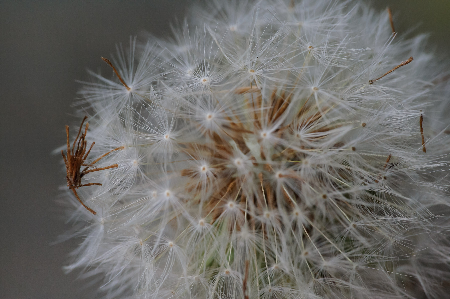
Nikon D700 + Voigtländer 125mm f/2.5 — 1/400 sec, f/8, ISO 5000 — full exif & map — nearby photos
Messy Dandelion
from the outing that produced this post in May
The areas of fine detail seem to firm up at about the 39〜46 quality level, and the areas of smoothness seem fine there too, but the pixel-peeper in me might want to bump up the quality setting a few levels so that quick toggling reveals less fluctuation in the background.
Five more examples follow, of various types, for your pixel-peeping, compression-understanding enjoyment...
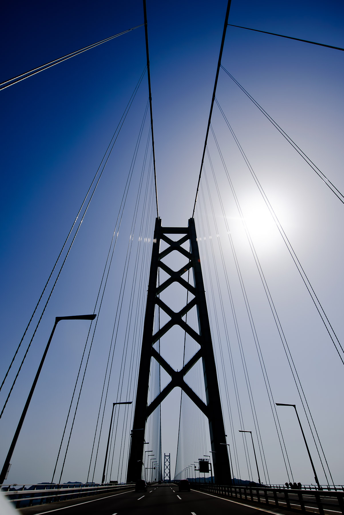
Nikon D700 + Nikkor 14-24mm f/2.8 @ 14 mm — 1/4000 sec, f/5.6, ISO 200 — full exif & map — nearby photos
Uber Challenging
detailed lines and smooth gradients, from this post on the longest suspension bridge in the world
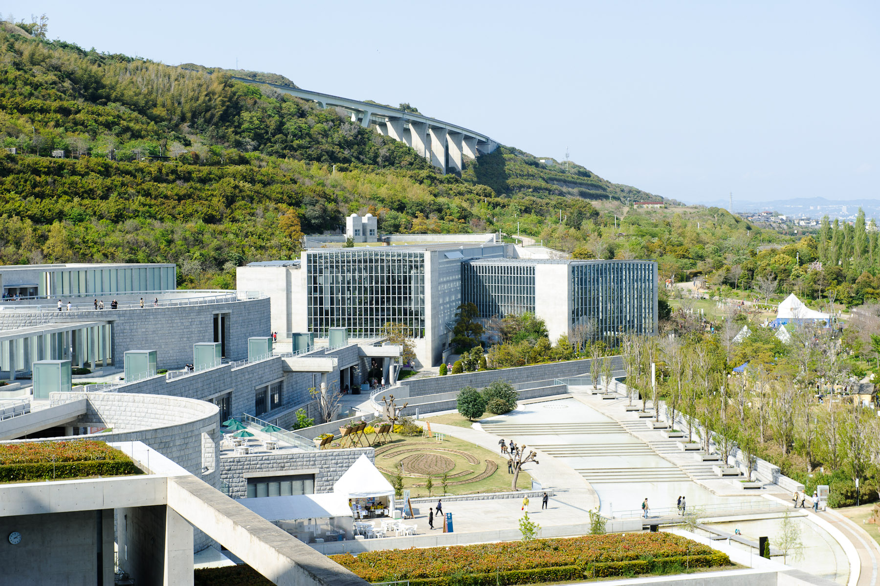
Nikon D700 + Nikkor 24-70mm f/2.8 @ 70 mm — 1/320 sec, f/9, ISO 200 — full exif & map — nearby photos
Boring, but Common
from our room when we stayed at the Westin on Awaji Island
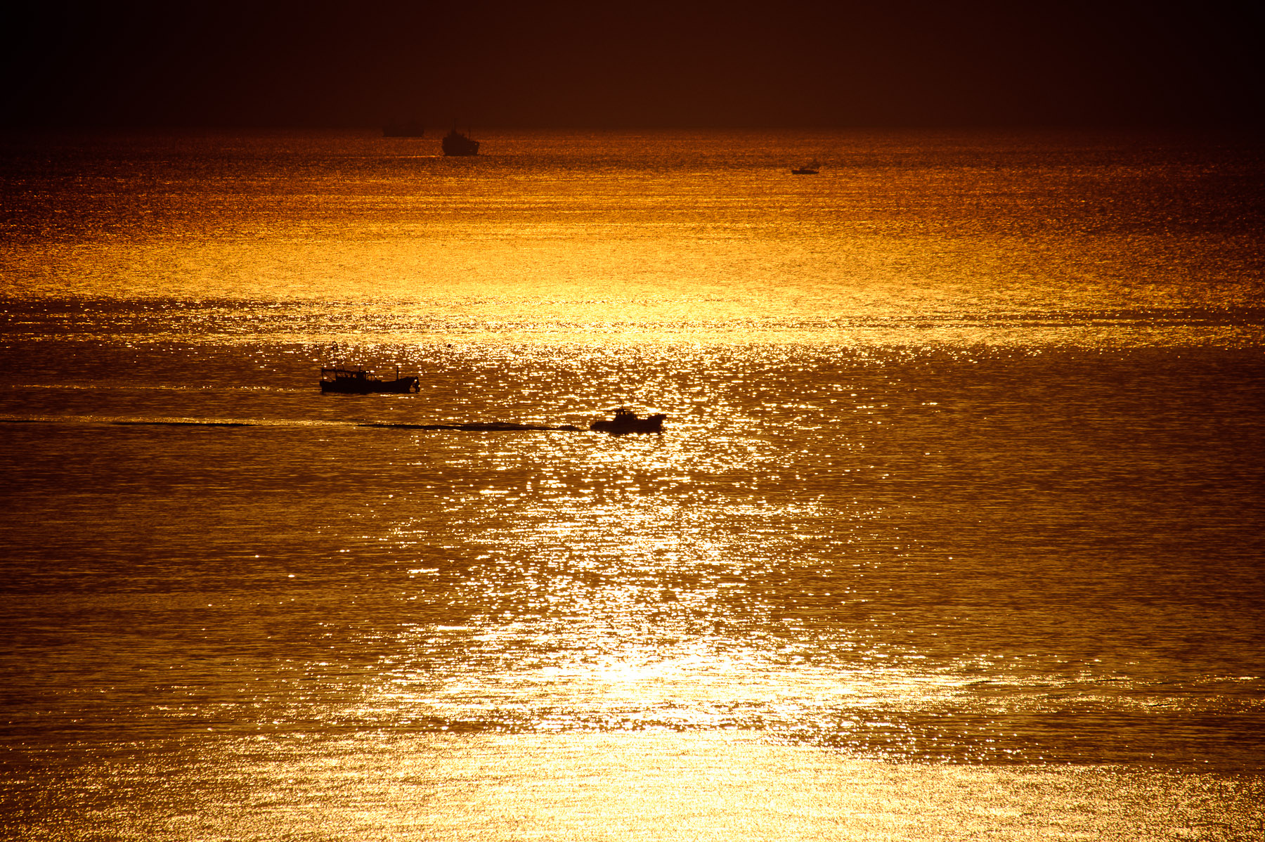
Nikon D700 + Sigma “Bigma” 50-500mm OS @ 500 mm — 1/8000 sec, f/6.3, ISO 200 — full exif & map — nearby photos
Lots of Nondescript Detail
a darker version of this photo
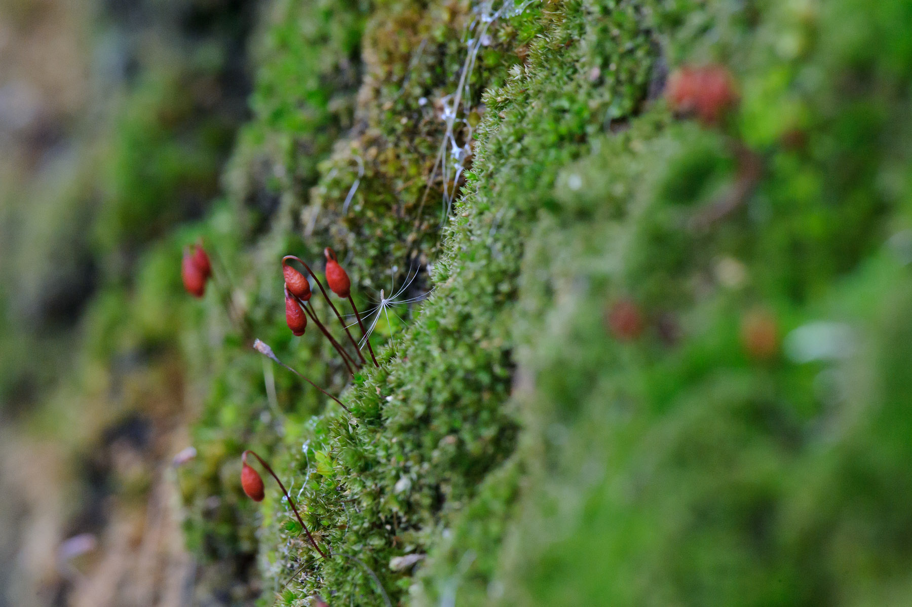
Nikon D700 + Voigtländer 125mm f/2.5 — 1/160 sec, f/8, ISO 5000 — full exif & map — nearby photos
Dandelion Seed and Moss
the same scene as this photo, but at f/8 instead of f/2.5

Nikon D700 + Voigtländer 125mm f/2.5 — 1/320 sec, f/8, ISO 5000 — full exif & map — nearby photos
Old Wooden Siding
Right next to the reed-shaded window of the second example photo
Conclusions
First of all, you can't directly compare Lightroom's JPEG quality settings with any other application. The settings may well map directly to Photoshop's save-as-JPEG 0〜12 scale, and they may well partially map to Photoshop's “Save for the Web” settings, but all bets are off when it comes to the JPEG quality setting on non-Adobe applications. They're just totally unrelated to how Adobe does it. (I should make it clear that the difference is neither good nor bad; I've presented nothing here about how any other application creates JPEGs, so there are no conclusions to draw about which might be better or worse than Lightroom; the important point is to recognize that the scales, even if sharing the same “0〜100” labels, are absolutely completely unrelated.)
The Lightroom default JPEG export quality of 75, falling in the 70〜76 range, seems to provide for as good a visible result as the highest quality setting for all the samples except for the bridge, which seems to suffer at least slight posterization banding at all levels, including even “lossless TIFF”. The file size, even at this relatively high 70〜76 setting, is still about one third that of the 93〜100 setting, so is well worth it in most situations. Those who blindly use the maximum setting for their exports likely waste a lot of local disk space, upload bandwidth, and remote storage space. But conversely, those who blindly use some lesser setting risk posterization in the occasional photo with an unlucky sky gradient.
Overall, my recommendation is to understand the situation, allowing you to avoid acting blindly.
About These Examples
To produce these examples, I used a plugin for Adobe Lightroom to export each photo at Lightroom's 13 different JPEG quality settings, and also as a losslessly-compressed TIFF, at a reduced size of 1518×1010 (down from my Nikon D700's native raw resolution of 4256×2832),* with medium screen sharpening and minimum embedded metadata. These are the versions used for the file-size graphs.
These image files have some extra stuff added by Lightroom — a few metadata items, an embedded thumbnail image, and an embedded sRGB color profile — that is the same regardless of the quality setting, so one school of thought would have me remove them before creating the file-size graphs, to isolate just the quality-related differences among the files. However, I thought it best to leave them there to keep these examples realistic, since since Lightroom will leave them there you export.
The crops you actually see in this post were exported similarly, then converted to losslessly-compressed PNG images for the presentation on this web page.
(Presenting the compressed JPEGs directly would have been problematic because a common browser, Firefox, does not handle display of JPEGs very well, sometimes introducing horrible posterization that does not actually exist in the image.)
This kind of reduced-size test is appropriate for many cases, but less so when you are considering exporting JPEGs for archive, or large JPEGs for print. To address this area, I've created the same eight samples as above, but without any image-size reduction, and without any additional export sharpening. This current web page is already a bit heavy, image wise, so I've placed the full-resolution images on a separate page, here.
Additional Resources
JPEG Export Quality Tester plugin for Lightroom
I created a plugin to quickly generate JPEG copies at all quality settings, my JPEG Export Quality Tester Lightroom Plugin. You can use it for your own testing. It's one of the 20+ wide-ranging Lightroom plugins I've published on my Lightroom Goodies page.
Full-Resolution Examples
As I wrote in About These Examples above, I have created full-native-resolution copies of all these tests. They are available here: Lightroom JPEG Export-Quality Settings, Full-Resolution Examples.
Lots of Lightroom Goodies
I've got 20+ plugins for Lightroom, as well as other writeups and tools, on my Lightroom Goodies page.
Other Digital-Image / Photography Tech Writeups
All kinds of stuff at my Photography Tech page.
Thanks
Thanks to Adobe for making a wonderful photo-workflow program, Marc Liyanage for his CoreImageTool command that allowed me to automate the post-Lightroom conversion to PNG for the 224 sample-crop images, Google for their very useful Chart API that generates and serves the filesize-graph images on the fly, and to the hundreds of people in my mail/comment queue that I have not responded to in the last few days, for your patience as I yet again let myself get sucked into another damn-fool project of my own devise.
| * | The bridge photo was actually a bit smaller than the others to begin with because it required a fair amount of rotation to bring the bridge towers to vertical; I'd taken the picture with one hand while holding the camera out the window of the car, and was concentrating on driving and on not dropping the camera more than on the finer details of composition. |
Hi,
Thanks a lot for the effort.
I always exported at 100% just to avoid any “unnecessary” quality loss. Thanks to your very helpful post I can now save a lot of space and feel confident about it.
This is an absolutely brilliant explanation of the quality settings.
Thanks.
Thank you very much, Jeffrey, for the detailled analysis … and Happy New Year 2016 !
Jeffrey, This was extremely helpful. I always struggle with this and never really understood what was going on. Thanks so much for the information, and for the plugin. Just trying it out now for Zenfolio.
I am concerned about applying your teaching to images I am sending to a higher grade photobook company. Wouldn’t the lower JPEG size show in an 6×9 print?
Thanx
It depends on what you mean by “lower” (how low?), the content, and the kind of print. If it’s a one-time upload for a printed book, I personally would rather upload in a non-compressed format, or indeed upload at a really high quality. 90% or 100% are probably overkill, but I’d rather be safe than sorry. —Jeffrey
Great informative website. Like really great , like i usually do not comment on any websites, but i made an exception just for you:P
Thanks for the very prompt response. I think I’d rather be safe than sorry when paying for a $90 book.
Herb
I have found the jpeg quality settings in Lightroom and Photoshop to be quite confusing. Now, after reading your article, I have a much better understanding of why. I would have found it difficult to recreate all the comparisons that you have made and very much appreciate your time and efforts in providing this information.
I gather from the article, if you were exporting jpeg for high quality or fine art prints, you would personally use the highest setting or close to it. Is that correct?
Thanks again and happy photo trails!
Yes, for one-time exports, I go ahead and use the highest quality settings that they’ll accept… 16-bit TIFFs if possible, but JPEG at 100% quality otherwise. It’s likely gross overkill, but for a one-time export where quality is the only concern, overkill is better than underkill. —Jeffrey
Jeff, I would love to see you investigate the claims of JPEGmini Pro to see how it stacks up.
https://photographylife.com/jpegmini-software-clarifications
I think this could drive a lot of traffic to your site because there are plenty of photographers who want to know more.
The license one must agree to to use JPEGmini expressly prohibits talking about how it performs. I find that utterly abhorrent, and it certainly calls into question the veracity of their claims. —Jeffrey
Hi Jeffrey
I’m from the UK. Searched out your article as I am using Lightroom and Canons image Garden and Adobe Photoshop Elements 14. I noticed that even if I set the highest quality jpg export on lightroom and increase the DPI as well I still get a much lower quality jpg than from image garden orAdobe Elements 14. Any ideas why??
It’s hard to guess from this limited information, but perhaps the pixel size of the final output is too small? The DPI value is irrelevant unless you’re setting the output width and height in inches or centimeters; the DPI value is combined with those lengths to come up with the final output size in pixels. Also, in the “file settings” section, make sure to not use the “limit file size…” option, as that’ll lower the JPEG quality at least as far as needed to get the final file to fit. —Jeffrey
From the Chicago suburbs and a retired technical writer who has an in – depth appreciation for excellent explanations of just about anything – damn fine job, Jeffrey. In a word, brilliant.
Writing from Tokyo. You say “As you sweep over the buttons from left to right…”, but on my computer, the buttons are displayed *vertically* far below the photo, so I can’t see the photo when I mouse over, making the buttons pretty much worthless to me. Does anyone else have this problem with your webpage?
Hi,
I’m from Italy.
Interesting article, good job.
Exporting to JPG from Lightroom, it asks also the DPI value. Did you try changing that value?
If I keep the same lenght and width of the original RAW file, how the DPI value affect the quality of the JPG file?
Thank you.
The DPI value has no impact on anything except when you give the width/height values in CM or inches, in which case the DPI value is used to compute the actual width/height in pixels. If you give the width/height values in pixels, DPI is ignored. —Jeffrey
This damn fool project of yours is a damn excellent one. Thank you for all the time you put into this must-read article.
Jeffrey – I just wanted to say “Thank You” for sharing these findings. The examples you have used really helped me to decide on a useful compromise between image size and quality. I guess it is time for me to register another Friedl plugin 🙂
Great article thanks!! After reading and some testing I can really save export file size. For on screen viewing (even 32″ screen) export as Long Edge 3200, quality 50%, and 200 ppi. I can’t tell difference on full screen between this and 100%. Nikon D800e file goes from 27.8 MB per pic to less than 1 MB. Probably wouldn’t print from this however. Thanks again for all your work! Cheers.
Fantastically informative and thorough post! Slightly OT, but I was linked here by a helpful guy on Digital Photography Review regarding a question I had about the digitization of some of my old negatives. Various websites offer to produce them as either JPGs or TIFFs, which in the latter case would appear to as much as double the price per frame.
I plan to adjust the images once I have them, so TIFs would make sense from that POV. However, I am wondering, since I can readily save from JPG to TIF and retain the same pixel values, whether there would be any point in requesting the pricier TIFs from the company in the first place. I’m guessing the pixel values would not differ between the file formats as they supply them to me?
Thanks 🙂
You’d have to ask them to be sure, but one would imagine that the reason they offer pricier TIFFs is that there is some value add, such as more bits per pixel, or lossless compression. Why not send a small representative sample and have each done both ways, then compare? The difference may end up being merely how clearly you can see the grain. —Jeffrey
Hi Jeffrey. Thanks a lot for this great article. I was lucky to read it months ago and I encountered it again.
I’d like to ask something however. I understand that to an extent it a personal choice, but when it comes to exporting a large amount of personal photos for storage (for example, over 5000 pictures mostly taken with 13 MP full frame DSLR), what quality increment would you recommend using or would otherwise use yourself in a similar situation? Perhaps some pictures will be printed for personal use, but almost all will only remain digital. Regarding resolution, I would think that keeping them in native resolution would not be too much (although I was initially downsizing to 2048 px long side)? Thanks.
I backup the original files and the Lightroom catalog (via Crashplan). It takes quite a while to get the initial backup done, of course. If you want to backup JPEG copies, then yes it depends on what it’s for, but if you want to allow for most any use, full-res at a quality setting of 80 seems a good compromise. —Jeffrey
This was incredibly valuable and well researched information. Thank you so much! Still relevant 7 years later.
Hi,
thank you very much for sharing this. It was really helpful for me to decide which quality settings to take for further exports. Until now I always exported my JPGs with 100…
Greetings from Germany
Thomas
Thank you for a great article, especially comparing LR to AP. I switched from AP to LR this year and have noticed a difference in the exported mb size. I have years of photos taken with a beginners dslr. They are all jpeg images because I was pretty much terrified of RAW. The whole editing, etc scared me to death. Fast forward several years and I now have an upgraded camera which I am learning to use it to it’s capacity. Knowing that the compression of the RAW files is to be expected on export, relieves a lot of anxiety. The one question I have not found an answer to is this: When I’ve imported a jpeg image, edited it in LR, then exported it for printing – the file size is usually half of the original jpeg after export. There are no “resize” or constraining blocks checked. Does LR automatically “re-compress” an existing jpeg? I’m worried that I’m loosing image quality if it does. Thanks for your time!
Yes, by necessity, Lightroom is recomposing the pixels, based on your edits/settings. It’ll also not include a fair about of metadata in the original, so the result can be smaller, but the biggest impact is the JPEG quality setting. If you set it to 100 in Lightroom, you’ll likely get a much larger file than the original, but no better quality. If you set it to 50, you’ll have a much smaller file, and lower quality. For printing the file size doesn’t really matter, so I use a high setting, but for most other uses, I’ll use Lightroom’s default of about 75, which seems to maintain quality but keep file sizes reasonable. —Jeffrey
Hey, thank you for such a useful tool and analysis of the different qualities, it must’ve been lots of work but it’s appreciated. very helpful, and it’ll save me some disk space!!
I wish there were more options in the export like turning subsampling on and off but hey ho.
Very clear and informative article- thanks very much for your time on this ever perplexing issue. One question for you. Would you have any recommendations for what settings we can use to “limit” the size our clients can print. With high res digital files I’d rather have them come back to me for large format prints like canvases etc. The largest they could print would be 11×14.
This “limit” you speak of is a perceptual/quality one, so it’s something you’d have to decide for yourself. Pixel dimensions, of course, influence the acceptability of larger print sizes the most, but the JPEG quality setting and how much sharpness is used in the export also play a role. I’d think that you just need to do a bunch of tests with a bunch of different photos at different settings, to come up with a set of settings that always gives acceptable quality at the size you advertise that they should be able to print at, but usually doesn’t give acceptable quality at larger sizes. —Jeffrey
Hi, This article was published almost 9 years ago. I am wondering how relevant it still is given the multiple changes Lightroom has gone through since then, if it is relevant at all. Has anyone done a more recent comparison?
Michael, Australia
I know that Adobe changed the JPEG-generation engine at one point, so overall it’s more efficient. There might be some slight differences in the relative settings, but for practical purposes, this article still applies. —Jeffrey
The best article I’ve ever read about JPEG compression. Thank-you
Aside from file size, is the 75ish range ideal for instagram to avoid compression or does it not matter in that scenario? I see 72-76 recommended often, but without a good explanation.
I imagine that any photo-hosting service will rebuild photos for their specific display needs, so I don’t think you can avoid having the photo recompressed. I think the explanation is a general “you pay a high filesize price without getting much extra quality”. That being said, it’s my understanding that Instagram is generally a low-frequency thing, so folks using it may not care at all about the file size…. —Jeffrey
Amazing article and the best technical (NOT subjective) analysis I’ve ever seen on the subject. Really a great job in every respect. I’m so glad I found this page — I learned a LOT. Thanks for all the hard work you put into this.
Hi, any idea what will be the default equivalent quality value applied in Lightroom Mobile?
I’m not at all familiar with Lightroom Mobile, but I imagine that they all need the same render engine, so one imagines(?) that the export engine is also the same? I don’t know. —Jeffrey
Just wanted to say thanks for this amazing analysis, and (maybe more amazing) comparison tools! After a decade or so of shooting, all my raw files are adding up and finally going through the process of compressing older portions of my archive. This saved me a lot of time and put some of my compression fears to rest! (also using your folder structure publishing LR plug in to reconcile older libraries from different computers, HUGE helps). Howdy from Texas 2021!
Thank you for doing this. There are so many website blogs out there that make statements about what quality a JPEG file should be. Others also comment about about how it depends on the situation. Etc. All of them are fairly accurate in what they say. But, you’ve gone and done the “Picture is worth a thousand words.” So by my calculations, you’ve written a book of information on this single page. Thanks again.