low quality jpeg compression, exaggerated
Introduction
My Tech-Related Photography Posts
- My Lightroom-to-iPad Workflow
- Lightroom Goodies (lots of plugins)
- Digital Image Color Spaces
- Online Exif (Image Data) Viewer
- Jeffrey's Autofocus Test Chart
- Photoshop Calendar-Template-Building Script
- How to Prepare Photos for an iPad
- A Qualitative Analysis of NEF Compression
- Tripod Stability Tests
more...
One of the first things a photographer learns about image formats is that JPEG image compression is “lossy”, meaning that the smaller file produced by greater compression comes at the cost of lower image quality. How much lower — whether low enough to “matter” — depends on the situation. JPEG compression can be remarkably effective at reducing the size of the image, so despite the lowering costs of storage space and bandwidth, the reduced size is still very appealing: storing essentially the same image in one fifth the file size, for example, means uploading five times faster.
The compression setting is usually controlled in camera with a “basic / standard / high” quality setting, each using progressively less compression. Most image-processing applications, though, use a “0-100 quality” or “0% - 100% quality” sliding scale, and Adobe Lightroom Classic is no exception:
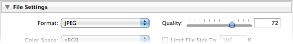
JPEG Quality Setting in the Lightroom Export Dialog
It's easy to figure out that that “Quality: 0” is less quality than “Quality: 100”, but what does it really mean? The JPEG standard is full of complex math that I don't understand, and I suspect you don't either, so it's not exactly intuitive what these “quality settings” (“quality percents?”) really mean. This barrier to understanding is exacerbated by the fact that different applications tend to implement the settings in different ways, so “quality 73” means one thing in one app and another in another.
Adding to the confusion for Lightroom users is the fact that Lightroom's JPEG quality setting is unique: it's different from every other photo-processing app I know, including other Adobe products. “Quality 73” in Lightroom, for example, is not the same as “Quality 73” in Photoshop or any other app that I know of.
Table of Contents
For the rest of this post:
- Lightroom's Two “JPEG Quality” Surprises
- An Example (Sunset and Bird)
- Quality-Inspector Features
- A Totally Different Example (Reed Window Screens)
- Example (Dandelion)
- Example (Bridge)
- Example (Mountainside Buildings)
- Example (Boat at Sunrise)
- Example (Moss and Dandelion Seed)
- Example (Old Wooden Siding)
- About These Examples
- Conclusions
- Additional Resources
- Thanks
Lightroom's Two “JPEG Quality” Surprises
I've been working with digital images for a long time, and have dug around in some aspects to a fairly deep degree (particularly color spaces, raw compression, and white balance), but was surprised by Lightroom's JPEG-quality settings in two respects:
“0 quality” is not zero — With some photos, you get pretty good results even at Lightroom quality 0, more than good enough for web thumbnail use, for example, where the substantial savings in size (often more than a 90% savings!) make the slight tradeoff worth it. “Quality 0” in Lightroom might be roughly comparable to “Quality 50” in many non-Adobe apps.
We'll see some compelling examples below.
“0-100” is really “0-12” — Lightroom maps the 101 points in its 0-100 quality scale to only 13 different quality outputs. Setting the Lightroom quality to 70, for example, results in the exact same output as setting it to 76, or anything in between. 7 is the same as zero, and 93 is the same as 100. The full mappings are shown in the examples below.
Those familiar with Photoshop will recognize 13 as the number of quality settings in Photoshop's Save-as-JPEG option (with 0 being “Low quality”, up through 12 being “Maximum Quality”). I haven't tested whether these are indeed the same except for the numeric scale presented to the user, but I suspect they are.
(For those wondering, Lightroom does not match Photoshop's “Save for the Web” 0-100 scale, either: with “Save for the Web”, a quality of 70 produces a result that is actually different than that produced with a quality of 76, so it can't be the same as Lightroom, where 70 and 76 are identical.)
An Example
Let's look at an example, a lightened version of the shot from this sunset post last month...
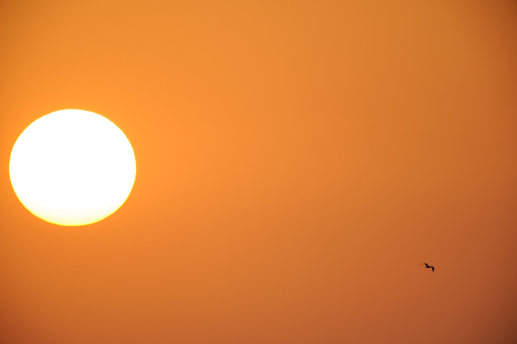
Nikon D700 + Sigma “Bigma” 50-500mm OS @ 1000 mm — 1/1000 sec, f/13, ISO 1250 — full exif & map — nearby photos
Sunset and Bird
In the javascript-powered tool in the gray box below, you can see a full-resolution “actual pixels” crop from the photo created at various export qualities. Initially it shows the highly-poserized “Lightroom quality 0” version, but if you mouse over the buttons at the bottom, other versions load, all the way up the scale to “Lightroom quality 100” (the “93〜100” button)....
As you sweep the mouse over the buttons from left to right, there's an initial dramatic increase in visual quality at relatively small costs in increased file sizes, but these trends quickly reverse so that toward the higher-quality end of the scale, there's little to no improvement in visual quality as the file size explodes by leaps and bounds.
To my eye at a glance the 70〜76 quality is just fine, but if I really look carefully with a critical eye, tipping my laptop LCD screen at an angle, I see uneven gradients even in the lossless version. This might well reflect that the sunset sky was not perfectly smooth(!), but the pixel-peeper in me wonders whether this smooth-gradient challenge was too much even for the basic technology of the camera image sensor.
Quality-Inspector Features
In visually comparing one quality level to another, it's very helpful to swap back and forth quickly between the two samples, as it hyper-highlights differences, revealing details of the difference that one would never otherwise notice. While this is useful, it's important to maintain a sense of perspective about what viewers will eventually see and actually notice on their own. Don't let yourself get carried away by raw pixel-peeping alone.
Comparing quality levels:
Comparing adjacent quality levels — Comparing adjacent quality levels is as simple as panning the mouse back and forth between the adjacent quality buttons.
Comparing a quality level versus perfect — Bringing the mouse just below a button reverts the display to the “lossless” perfect-quality version, so sweeping the mouse up and down into the button then below it toggles between the view for that button and the perfect-quality version.
Comparing any two quality levels — Selecting the small circular checkbox below a quality button makes that button the one reverted to when the mouse is brought under a button, so you can select the checkbox for one quality, then move to the button for the other and pan up and down to toggle between the views.
Again, I'd like to suggest keeping this pixel-peeping in perspective. It's easy to let yourself get carried away to the point that you start to find fault where there's not, or finding importance in some minor fault that won't at all be apparent to your intended audience.
A Totally Different Example
Let's look at a photo with very different compression results. Here's an image of some reed shades hanging in front of the window of an old house near my place in Kyoto (the same window seen in this post from last year). It's a fairly boring shot, but I'd thought it might make for an interesting desktop background photo.

Nikon D700 + Voigtländer 125mm f/2.5 — 1/400 sec, f/8, ISO 3200 — full exif & map — nearby photos
Reed Window Shades
This scene has a lot fine detail in the many thin reeds making up the window shades, so you'd be forgiven if your first instinct would be that this image would require high JPEG quality for acceptable results with all that detail, but it's just the opposite: there's almost no difference in appearance between the “Lightroom quality 0” setting and lossless (perfect quality) TIFF output, but the file size difference is remarkable: the TIFF, even when compressed (with lossless ZIP compression) is still more than 15 times larger, while an uncompressed 16-bit TIFF is more than 50 times larger(!)
Again, here are full-resolution “actual-pixel” crops...
As you sweep the mouse over the buttons from left to right, the file size increases considerably as the “quality” goes up, especially in the last few steps where again the size explodes by leaps and bounds, but you really don't seem to get additional visual quality for the extra bytes. Overall, there really doesn't seem to be much difference at all over the entire range, from the the 174k-byte lowest-quality JPEG version to 1.4 megabytes for the highest-quality JPEG version, except perhaps some halos in the low-quality version near the vertical string lines tying the reeds together, but these are gone by the time you get to the next quality level.
Plenty of other differences make themselves known when quickly toggling between views, but in a static view they're mostly lost among the many details of the photo, and I suspect that when presented with the perfect version and the second-to-the-lowest quality version, only those with a trained eye would be able to pick which was which.
The difference from the first example is stunning, and relates to what visual changes human are sensitive to: we pick up on imperfections in a continuous tone much more readily than slight changes in varied detail. The JPEG compression algorithm is built around this difference, trying to preserve quality in these smooth gradient areas, but as well as it does, a photo like the sunset presents a daunting challenge.
The lack of detail in the sunset example is reflected in all versions by a drastically-decreased file size compared to the reed-shade example.... the sunset's smooth gradients compress well, so all quality levels compress much more than their highly-detailed counterparts in the reed-shade example: for the same size result, the lowest-quality versions come in at 34k and 174k respectively, while the highest-quality versions weigh in at 445k and 1.4 megabytes.
One thing I find interesting (but don't understand) is that in the first example, the difference in file size between the 47〜53 quality and 54〜61 quality is considerable (49k to 66k bytes), while in the second example, the the same two levels of quality produces essentially the same file size. There seems to be some kind of switch in compression algorithm once Lightroom is at a quality setting of 54 or above that puts the emphasis on encoding the easily-discernible smooth gradients of the sunset example, and if they are lacking in the image, as with the reed-window-shade example, the attempt at extra quality fails, and the file size does not increase. That's my guess, but it's just a guess.
Let's look at an example mixed with lots of detail and various areas of smoothness...
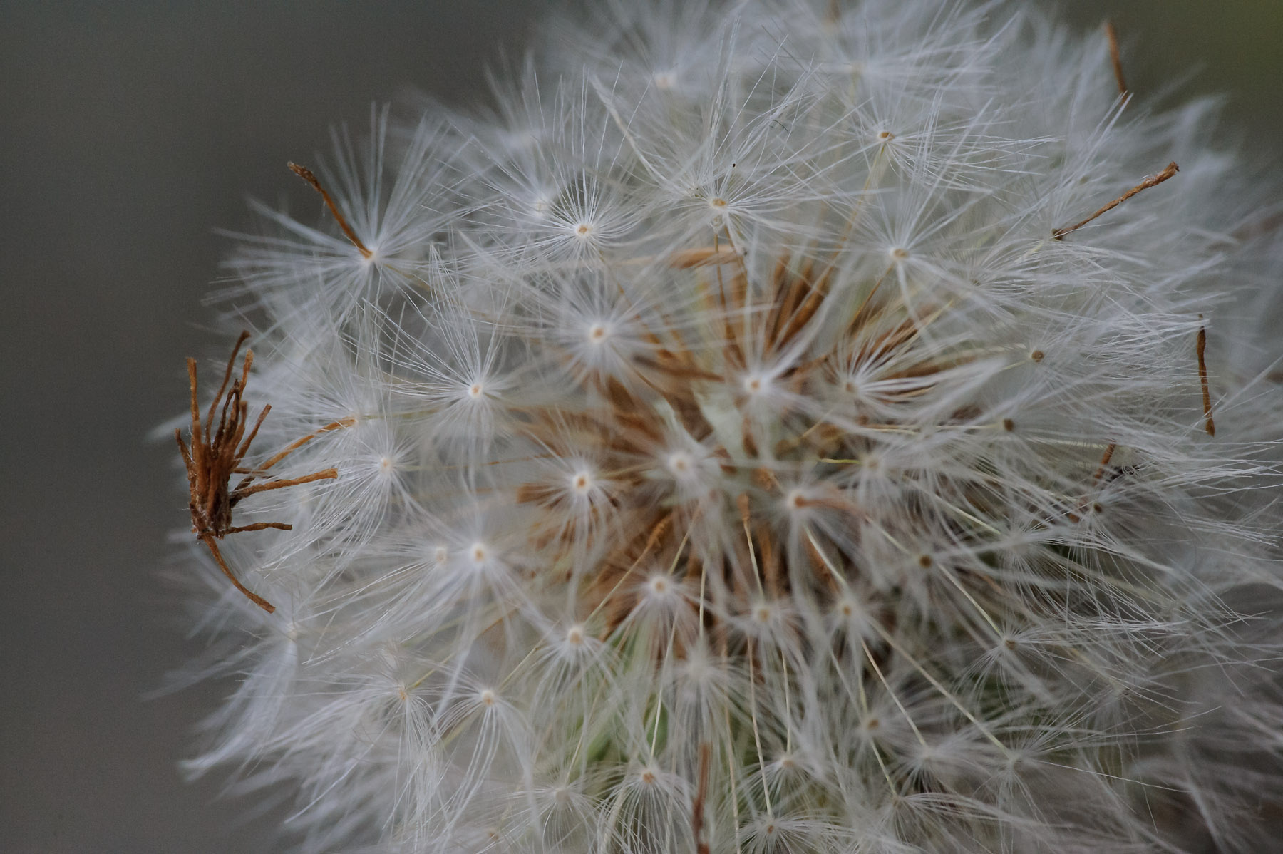
Nikon D700 + Voigtländer 125mm f/2.5 — 1/400 sec, f/8, ISO 5000 — full exif & map — nearby photos
Messy Dandelion
from the outing that produced this post in May
The areas of fine detail seem to firm up at about the 39〜46 quality level, and the areas of smoothness seem fine there too, but the pixel-peeper in me might want to bump up the quality setting a few levels so that quick toggling reveals less fluctuation in the background.
Five more examples follow, of various types, for your pixel-peeping, compression-understanding enjoyment...
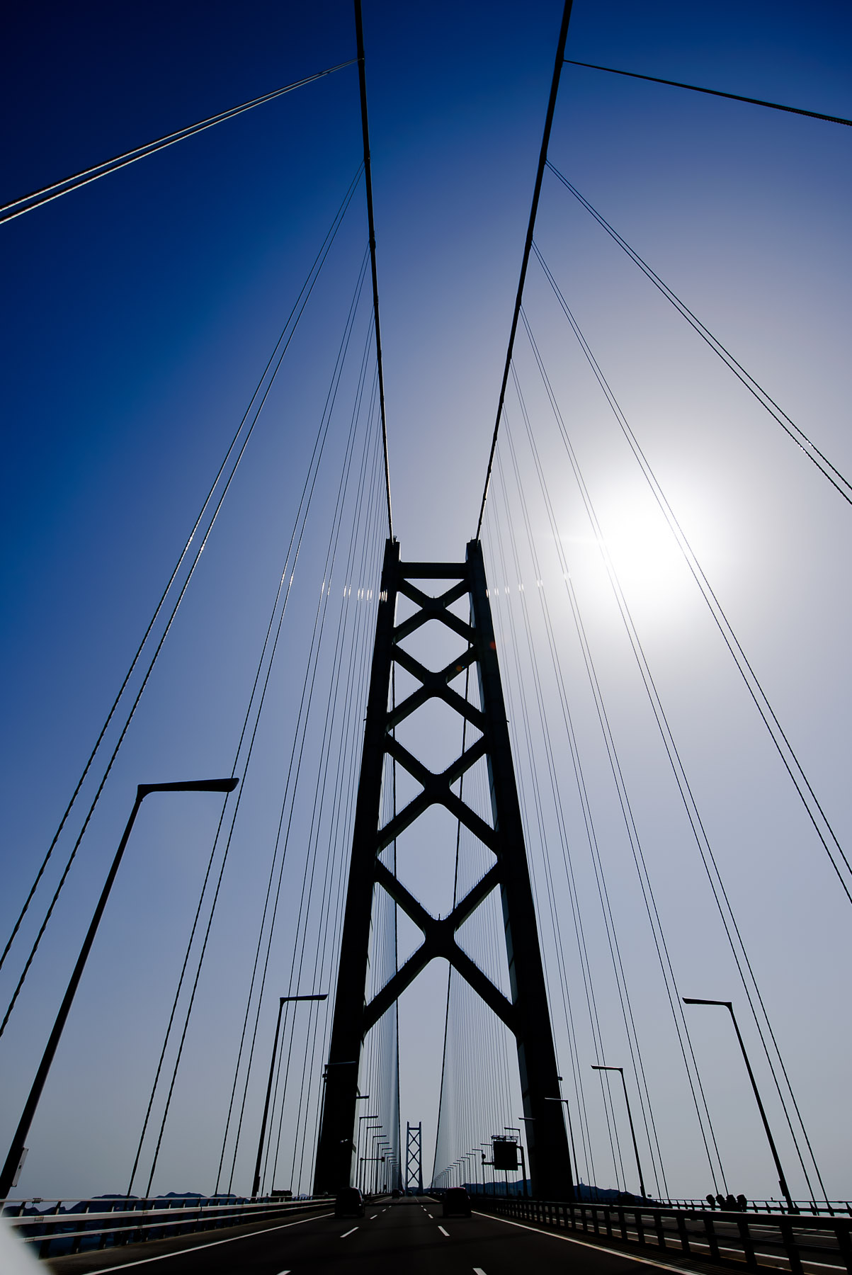
Nikon D700 + Nikkor 14-24mm f/2.8 @ 14 mm — 1/4000 sec, f/5.6, ISO 200 — full exif & map — nearby photos
Uber Challenging
detailed lines and smooth gradients, from this post on the longest suspension bridge in the world
Nikon D700 + Nikkor 24-70mm f/2.8 @ 70 mm — 1/320 sec, f/9, ISO 200 — full exif & map — nearby photos
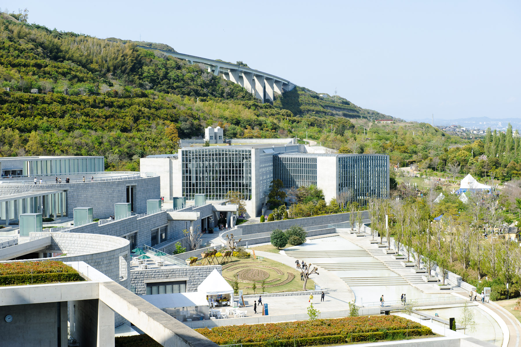
Boring, but Common
from our room when we stayed at the Westin on Awaji Island
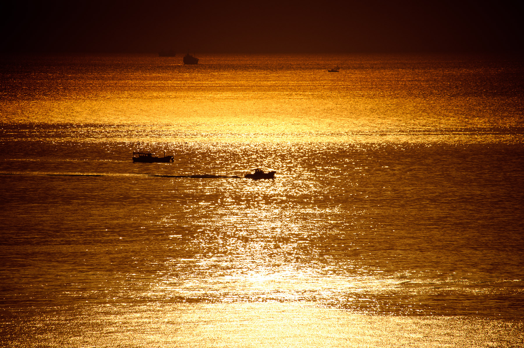
Nikon D700 + Sigma “Bigma” 50-500mm OS @ 500 mm — 1/8000 sec, f/6.3, ISO 200 — full exif & map — nearby photos
Lots of Nondescript Detail
a darker version of this photo
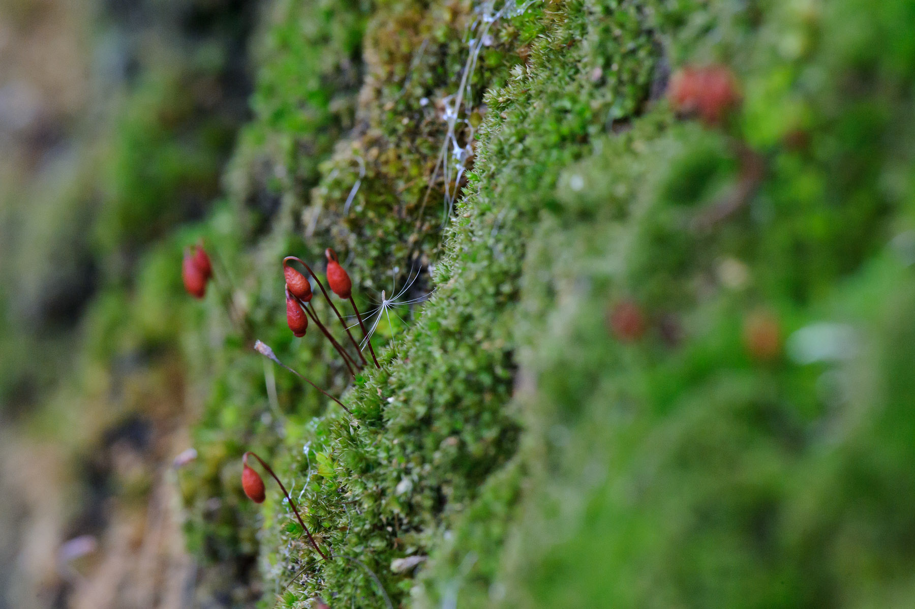
Nikon D700 + Voigtländer 125mm f/2.5 — 1/160 sec, f/8, ISO 5000 — full exif & map — nearby photos
Dandelion Seed and Moss
the same scene as this photo, but at f/8 instead of f/2.5

Nikon D700 + Voigtländer 125mm f/2.5 — 1/320 sec, f/8, ISO 5000 — full exif & map — nearby photos
Old Wooden Siding
Right next to the reed-shaded window of the second example photo
Conclusions
First of all, you can't directly compare Lightroom's JPEG quality settings with any other application. The settings may well map directly to Photoshop's save-as-JPEG 0〜12 scale, and they may well partially map to Photoshop's “Save for the Web” settings, but all bets are off when it comes to the JPEG quality setting on non-Adobe applications. They're just totally unrelated to how Adobe does it. (I should make it clear that the difference is neither good nor bad; I've presented nothing here about how any other application creates JPEGs, so there are no conclusions to draw about which might be better or worse than Lightroom; the important point is to recognize that the scales, even if sharing the same “0〜100” labels, are absolutely completely unrelated.)
The Lightroom default JPEG export quality of 75, falling in the 70〜76 range, seems to provide for as good a visible result as the highest quality setting for all the samples except for the bridge, which seems to suffer at least slight posterization banding at all levels, including even “lossless TIFF”. The file size, even at this relatively high 70〜76 setting, is still about one third that of the 93〜100 setting, so is well worth it in most situations. Those who blindly use the maximum setting for their exports likely waste a lot of local disk space, upload bandwidth, and remote storage space. But conversely, those who blindly use some lesser setting risk posterization in the occasional photo with an unlucky sky gradient.
Overall, my recommendation is to understand the situation, allowing you to avoid acting blindly.
About These Examples
To produce these examples, I used a plugin for Adobe Lightroom to export each photo at Lightroom's 13 different JPEG quality settings, and also as a losslessly-compressed TIFF, at a reduced size of 1518×1010 (down from my Nikon D700's native raw resolution of 4256×2832),* with medium screen sharpening and minimum embedded metadata. These are the versions used for the file-size graphs.
These image files have some extra stuff added by Lightroom — a few metadata items, an embedded thumbnail image, and an embedded sRGB color profile — that is the same regardless of the quality setting, so one school of thought would have me remove them before creating the file-size graphs, to isolate just the quality-related differences among the files. However, I thought it best to leave them there to keep these examples realistic, since since Lightroom will leave them there you export.
The crops you actually see in this post were exported similarly, then converted to losslessly-compressed PNG images for the presentation on this web page.
(Presenting the compressed JPEGs directly would have been problematic because a common browser, Firefox, does not handle display of JPEGs very well, sometimes introducing horrible posterization that does not actually exist in the image.)
This kind of reduced-size test is appropriate for many cases, but less so when you are considering exporting JPEGs for archive, or large JPEGs for print. To address this area, I've created the same eight samples as above, but without any image-size reduction, and without any additional export sharpening. This current web page is already a bit heavy, image wise, so I've placed the full-resolution images on a separate page, here.
Additional Resources
JPEG Export Quality Tester plugin for Lightroom
I created a plugin to quickly generate JPEG copies at all quality settings, my JPEG Export Quality Tester Lightroom Plugin. You can use it for your own testing. It's one of the 20+ wide-ranging Lightroom plugins I've published on my Lightroom Goodies page.
Full-Resolution Examples
As I wrote in About These Examples above, I have created full-native-resolution copies of all these tests. They are available here: Lightroom JPEG Export-Quality Settings, Full-Resolution Examples.
Lots of Lightroom Goodies
I've got 20+ plugins for Lightroom, as well as other writeups and tools, on my Lightroom Goodies page.
Other Digital-Image / Photography Tech Writeups
All kinds of stuff at my Photography Tech page.
Thanks
Thanks to Adobe for making a wonderful photo-workflow program, Marc Liyanage for his CoreImageTool command that allowed me to automate the post-Lightroom conversion to PNG for the 224 sample-crop images, Google for their very useful Chart API that generates and serves the filesize-graph images on the fly, and to the hundreds of people in my mail/comment queue that I have not responded to in the last few days, for your patience as I yet again let myself get sucked into another damn-fool project of my own devise.
| * | The bridge photo was actually a bit smaller than the others to begin with because it required a fair amount of rotation to bring the bridge towers to vertical; I'd taken the picture with one hand while holding the camera out the window of the car, and was concentrating on driving and on not dropping the camera more than on the finer details of composition. |
Highly informative. Thank you – Atlanta, GA
Wow, great detailed post … I’ll certainly be changing the way I export images now.
Very interesting – something I’d long wondered but never attempted to display so elegantly.
I’ve always favoured 75(%, whatever) and 80 at most for portraits – anything more on a full image not being viewed 1:1 is a waste.
100 is, as you say, as waste of resources, especially for people scanning slides/photos – unless the original is pin sharp you’re only encoding at higher resolution something soft. Pointless.
Thanks very much for this post!
Hi Jeffrey, thanks for the post.
Tangentially, I’m wondering about your statement, ” a common browser, Firefox, does not handle display of JPEGs very well”. Firefox is in fact one of the few color managed browsers (along with Safari), so this is a curious statement to me. (I presume you mean on the Mac, but likely also on Windows.) Care to elaborate?
Paul
Try viewing this post in Firefox and another browser, and compare the image posterization. Firefox’s move to color management was a long road whose travel I helped encourage, but I suspect that in adding it they introduced some other error. I still use Firefox as my primary browser because it otherwise rocks. —Jeffrey
Jeffrey – Thanks for creating these examples. I found them very interesting and useful. Before now I had mistakenly thought that the relationship between quality and file size was linear.
I’m one of the people that’s guilty of using one settimg for every expert, so this was a Very intersting post. I didn’t know that the 0-100 scale wqs mapped to 13 steps, so that was enlightening. I guess the conclusion here is that there’s not any single setting that will do “just fine”; I guess eperience here, as in many other aspects of photography, is key.
Hm, well I think I have a discerning eye, but here’s what I see.
It seems the posterization is simply more apparent when the image is less vivid. Safari & FF being color managed appear less brilliant than Chrome. Likewise when I put my monitor in sRGB space (from Adobe RGB) there is a bit less brilliance as well, perhaps amplifying the effect. But when in either case I look at the image in PS CS5, I *still see* the posterization in this sRGB space image. So I don’t see a flaw in these browsers, but perhaps, actually, a more accurate rendition. My $.02.
(This viewed on Dell U2410, Win7, Adobe RGB space, spyder2 color calibrated monitor. I did not recalibrate upon switching to sRGB space.)
Paul
The Firefox problem is sometimes subtle, sometimes wildly obvious; I’m not sure what causes the difference. But I’ve got to say that your references to color spaces has me perplexed…. AdobeRGB / sRGB are not device color spaces, so have absolutely nothing to do with monitor color spaces. You would never need to adjust the monitor color space to depend on the color space of some content you were viewing in a color-managed application. —Jeffrey
Ok, point taken. I guess gamut is the better word. Since the gamut of the monitor is about 100% of the Adobe RGB gamut, and larger than the sRGB gamut, I suppose it limits its range to match, depending on its hardware setting. My intention was to limit my monitor to what others might be seeing.
Color Gamut
110% (CIE 1976)
Support and Compatible with Industry Color Space
AdobeRGB (96% Coverage)
sRGB emulates 72% of NTSC Color (100% Coverage)
xvYCC Compatibility
Ah, I see. Those kind of monitors are not all that popular (and your monitor is much nicer than mine!), so I didn’t consider that you might have been alluding to that. —Jeffrey
Great job Jeffrey – the best explanation I’ve seen.
Hi Jeffrey,
Great presentation of the JPEG compression. Seems that is not as “damaging” as I thought it was.
Will start reducing quality and save space 🙂
Have a great day.
John
Firefox 3.6’s color support is provided by the qcms library, which unfortunately does not handle ICC v4 profiles right now, only ICC v2 profiles. This may be the difference that Jeffrey is seeing in Firefox currently. Firefox 3.0 used a different software library for color support and did support v4 profiles.
More info here:
http://muizelaar.blogspot.com/2009/06/qcms-color-management-for-web.html
https://bugzilla.mozilla.org/show_bug.cgi?id=488800
If you (or anyone reading this post) has the time/knowledge to help us update qcms to support v4 profiles, we’d be able to ship it with Firefox 4 later this year. Right now it’s unclear as to whether that will get done or not.
I’m sure the problem I’ve seen has nothing to do with v4 profiles, since it happens with sRGB. It may well not have anything to do with color-space transformations at all… I was just speculating blindly. —Jeffrey
I can see the difference between FF (3.6.6) and IE (8.0.6001) but to me, the posterization is getting masked a bit by the saturation change, IE being a bit more bumped up, say… 3 or 4 points on the Vibrance slider. The difference only being apparent with fast Alt+Tab switching, I’d never notice if I hadn’t looked for it.
More interesting to me is that in mid-2010, fully 15 years since I’ve been using the internet and hand-coding basic HTML, that browsers STILL render font sizes and element layouts differently. Although, they’re a whole lot closer than when tables and frames were your only choice.
The problems I’ve seen with Firefox are readily apparent when they happen, visible from across the room at a glance. No need for pixel peeping. I’ve seen it in both Windows and OSX, but not always… not even usually. I’ll try to point out the next time I see it, and we’ll find out whether it’s just my systems or a general issue…. —Jeffrey
Thanks for a truly excellent write-up, hopefully you are getting closer to the photography book you have “promised” us ! Your analytical approach and clarity of language are just what’s needed for such subject matter (as with your Colour spaces epistle).
Ref. JasonP, I have only noticed the posterization in Firefox (3.6.6 on XP) recently (as when I made a comment under ‘Back in the saddle with a wonderful sunset’). I am prepared to accept that it may be a function of my not-very-special monitor (HP LP2065), but would add that it seems to be associated with areas of highlight clipping as also in the sun in the example you mention to PaulC above.
Fascinating. I did a similar test back in the 1.x days (or maybe earlier), looking at quality setting vs. file size. Unfortunately I can no longer access the writeup I did of this, so it’s possible I’m misremembering the details, but I remember two things that differ from your findings:
(1) While there were discrete bands, the breakpoints differed between images. In other words, for one file there would be a break between 92 and 93, but for another there would be a break between 90 and 91. That led to a feature request for more deterministic quality settings, and perhaps that evolved into the fixed bands you’ve discovered.
(2) The file size of the image portion of the file (ignoring metadata) was halved at each jump. That’s clearly not what you’re seeing, particularly with the anomaly between 53 and 54. I understand why you chose not to ignore metadata in your file size reports, but if you did, would either the >=54 or <=53 bands follow this model?
Thank you Jeffery for the great analysis! I admit I’m one of those who exported at 100% due to just being paranoid about losing quality, but since joining a support group, I’ve lowered my quality setting to 80%. Looks like I might be able to move down to the default setting of 75% seeing your results.
Cheers!
Thanks very much.
This kind of reminds me of the quality measures for encoding video. I used to rip the occasional DVD and I am somewhat fixated on quality. You kind of can train your eye (just like your ear) to spot even the slightest artifacts from encoding. This almost happens automatically when you start caring about it, well, at least that’s true for me.
Anyway, in video encoding, there’s a rule of thumb for the number of effective bits per pixel. I remember, when I started experimenting with xvid-encoding, you would try to accomplish something like 0.2 bits per pixel, if you wanted good quality. Anything above 0.25 or maybe 0.3 would be complete overkill and anything below 0.15 would make me want to cry, even though some people still found it to be acceptable.
So, when looking at your images, I mostly find something a bit above 200kB to be visually and pixel-digger-wise pleasing. Let’s have a look. 1518 x 1010, that’s around 1.5 million pixel. Now when you take 200kB, that’s somewhere around 1.6 million bit, so you get roughly one bit per pixel.
When taking into account that a video codec has to encode 3-dimensional data, and that it highly depends on the fact that the data in time direction doesn’t change too much, and the fact, that the eye is occupied processing motion rather than shades of color or detail, one bit per pixel isn’t that far from the old rule of thumb that holds for video encoding.
I was always wondering, the quality “points” or “percent” never felt natural. If you know the dimensions of the image and you have a feeling for it’s complexity level, you can guess how big the file should be … I never understood, why in professional level tools one would want to obfuscate the most important setting. Of course you can go with “80 gives me good results most of the time”. But the truth is, it probably wastes space and bandwidth, most of the time …
Jeffrey, you write:
This is due to the downsampling (basically, a reduction in resolution) of one or more of the image channels before passing it to the actual compression routine. Human vision is much more sensitive to changes in luminance (brightness) than chrominance (colour). JPEG takes advantage of this by reducing the amount of colour information stored in the image in order to achieve higher compression ratios. Because it is colour and not brightness that is sacrificed, this is called “chroma subsampling”. Look up that term in Wikipedia for a far better and more detailed description than I can provide here.
In a nutshell, Adobe products will use either a 4:4:4 subsampling (which is no subsampling at all, and thus full resolution) or 4:2:0 subsampling (both red and blue channels are reduced to one-quarter resolution before compression). There is no switch to specify the amount of subsampling to use. In Photoshop, the change from 4:2:0 to 4:4:4 happens between quality 6 and 7. In Photoshop’s Save For Web, it happens between quality 50 and 51. In Lightroom, you already noticed that something unexpected happens between 47-53 quality and 54-61 quality. Guess what levels those correspond to in Photoshop? 6 and 7… exactly as expected. 🙂
You can very easily demonstrate this by creating a worst-case scenario of JPEG chroma subsampling. Create a small image in Photoshop with a pure blue (RGB = 0,0,255) background. Now type in some pure red text (RGB = 255,0,0). For maximum effect, turn off anti-aliasing, so each pixel is either full on red or full on blue. Zoom in to 500% or so for a clear view of the pixels. Now save the image as a JPEG. With the JPEG quality dialog visible, you will see a real-time preview of the effects of JPEG compression. Start at 12, and work your way down to 0, one step at a time. Watch what happens when you go from 7 to 6. You can do the same with Save For Web and with Lightroom to confirm where they switch from 4:4:4 to 4:2:0.
The file size discrepancy is more noticeable in the sunset shot because most of the information (relatively speaking) is needed to encode the gradual change in chrominance values. There is virtually no luminance detail to worry about, except around the silhouette of the bird. But in the photo of the reed window shades, the fine detail and texture and lack of colour result in practically no difference going from 4:4:4 and 4:2:0.
Because of this hidden (and inaccessble) switch, I have been recommending that to be safe, one should never go below quality 7 in Photoshop, or 51 in Save For Web. In Lightroom, this corresponds to quality 54.
Hope this helps.
Great explanation, thanks! —Jeffrey
Thank you very much for explaining all of this in such detail. Very helpful overall, and there are some interesting surprises.
This is possibly one of the most misunderstood areas of post processing, and you did a great job of showing what the effects of these incremental changes do to the exported image. I never use 100 for Web, but I did for any JPEGs that I used for upload to Stock sites etc. I’ll certainly be rethinking the quality I use in all of my exports from now on.
Excellent work Jeffrey, as usual!
Posting from Tokyo.
The conclusion about the jpeg algorithm is a bit odd, I hope you read about the chroma on wiki or jpeg on wiki where it is explained(I don’t think I am capable of explaining).
Plenty of other differences make themselves known when quickly toggling between views, but in a static view they’re mostly lost among the many details of the photo, and I suspect that when presented with the perfect version and the second-to-the-lowest quality version, only those with a trained eye would be able to pick which was which.
If you consider trained knowing to look for problems around sharp color changes under an angle(which is not on that picture) and a loss of gradation in color, then you need a trained eye otherwise you can tell with decent accuracy which one is which.
The difference from the first example is stunning, and relates to what visual changes human are sensitive to: we pick up on imperfections in a continuous tone much more readily than slight changes in varied detail. The JPEG compression algorithm is built around this difference, trying to preserve quality in these smooth gradient areas, but as well as it does, a photo like the sunset presents a daunting challenge.
Actually we don’t pick up on gradient so well, that is why jpeg is throwing lots of info away about this, hence a picture with just 1 big gradient(with a little color difference) becomes ugly fast and also a really small file.
Last one, after the first picture you mention you see banding also in the lossless file. This is probably due to your lcd screen. Most lcd’s are just 6 bit and with a small color difference over a big distance you will start noticing this. If you have an pva or ips screen then the screen should be 8bit and a big improvement but here it’s still the screen that is the limiting factor since your camera is likely to be 10 bit however the jpeg(8bit) neither.
Anyway I enjoyed you website and pictures. THNX and sorry about the wiseass comments
Awesome writeup, very informative.
One change that would have made it easier to compare the images would be to have the image selectors appear in increasing (or decreasing) quality order. Currently with lossless on the left end, then the lowest quality right next to it, you can’t just slide your mouse left to right and see decreasing quality; it jumps from lossless to lowest back to highest jpeg quality. Or if the lossless was on the right end, that would fix it as well.
BTW – keep up the good plugin work too!
Uh, I guess you didn’t read the prose near the top about the various ways the presentation was designed…. you can do exactly what you want, and more. —Jeffrey
Excellent write up!
Indeed very helpful write-up, thank you!
I also ran into the Firefox artifacting/posterization you mentioned. My conclusion is that it is related to FF’s (and Safari’s) color management. More details in my post on Luminous Landscape forums, link below.
http://luminous-landscape.com/forum/index.php?showtopic=45058&hl=
Excellent write up on an often forgotten part of our daily workflow. This is definitely the best piece of useful information i have ever read about on this subject. Well explained and very interesting read indeed.
There is one thing about JPEG compression, and compression for other still and video formats that’s worth knowing. They all favor vertical and horizontal lines over lines that are angled. The closer to 45% the line gets, the more the compression will be noticeable. That’a a good part of why photos with a good amount of vertical and horizontal detail such as the one of the reed blinds seem to fair very well at very low compression, while others, with varied line angles do worse.
Of course, there are more areas in the format that that, so sometimes lines close to vertical and horizontal are even lost. But that’s due to other detail in the image that’s being worked on, as well as color and contrast differences, and it drags those lines in with it.
Gradients are very difficult at high compression rates, and that’s always been a problem. At lower rates, gradients aren’t compressed as much, but at higher rates, they must be, to lower the storage. As far as our sensitivity to gradient compression goes, unlike what one poster here said, we are sensitive to this, but it isn’t usually a problem, though it’s one major reason why we’ve been moving to 16 bits per color.
Interestingly, Thorsten Lemke’s venerable GraphicConverter provides a live preview of a selectable part of the image as the Quality slider is moved from low to medium to high, and that slider has 11+ tick marks on it. If the “Calculate File Size” box is checked it also shows how the file size changes as the slider is moved. Even LR3 doesn’t have these capabilities. Admittedly its GUI is a mess, but it has been called the swiss army knife of graphic images. It can be downloaded free and used indefinitely. Shareware cost is $35. Frequent updates, and Lemke responds personally to questions. Sorry, Mac only.
OB Statement: My only relationship with LemkeSoft is as a very satisfied customer.
As a novice in digital photography (age 60 something) I found this article very well written. As a professional mathematician, I was curious to know why the file size rises exponentially with resolution
i. e. the math that you deleted. Any references you can suggest?
Howard
I’d follow the link to Wikipedia and look for its references. I don’t have the mathematical smarts to judge which descriptions of the math are good or bad. —Jeffrey
Fascinating post. Gradients with high dynamic range (big change from source to destination) seem to be the ones that require the higher settings. It is interesting how the background of the dandelion shows different artifacts across the mid range of compression, but a lot of them would be acceptable in many circumstances.
I’m looking forward to seeing your plug-in when it’s cleaned up to give it a whirl.
Thanks for putting that article together.
Rob
Nice article and very informative, but I for one would have liked to have seen the originals – the full photos (you didn’t state they were compressed on un or if how much) and the zero quality pictures at the same crop.
Maybe I’m missing something, but can you explain why you showed the zero qualities all cropped??
I don’t think I understand what you’re asking (“zero qualities?”), but I show crops because each image is huge in area (4256×3832 pixels) and I can’t think of a way to manage that UI in a little web app. Also, the full-frame images can be huge (10+mb for the higher qualities), which would make the page hundreds of megabytes heavy. As it is, even with only these crops, there are 87mb worth of images, and my server has been struggling. —Jeffrey
While I found the article interesting and well-researched, my main takeaway from this post is: I want that interface when saving JPEGs! In other words, why can’t Photoshop, Lightroom et al give us the same preview of each compression setting, simply by mousing over? This is the best way I’ve ever seen to make a decision which setting to use.
Ever considered turning it into a Photoshop plugin? I’d buy it for sure.
Thanks a lot !
This is very helpfull for my understanding of what factors are contributing to which extent, in what my picture is going to look like / come across as.
Arthur
Very informative post. I have been setting quality to 100% like a blind fool all this time. Now I can use a slightly lower quality and save some space. Thanks!
By the way, you have a brilliant blog here, really love the photographs, and you’ve got great tips about Lightroom. I am glad I found your site.
great article the export setting is one thing that the most people only put in 100 and forget about it but I going to be putting more attention to thanks to this article, let us know when you release the plugin thx
No offense but I really don’t see the point of saving screen resolution JPGs at anything but maximm quality.
The minimal gains in bandwidth and disk space is simply not worth it. Why, just why would you ever want to lower the quality of your photos? It’s like making your paintings and drawings smaller to save space or using less paint or ink. It simply does not make sense for a photorapher.
Don’t be so cheap on bandwidth and disk space.
I dont’ get how any of you can be convinced of doing something like this. To achieve what? Save a few megabytes per shoot?
The vast majority of professionals may keep the following sets of files:
1) Original RAW files
3) Layered Photoshop, or whatever editing program you may use, file
2) Possibly full resolution or lower resolution TIFF of edited files
3) Full and/or low resolution JPG of edited files
4) Full and/or low resolution JPG of RAW files untouched
The savings are minimal. We are working with multiple gigabytes flash drive, 4.37GB DVDs, multiple terabytes hard drives. Don’t skimp on something so trivial.
Again, all of this to achieve what? Save a few kilobytes when sending low resolution JPG proofs by email to someone? Save a minimal amount of space when archiving low resolution JPGs? That you will probably never use? That you have the original files for?
This is completely ridiculous.
Condescension aside, I can totally understand someone looking at this information and still deciding to always use 100%, but it’s better to do so from a position of knowledge rather than ignorance. However, it’s disingenuous to suggest that size and its related costs (disk space, upload bandwidth/time, online quota) are non-existent, so it behooves one to understand what those costs are getting them. If you shoot raw, the master source of the image is the raw file and Lightroom settings, so any JPEGs you export are just copies for something, and some people use copies for things where a small size is a real advantage. In the same way that I would suppose you’d settle for something less than bottled European spring water to wash your car, perhaps you might allow that others might choose less than JPEG’s fairly costly “100% quality” for every use every time. —Jeffrey
This is because during compression, the algorithm analyzes the pixels in rectangular blocks, commonly of 8 or 16 pixels. You can notice the familiar jpeg artifacts form “mosiacs” as Jeffrey mentioned.
People interested in experimenting with JPEG compression may also want to look the The Gimp’s export. It allows great degree of tweaking: even controlling the channel subsampling Brian mentioned.
Awesome comparison, man. In your next project you can compare the imagequality when you save over a jpg multiple times. That would be interesting to see.. =)
Cheers, dude!!
“As a novice in digital photography (age 60 something) I found this article very well written. As a professional mathematician, I was curious to know why the file size rises exponentially with resolution
i. e. the math that you deleted. Any references you can suggest?”
I hope I can give you some idea. As this is a perceptual compression format, it removes what most people won’t notice most of the time, as we find MP3 and other audio codecs also working. The first alliteration, that is, the lowest compression (93-100), actually removes the most information from the image, and so we see a great deal of file reduction. As the file is compressed more, there is less removed, so the file size changes little. Indeed, with the smaller file sizes, meaning the most compression, we can sometimes see the file size increase a bit when compressing further, as the algorithms change what they are doing.
The reason for it working this way is that there is a lot that we can’t see in an image. Basically, much can be removed, as we see in his first example of the bird. But there comes a point that further compression is easily seen, and so the algorithms become more complex, and can remove less because we can now see even the slightest increase in compression.
I also believe you meant to say; “…exponentially in lower modes of compression”. Resolution is reduced, but it’s just one of many areas that are compressed.
If you’r interested, this Wipipedia article is as accurate an explanation as I’ve ever found, and will explain, better that I can here, of why it appears to be exponential, without ever mentioning the word. Scroll down to where it says “jpeg files”:
http://en.wikipedia.org/wiki/JPEG
You should try compression with a vibrant color of Red. For some reasons, I’ve noticed that when there is red in the image, the JPEG compression has a lot of difficulty with making it NOT appear muddy/blocky. Also, I think this would also be interesting to try this with graphical images, that mainly include text. I deal with text and compression on a daily basis, for e-mail marketing designs sent over the web.
“This is because during compression, the algorithm analyzes the pixels in rectangular blocks, commonly of 8 or 16 pixels. You can notice the familiar jpeg artifacts form “mosiacs” as Jeffrey mentioned.
People interested in experimenting with JPEG compression may also want to look the The Gimp’s export. It allows great degree of tweaking: even controlling the channel subsampling Brian mentioned.”
Yes, I’m aware of that. I didn’t want to explain it.
It’s generally not a good idea to tweak this unless you understand exactly what the parameters are doing. It’s likely that one will make something significantly worse, while getting a small benefit in another area.
In reply to Bob’s comments, there are several reasons for wanting to reduce jpeg file sizes. Emailing would be one reason, where file size can make the difference between the email getting there and being bounced. Another reason is online submission, where often a maximum file size is specified. My photo club has a limit of 500KB for each image being submitted online. Yet another reason is to make images in web galleries load faster. Ever tried to view 2MB image files online? It gets boring waiting for them to load. And even another is to deter people from ripping off an image displayed on a website: much less likely if it’s limited to screen resolution.
Thanks, Jeffrey, for a very informative post (and for your plugins)!
I have a question about optimizing for web sized images. With LR2 at least, I export at 900×600 and noticed that anything below 100% just looks muddy (ie. 80% or 90%). So I’ve been forced to export at 100% in LR although I’d prefer having smaller image sizes.
I wonder how your results may change if you are already scaling it down so much from the original size to your intended display size.
I’d guess that the JPEG engine in Lr3 is identical to that in Lr2. Perhaps you could post two copies of an example, one you feel is muddy at 80%, and the corresponding non-muddy at 100%? My selection of test images is rather haphazard (it’s certainly not borne from a deep understanding of the JPEG compression algorithm), so maybe there’s a class of image whose results are very different from what I’ve posted. … —Jeffrey
Sorry to confuse. Basically I was saying I assumed the full photos we were seeing were less compressed and that the crops were showing what happened at the lowest quality saving level. If that was true, I would’ve liked to have seen the same view/crop/section of the two photos to more directly compare the amount of quality loss – however maybe you were showing the same compressed jpg rendering of the full photo and a section of detail from the same file (which in the shots of the crops always showed the “0-7” quality in red).
As for Jarod’s comment on multiple savings of jpg’s, my understanding is that you absolutely introduce new artifacts every time you reopen and resave a jpg (which you would do presumably to do further editing).
I try to make my edits in adjustment layers or image copy layers on my original TIFF’s so that I have a TIFF with all the original info and the edits – any of which I can turn off/on. I then always resave the original TIFF and then make a new jpg to replace or complement the previous jpg. If a crop is involved that’s specific to the jpg, I make the crop after saving the TIFF. The TIFFs do grow some with additional layers, but often less than one might imagine. In any case, this workflow means nearly all my jpgs have only been saved once.
In the odd case where I irrevocably alter the original TIFF, I tend to save a new TIFF and a new jpg. I suppose this would also generally be the case if I started from RAW files, but I haven’t yet had a RAW capture rig.
But in any case, thanks for your reply!
Fantastic information. Thanks very much for your work. I think this will benefit many photographers of all skill levels.
Could you please publish the JPEG files, as saved from Lightroom, for at least one of the example images? I’d like to have a look at the quantization tables Lightroom uses.
Sure, here you go. —Jeffrey
Thanks for a very technical and thought-provoking post, Jeffrey. I co-manage a photoshop user group in Las Vegas, and I just gave my 2nd Lightroom demo last week. This is the type of info that makes me look good in front of a group, and I am glad to share the source. Whenever I get the chance, I refer people to your blog and plugins.
Again – thanks. Keep up the great content.
Cheers
“The problems I’ve seen with Firefox are readily apparent when they happen, visible from across the room at a glance. No need for pixel peeping. I’ve seen it in both Windows and OSX, but not always… not even usually. I’ll try to point out the next time I see it, and we’ll find out whether it’s just my systems or a general issue…. —Jeffrey”
I unfortunately have a perfect example from one of my photos. Firefox 3.6 shows hideous rainbow banding in the sky around the sun, but the pic looks just fine in both IE 8 and Opera 10.6. This is in Windows Vista on a calibrated HP LP2465 monitor. Firefox has gfx.color_management.mode set to 2.
Oddly, I don’t see any difference among Firefox, Chrome, and Safari on my Mac. Maybe it’s a problem that comes and goes. —Jeffrey
One difference is that Safari has, for some time, supported Adobe RGB. Chrome does not, and Firefox hasn’t, but they may now. An image on a browser that supports it will throw an image that looks much different than one that doesn’t, if the image profile is Adobe RGB.
An Adobe RGB image will be oversaturated, darker, and will exhibit more banding when viewed in a browser that just supports sRGB.
Of course, if someone is using a crummy, old, or uncalibrated monitor, than it might not matter much, as nothing will look right. But the difference might still be seen somewhat.
If a browser supports embedded profiles, it doesn’t care about the profile name, and Adobe RGB will work as well as sRGB or any other. Are you perhaps referring to the InteroperablityIndex way that some cameras denote AdobeRGB in their JPEGs (that is, denote AdobeRGB without actually embedding a color profile)? It would be common sense for browsers to support that standard notation, but I didn’t think any did (and last I looked, Safari did not, but it’s been a while)… —Jeffrey
Basically, most browsers don’t look for a profile in a photo at all. They assume an sRGB profile. If you embed no profile, it will be seen as sRGB. If you embed Adobe RGB, it will also display it as sRGB. But Safari and one or two others now will look for an embedded profile, as long as it is either sRGB or Adobe RGB, and display it as such. You can easily see this. Take a jpeg and embed one of those two profiles in them, and put then on your site. Safari will show them properly, most other browsers won’t, or the Adobe RGB jpeg will look under saturated (in my earlier post, I made an error where I mean to say under saturated, I said over), which is what will normally be the case. It’s easy to do.
This is because Safari is a color managed browser, while most others are not. Its why most photographers who understand this use Safari. As Firefox is now also color managed, it should respond the same way Safari does.
Otherwise, make sure all your photos are in sRGB mode.
Check this out through several browsers, they will look the same in Safari and FF, but not in others.:
http://www.zanzig.com/blog/?p=559
Modern versions of most browsers now do respect an embedded color profile. Last I checked IE was the last that didn’t. Those that don’t (IE and old versions of other browsers) generally do not assume sRGB, but rather, assume no color management at all (which is the same as assuming that the image color, which should be device-independent color, is actually in the device-dependent color space of the user’s particular display setup…. a totally ridiculous and improbable assumption). If you really want to test what your browser does with various kinds of color-space notations and profiles, see my Introduction to Digital Image Color Spaces. —Jeffrey
Interesting post!
I just wanted to note that I work with the low-level jpeg code a bit, and it has basically two parameters. The first is the quality setting, which is 0-100. It’s surprising that Lightroom is binning it’s quality setting like it is, because under the hood, 93 and 94 are definitely different. Also note that perceptaully the quality settings are very different between the 8-bit and 12(16)-bit standards. I find I can go much lower for 12(16)-bit jpegs than for 8-bit ones.
The other parameter is sampling, either “4:4:4”, “4:2:2” or “4:1:1”.
Thanks Jeffrey,
I will include a link to this helpful info in the next issue of Stock Photo News. And I also appreciate your useful conclusion for us who are less technical and mostly occupied with having the pictures done:
‘The Lightroom default JPEG export quality of 75, falling in the 70〜76 range, seems to provide for as good a visible result as the highest quality setting for all the samples except for the bridge, which seems to suffer at least slight posterization banding at all levels, including even “lossless TIFF”.’
Best
Soren Breiting, Denmark
Hi Jeffrey,
Really informative.Thanks for such a wonderful content
cheers
Hello Jeffrey, Thank you for your sharing your knowledge. One question. This may be really basic but this is not my strongest area. I see your point that on the screen there is little difference between two qualities. However, I have a zenfolio account setup for people to purchase prints. So lowering my quality settings doesn’t affect the screen view but will the difference be noticeable on prints? Thank you.
Andy
It depends on the sizes involved (pixels sizes; print size)… if you’ve got enough pixels as you should always try to have, the quality shouldn’t be worse. I’m not an expert in this area, but I’d think that if the pixels don’t look worse, the print shouldn’t be worse. —Jeffrey
Interesting. Thanks for this write up. I have been blindly doing “100” all this time. Only recently dropped to 92 because I have a 2nd smugmug account with a 12MB file limit.
I couldn’t really tell a difference, and nothing I print will go over 20×30 at best, so I just left it. I will likely leave it for my Pro account too because it saves a hell of a lot of time in uploading and processing the export with no noticeable downfall.
I keep my RAWs anyway in the event I need utmost quality. While storage is “cheap” it gets real expensive when you start duplicating it for backup purposes.
Could you address the difference in filesize when exporting from Lightroom & Photoshop CS4’s “Save for Web” with the same settings (haven’t tried CS5)? I have tried numerous tests of exporting the same photo each way and Photoshops is always smaller. Why is that? Are the slide scales different (you discussed Adobe vs. non-Adobe software differences)? Or do Lightroom & Photoshop use different engines?
I think Photoshop’s “Save” and “Save for the web” use different JPEG encoding engines, or, at least, different scales, but I’m not sure of the details and how they might match up to Lightroom. However, I think “save for the web” strips out most image metadata, and may not include a color profile unless you ask. Lightroom always includes the profile, and includes a lot of metadata unless you strip it (with the “minimize metadata” or “specific filesize” options), so you’ll almost certainly see a difference. —Jeffrey
Thank you so much for supplying this information in such a clear way with those examples, Jeffrey.
Up to now, I’ve been exporting jpegs at 90 on Lightroom 2 for upload to my website. I am now thinking of making some of my images available online for sale as prints, and that started me considering this compression issue again. I therefore searched, and found your blog in the process.
It appears, then, that I could well get away with a lower compression, but any prints that would go out to customers from a third party service are still an unknown quantity to me at this stage, so I’ve decided to continue with the 90 level. I do, though, feel so much better informed thanks to you.
Andrew Gould, (Australian living in Santiago, Chile.)
This is THE best comparison tool i have seen EVER… and i have seen a lot since all the years in photoshop… It’s pertinent and don’t tell people the “best” result.. i can see it by myself !.. great..
Now, i an looking for the same shootout about smart sharpen. I know that size matter a lot, but let say it’s to export for screen view on cheep pc monitor like 960 * 650 or something like that…
Keep me inform if you do it..
thanks in advance
mam
Thank you! This has helped to solve the mystery of LR3 jpg quality. Very informative!
Brilliant! Thank-you for sharing this!
Thank you for all your research and painstaking and detailed description! This is an excellent piece of research, very valuable.
Thank you for a most informative article.
While shooting with older lower megapixel cameras (less than 10MP), it wasn’t an issue to use 98% quality setting. However, with my new camera bodies, the 18MP and 21MP files are huge when exported at 98% quality. After reading this article, I did a test and went down to 90% quality. The files decreased in size by almost half and the image quality (in my opinion) is identical to those at 98%, even at 400% zoom on my color calibrated 100% Adobe RGB gamat LCD screen.
I am so glad I found your article. I will now use 90% for all images larger than 10MP and still use 98% for smaller ones.
Oh, for me using 100% sometimes introduced artifacts in my images when viewed at 400% zoom; and it goes away at 98%. No idea why.
You mentioned that you might release a “Export-Quality-Tester plugin for Lightroom” and I’m wondering if that ever came to be.
Not yet… just something I have to get around to. I’ll try soon. —Jeffrey
Maybe I have found someone who can finally resolve this with me. I’ve conversed about this in forums for a year and all I get is, “live with it”. I can’t. Selling photography is my lifeblood and a website is my showroom.
Problem: I use Photoshelter for showing my photography. I shoot RAW, import it via Lightroom, view on an AdobeRGB colorspace I-1 calibrated moniter that gives me 110% AdobeRGB gamut, print to a 24″ HP Z3100 which wants AdobeRGB profile adjusted photos – and the printing is amost perfect. Then next, I want to export the photos in sRGB to my website – and the photos are horribly dull and unspectacular like they were in Lightroom. I have taken to sending the photos to a file and adjusting them on my laptop in another Lightroom Catalog, so I can have a reasonable idea of what they may look like in Photoshelter and on the web. This takes a lot of time and I have photo files everywhere now. Is there any way that I get a decent AdobeRGB corrected photo to convert to sRGB on export to the web without creating 2 sets, one for print and one for web?
I will buy your sRGB exporter and download them to my harddrive, then send them to Photoshelter, if I knew it would work. Any other suggestions will really help.
Tbanks.
I have no idea what “your sRGB exporter” refers to, but your phrase “an AdobeRGB colorspace I-1 calibrated moniter” is a bit worrying. I hope the reference to AdobeRGB with respect to the monitor is merely about its gamut, and not the display profile being used to drive it. The latter would explain the color problems. When you export from Lightroom, are you uploading directly? Are you sure Photoshelter honors the color profile, and preserves it in the versions actually distributed via the web? Are you sure your browser is color managed and color-manages the images that Photoshelter spits out? —Jeffrey
Hi Jeffrey,
I read this blog entry with great interest and then wondered what was in all that data that was lost (compressed away to nothing) between the two highest settings.
It seems that a major source of the difference between the jpeg compression 12 setting and the 11 setting in Photoshop may be the elimination of sensor noise. This makes sense because jpeg compression removes the highest frequency information first, and pixel noise tends to be at the highest frequencies.
To test this I started with a jpeg image from the camera with a smooth gradient (a shot taken into the sunset) and saved it as jpegs at 12 and 11 (Photoshop CS5). Then I Gaussian Blurred the original at 0.4pixel radius (could be any small number) and saved again as jpegs at 12 and 11.
Then I loaded unblurred jpeg 12 as background in a new Photoshop file and added the blurred jpeg as a layer and blended the blurred layer image with “Difference” (sometimes a slight alignment adjustment is needed). I added a “Levels” adjustment layer above the two and moved the sliders to the far left to amplify the differences. It was mostly noise.
Then I loaded the unblurred jpeg 11 as another layer and “Difference” blended it with the unblurred jpeg 12 background image. Using the same “Levels” adjustment layer revealed that the difference was again almost all noise.
To cross-check, I differenced two copies of the same unblurred jpeg 12 image and g0t nothing (black) no matter how much adjustment gain I add.
The file sizes:
1400K – unblurred jpeg 12
981K – blurred jpeg 12 <- this size may vary some with the Gaussian Blur radius
631K – unblurred jpeg 11
482K – blurred jpeg 11
Thanks for a thought-provoking post!
This is the best analysis I’ve seen regarding Lightroom export settings, and the information is presented in a way that makes it easy to understand without getting into the weeds. It’s quite an eye-opener. Many thanks for taking the time to put it together.
John
Aiken, South Carolina
Jeffrey,
Thanks very much. Great post. I’ve standardized on Jpeg 8 for PS for best size/quality ratio for non critical use. No time to test and compare ( have to work on post for 200,000 more images ;-)) I’ve asked forums and other experts about the mapping of LR and PS, and can’t get any definitive answer. Your presentation of the quality settings, actual visual reference, file size bar graph, and easy to use comparison is brilliant and explains everything in the easiest way. Pro level quality information. Keep up the great work. Hey, can you do one on 8 bit vs 16 bit files, to settle the matter once and for all? 😉 Pros can save TB’s of space if there’s no real difference in the practical world…
Two comments questions:
-you mention saving a third of the space for quality 75. I think you mean the size goes to a third, which is a huge difference, more like 300% savings in space. Quite important when you are emailing or working on hundreds or thousands of images.
-are these samples crops of 100% views on screen?
Thanks again,
Stu
Canada
http://www.studeeo.com
Thanks, I’ve corrected the “third” prose (yes, big difference!), and made it clear that yes, the crops are 1:1 “actual pixel” full-resolution crops. —Jeffrey
Stu, 300% saving? It’s difficult to save more than 100% (that is, size would drop to zero). Maybe you mean 67% saving 🙂
Sorry to be anal!
There are times, like here, where the people at Adobe appear out of touch with the real world. I suspect they don’t own cameras, or at least don’t know anything about the types of images (files) they produce. The standard compression level for Canon’s SuperFine mode is 98, that of Nikon’s Fine is 98, and for good reason. The level was achieved by very careful visual observation and mathematical modeling of the quantization tables for JPEG compression, and was found to be an optimum balance of file size versus maximum image quality (although it would appear that Adobe takes exception to that conclusion). That Lightroom uses this 0-100 scale is most confusing and misleading, as you (Jeffrey) have made it abundantly clear, as there is no “98”, which a user could potentially select in Lightroom, yet not actually achieve. In Lightroom you can have 100 or 95, of which I would say 95 is too low for the next available selection below the minimum compression level of 100. In summary, I (and most of the major camera manufacturers) would have suggested the availability of a 98 level of compression. One can only hope…
There’s a lot more to JPEG compression than just a number. Canon’s “98” may well be wildly different than Nikon’s “98”. Having experience with one app’s numbers does not necessarily give you insight into what you can expect from another. (Knowing that one person can bench press 98% of their weight doesn’t tell you much about what another can.) Instead of these numbers all feeding into the same backend engine, they combine with other proprietary configurations to yield app-specific results. —Jeffrey
Here’s another interesting article on this topic. It claims to prove that Photoshop’s 6 (Lightroom’s 47-53) is better than 7 (54-61) in luminance and chrominance compression, even though 6 subsamples and 7 doesn’t. In fact, if you look at the tables, it looks like you have to go all the way to 10 (77-84) to consistently beat 6 in terms of compression. It seems as though you need to look closely at 6 and 7 for each image to see whether the subsampling is a worthwhile tradeoff against compression, if you’re working in that range.
This is awesome! Thanks for including the comparison slides!
Extremely useful – thank you!
Wow, it’s so nice when you do a search on the internet and very quickly find exactly the answers you were looking for. Jeffrey, thanks so much for taking the time to do this! A massive help! -Rob (from Hawai’i and living in Russia)
Great post. It would be neat if you could have Photoshop’s exports alongside Lightroom’s, just to see.
Thanks for all your great stuff.
-Clifford
Excellent post!!! Very very helpful!! I was really looking for the best balance between file size and the overall quality.
Thank you very much for these informations!!
Ps.: in the Uber Challenging image, I see that the quality decreases from (47..53) to (54..61). I don’t know if the images may be inverted or if it’s a trick of the gradient and the JPEG algorithm.
If I recall correctly, there’s a time when the algorithm shifts modes, and that’s likely where it’s happening, in a way that does not compliment that image. —Jeffrey
Many thanks for your blog! Excellent practical analysis of JPEG compression factors. I run a homebrew motion sensing video surveillance system based on open source (zoneminder), which employs JPEG and MJPEG. I frequently fine tune the system for best performance and storage efficiency. Your page allowed me to find the best balance between quality & file size – without resorting to additional endless hours of trial and error. In essence: I was able to improve performance of the system and reduce storage utilisation by another 28% – without a perceptible hit on image/video quality. That’s a really big deal because my system generates many thousands of JPEG event frames & thousands of MJPEG event videos every 24hrs. So, again, thanks.
—
eok
I was just working on a client’s website tonight, and noticed something quite odd with Lightroom’s exports.
One example I exported an image at 250px on the long edge, 60 quality, standard screen sharpening. This produced an image 250px x 167px that came out to 210k. Needless to say I was kind of shocked to see that, particularly because it’s such a small pixel dimension image, there are fewer than 42,000 actual pixels, so that’s almost 5 bytes per pixel which seems quite high to me. Curious what a quality of 100 would produce, I exported it again and it only climbed to 250k file size… not the vast difference I was expecting.
Next, using “Edit In” in Lightroom, I brought the NEF into Photoshop and used “Save for Web and Devices” with the default Jpeg High settings (60 quality), and having it resize to 250px wide.
I don’t know what kind of secret sauce it’s using, but going through Save for Web produced a file size of 20k. And after some pixel peeping (what little can be done with a 250×167 image) the two images look identical to me.
For grins, I went back to Lightroom, and tried to enable the “Limit File Size To” option, to limit it to 20k, and see if that might switch to something more like the Save for Web compression mojo. It mocked me with an error saying it couldn’t produce an output that small.
So I wanted to see what size Lightroom would produce an uncompressed 8bit TIFF. If my math is correct, the calculation should be w*h*total bit depth/8, or 250*167*24/8 = 125,250… however the TIFF Lightroom produced is 353k. WTF Lightroom?!
This appears to be a bug when you export small image dimensions, causing the file size to explode. Exporting the same image at 800 on the long edge, but otherwise the same 60 quality, standard screen sharpening produced an image that was 800×536 and 289k. With 428,800 pixels that makes it about 2/3byte per pixel. That’s two thirds, not 2-3. Much more in line with what I would expect from just slightly over mid-range quality level.
I tried one last test, 250 long edge, standard screen sharpening, quality 0. The resulting file size is 201k, but visually it looks a bit like an impressionist painting.
… this is me tossing my hands up in frustration.
I never noticed this problem before because on my site and Flickr or Picasa, I always export much larger images (960px on my website, and 1024-1200px to photo sites).
Makes me wish there was an easy way to batch Save for Web. When I’ve got a gallery of ~100 client images I need to export, I like being able to do so in Lightroom and get up and get some coffee or whatever. Batching Save for Web either produces one file, as it uses the last file name provided and thus overwrites the image over and over again until it gets to the last image in the batch, or you have to babysit the save dialog to provide a new file name for each image. Ugh!
I haven’t delved into droplets yet, though I found a tutorial that’s suggesting droplets are the way to go for batch Save for Web. Must try this out! If it works, I guess I wouldn’t mind exporting thumbnails and other small images from Lightroom at 100 quality, then dropping them on a Photoshop droplet to batch Save for Web at 50-60 quality.
Besides the image there’s also image metadata, and that always includes an embedded color profile. Are you by chance exporting with a huge custom color profile?
Perhaps check out the 250px version for hints in my exif viewer, or email a copy and I’ll take a look. —Jeffrey
As Jeffrey mentions, this is almost certainly image metadata that is accounting for most of the file size. Embedding an ICC profile means the entire profile itself is added to the JPEG itself. I’ve seen print profiles exceeding a megabyte in size, which means every JPEG will have over 1024K added to it, even if it is a 1×1 image. Tagging an image with the output profile only embeds the name of the profile, with the assumption whoever you are sending it to already has the profile on their system.
Another culprit is an embedded thumbnail. Those can be hundreds of kilobytes in size, or larger. It makes sense if you are sending a print-ready, 24-megapixel image. A small 200K preview image is just fine for viewing. But if your image is only 50K to begin with, it doesn’t make sense to include a preview at all! I don’t think Lightroom is doing this, so I also think the problem is caused by an embedded profile.
FYI, Lightroom scales the size of the embedded thumbnail. I don’t know whether it ever actually omits it, but the thumbnail size seems to be based on some percent of the image size, so a tiny image gets an even tinier thumbnail. —Jeffrey
Setting “Minimize Metadata” and turning off “Write Keywords” (although this particular image doesn’t have any either way) brought it from 210k to 57k… wow. I knew Lightroom added a lot of metadata, but had no idea it was ~150k worth. I export everything else with a basic sRGB colorspace, which is only about 3k according to the exif viewer coming from both Lightroom and Save for Web (I didn’t expect it to be different, but I wanted to check both to be sure that Save for Web wasn’t working some hackery and somehow truncating the color profile and throwing away data/colors not actually in use. Is that even possible?) Going through Save for Web and trying with and without embedding the profile, the actual file size difference is 2k.
From your exif viewer, it looks like Save for Web strips the exif data, which appears to be taking up 18k in the export from Lightroom (although I thought “Minimize Metadata” was supposed to strip that? The data itself is gone, but the exif viewer is showing a block for exif that is encoded in 18k)
That doesn’t appear on the Save for Web version.
The rest appears to be coming from the embedded thumbnail that’s 18k, and not present in the Save for Web version. That seems kind of pointless to embed a jpeg thumbnail…in a jpeg. I don’t see anything in Lightroom’s export dialog to disable that thumbnail embedding… Looks like I need to check out your Metadata Wrangler plug-in 🙂
… Yep! That did it. Got it down to 22k out of Lightroom by basically stripping all metadata except the ICC profile and copyright/creator info. Once again, you are a life saver, and a genius 🙂
I’m curious what was taking up so much space. If the thumbnail was taking 18k (the thumbnail is part of the Exif data, which is why it’s there even when “Minimize Metadata” is enabled) and the profile 3k, what’s accounting for the 150k that got stripped? Something doesn’t sound right. —Jeffrey
I wonder if the thumbnail scaling actually stops after a certain resolution? Seeing it side by side with the output file in the exif viewer, they looked to be the same pixel dimension, or very close to it. And if the Save for Web version without a profile was 20k, having an 18k thumbnail in the Lightroom version would suggest they’re at least very close to the same dimensions.
The only thing I can think of that would account for that 150k is just an inordinate amount of Lightroom/ACR specific metadata. I guess I always just assumed if it wasn’t filled in/adjusted, it didn’t get written to the metadata. But looking at the normal export without everything stripped in your exif viewer there was a massive amount of data, and the majority of it was blank.
I’m still curious where the extra 18k came from with just removing the Lightroom metadata, though. The file was 57k, so if the thumbnail was 18k and the profile 3k, that still leaves about 13-15k unaccounted for over the Save for Web (or now metadata wrangled) 22k export.
There’s quite a bit of difference between the quality levels, and those of save-for-web and Lightroom don’t correspond, so that could easily explain the difference. Try save-for-web at 10% higher quality, and perhaps it’ll match up with Lightroom. —Jeffrey
Thank you for taking the time to do this. It’s exactly the analysis I was looking for. Excellent.
Jeffrey,
Thanks for A very enjoyable and informative read. It seems that I am the only one who uses a different export method. I leave the LR quality setting at 100 but choose a “limit file size to x”. Typically this will change my 10MB NEF images to 512K (or 2048 if I think someone will want to print up to 5×7) Is there a flaw in my method?
Ian
Assuming that you always choose the proper ‘x’ for the output-pixel size you select, it seems fine except that exports will take longer as Lightroom iterates over the qualities until it finds one that fits. At least, I assume that’s how it would work. —Jeffrey
Thanks Jeffrey, this was extremely useful. As a point of clarification, I’m assuming you used LR3 for these tests. Would you expect pretty much identical results out of LR4? Many thanks!
Yes, I would expect identical results from Lr4, but it’s possible that expectation is borne from ignorance because I haven’t actually tested. But I’ve also not heard of any changes… —Jeffrey
Thanks Jeffrey, This is a fantastic post. ( Australia)
Hi 🙂
Very useful analysis! Thanks a lot.
Do someone know if this is valid for Lightroom 4.x? I mean, did Adobe changed something at the quality settings from 3.x to 4.x?
greez
GarfieldKlon
I don’t think anything has changed. —Jeffrey
Interesting analysis and results. I wish you also included human faces because our eyes are very sensitive to the skin tones. My guess is that the setting of 76 would not be sufficient and you would see image quality degradation on smooth skin, similar to the sky on the photo with the bridge. So would you agree that for portraits a safe setting is probably about 80?
Another point is that many viewers of our online galleries may have brighter screens than we do. And what for our eyes appears fine may quickly fall apart on those bright not calibrated screens, especially in the shadows. Perhaps the above comparison would be more complete if this was taken to account?
Magnificent presentation – thanks very much. Never seen before – even from Adobe itself.
But do you have any ideas about good settings for large prints (“posters”), beacause they need much more resolution (dpi) than our common screens – apart from the new (but small) iPad.
For normal websharing a quality setting on 70% maybe quite sufficient for our family & friends, but what setting is needed for preparing good jpegs for (mainly non-professional) printservices.
Rinus Alewijnse / The Netherlands (Picasa-specialist)
Thanks for the info! Very useful and clear presentation!
Paul Lawrence / Alaska
Thanks for this Jeffrey!
It made the creation of my “dire-emergency-recovery-backup-folder” very easy, effective, and efficient! Everything >2 star is getting exported at 77*
*Of course I had to add +02 to the lightroom default to tell myself that “my” super refined pics require a little something more… besides just more “editing” 🙂
-Bern
Hello!
Good article. Since a couple of weeks I use LR4 to export my web galleries (via the SimpleViewer Pro template).
I just want to mention that I found out, that Photoshop “Save for web…” produces sharper AND smaller JPEGs than LR4. So maybe a nice follow up article could be to compare 2-3 common apps and their JPEG result (image quality & filesize).
Regards, Jan
(Hamburg, Germany)
Wow Jeffrey, What a incredible study! Extremely helpful and very well made. Thank you, big time! For prints I’m using 92 and for anything else 75.
Cheers!
Marcus
Thank you for the interesting explanation. I’m wondering if a more salient comparison would be between large prints (e.g., 16×24) made from JPEGs at different quality settings. That has been my primary motivation in providing customers access to the largest files possible.
In response to Bruce: that was also my point 3 month’s agoo, but Jeffrey did not respond.
However, it would be a very tuff and expensive job for him (and for all of us) to compare the subtle quality differences in large prints due to the amount of jpeg-compression.
As a simple rule of thumb, you can multiply your MP’s by 3 and then divide by 5 to get an average value for the jpeg-filesize in MB you need for perfect large prints (ca. 10 MB for a 16 MP camera).
This was awesome. New to LR, this whole site is great 🙂
PS – Canada
I’m having some kind of problems exporting from Lightroom 4. The image will look fine in Lightroom, but when I export to .tiff or .jpeg it doesn’t look the same in the default Windows Photo Viewer or in my web browser. There seems to be some kind of chromatic noise in the darker areas.
Strangely, the same jpeg or tiff looks fine in either Faststone Image Viewer or Irfanview. So, I’m not really sure why.
I’m saving as sRGB
Nothing particular comes to mind… the only thing I can think of is perhaps a bad display profile is causing stangeness in some apps? —Jeffrey
Thanks for this info. It’s super informative and is saving me time, upload bandwidth and disk space. I used to blindly archive my stuff at 100% quality for no reason. I always save the raws and LR catalogs on my external hard drive so 100% quality is overkill.
Thanks so much Jeffrey! Very useful. Now I can save a ton more disk space.
Any thoughts on the Pixels per inch setting in Lightroom? Mine defaults to 240ppi. Are you aware of any thorough comparisons for ppi like yours above?
PPI makes sense only in the context of a print when sizing by non-pixel units, and so it depends greatly on the printer. —Jeffrey
I have around 200,000 dimesnions around 3000×4000 images takes a lot of space around 200-300GB so I decide to try save up some HDD space I have and I use lightroom and photoshop, but found free program RIOT there is quality 0-100 and subsampling 4:4:4 4:2:2 4:2:0 4:1:1 , plus it clears meta data and potoshop data and comments. so if you set 70% quality with ss 4:2:0 you can save up space around 30% without losing 1:1 quality too much, good 60% with 4:2:0 if you do’t care about 1:1 but still quality not to bad . best thing you can compre two photos after I dissapointed of photoshop compression and subsambling Riot program seem good to tray did few test and seems works perfect.
Hi Jeffrey,
Every now and then you stumble across a Really Useful Web Page. One that does not only provide the information you so desperately need, but ont that provides you with additional insight conveyed in clear language not cluttered with tribal lingo.
Marvellous page. Thanks for saving me hours of testing.
Best regards
Jo Dohl
Oslo, Norway
To echo the comments of others; thanks for an informative write up on the grading of Lightroom’s JPG settings. Saved me loads of testing time with my own photo library.
Thank you for this terrific article! So well done – thorough and clear… This will save people a tonne of time in experimenting and comparing on their own. This article is a great resource for anyone who wants to save a significant amount of disk space, while making an informed decision about the visible (or not) trade-off in image quality.
Very interesting study. Have you performed any tests of opening a JPEG, modifying it and then resaving it. As I understand the issue, a jpeg that was originally saved at 80%, opened and modified and then resaved at 80% will show a degradation in quality with each new saved generation. If I know it might be modified again, would it be better to originally save it at a higher quality, say 95% so the second generation file would start out better and thus show better quality? I shoot in RAW, hopefully to avoid this since saving images in the camera as JPEGs would create this similar condition.
Dear reader,
“portraits in JPG”:
assuming some smooth area, the AC components of JPG would be zero.
the Fourier DC component of an 8×8 (perhaps subsampled) block would be 8 times the average of the 64 pixels (sum of sum of all samples times cos(0)*cos(0) / 4 / (sqrt(2)^2) );
meaning a DC quantization factor of <=8 would impose virtually no loss to smooth areas in theory.
Despite of rounding errors due to YPbPr conversion matrix.
Kind regards,
Jochen
In this old post, you don’t mention the Lightroom version you were using. Lightroom is currently up to version 5.3. Has there been any improvement in the JPEG handling mentioned in your post?
Thanks for the article – and all the excellent plugins.
Alan
Alan Haynes Photography
San Diego, California, USA
I don’t know of any changes to Lightroom’s JPEG-rendering engine. —Jeffrey
Hi Jeffrey.
Huge thanks for all the work you did on this subject. I compress images for my website and need to keep them high quality so I’ve been using a setting of 73. Looking at your examples and experimenting with my own images I can drop them down to the 54–61 range without compromising the quality.
It baffles and annoys me that Adobe have done it this way instead of being upfront that there are only actually 13 levels to choose from. At least now with your explanation I’ve got a clearer understanding of what’s going on and what the compression setting numbers actually are.
Thanks again.
Matthew
Hi, Really informative post, thanks!
My question is this, I take photos for a company that covers sporting events, sometimes up to 3000 images per day. Camera settings (Canon 7D) set to smallest jpg, resulting in files that vary between 600kb and 1mb on the CF card. If I import those files in to LR, even leaving all Develop settings at zero, then export them the file size will more than double! Any idea why this is happening ?
Sometime this isn’t an issue, on an overcast day the dynamic range of the image is fine and I can upload the files to the company server straight from the card. However on a bright sunny day it can be useful to apply a little lightening of the shadows and darkening of the highlights to mitigate the contrasty conditions. The trouble is that these minor adjustments coupled with the unexplained size increase mean I have 2-3 times more data to upload than I think should be really necessary.
I’d guess you’re exporting from Lightroom at a higher JPEG quality setting than the camera is using. Try lowering the setting until the file size seems comparable. You might also consider my Metadata Wrangler plugin to remove the thumbnail and any metadata you don’t need, to reduce the size further. —Jeffrey
Thanks a ton for the article.
Started learning photography and after all the editing, this saved me when wondering how would it make a difference. And specials thanks to JS comparison.
I have now set the Quality at 75. Should be more than enough for personal photos.
Wonderful post. Many thanks
First like everyone else who learned that 0-100 is more like 1-12 I have to say thanks for taking the time to do this and explain it so well.
However I for one will continue to use 100 for every export. My reasons 1:
1. At some point in the future I may use other software to further modify the image. Yes I should go back to the original but for minor tweaks I probably won’t. Yes I can open up lightroom and export again IF the format of the catalog doesn’t change AND the software is still available for my platform. The bottom line is that extra disk space is worth it. If I really wanted to optimise for viewing on the web, sure I’d be looking at lowering quality setting to 75.
2. I’d be interested to know how well the comparative qualities print. Screen display is hardly the most demanding form of display.
3. The one key flaw in your presentation is the resize. It invalidates a lot of your findings. I’m more interested in 100% crops. I already knew I could export at lower size and quality for web display. That’s not the only thing all of us do with our images though.
Hello, thank you for this post. Very usefull to know which quality to choose to display my pictures on my website. Bye.
very useful article and thanks a lot. I have shared the link on my Facebook page for others to benefit.
Fantastic post. Thank you so much for the photos and information. Best article I’ve seen on the topic.
Hi Jeffrey, I’m writing from the UK.
I notice in the graphs above that there is an anomaly at 50%. I wondered if this was a mathematical synchronicity thing or if there was something special about this setting.
Much obliged, great article, I’ve shared it with my colleagues and students.
Si
I don’t understand the exact details, but I believe that’s where the underlying JPEG quantization tables (how many bits are used to encode what kind of data) shift from one setting to another. —Jeffrey
Thank you Jeffrey, I wondered if the “roundness” of 50%, 25% etc would come into it somewhere…
All best
Si
Hello,
I use blogger recently to host some of my images I captured .Images are captured in raw fomats and saved as jpeg and in 100% quality . In my pc there is no drawbacks in images . but when I post the mages into my blogger named Discrete . All images are got more saturated and noises are huge I don’t understand why this is. I just uploaded only two photos because of losses. there some links to other sites
help me!!! Please
You should perhaps be asking Blogger what they’re doing to your photos between your upload and the user’s browser’s download. —Jeffrey
To Romi
Blogger works together with Picasaweb, but since May 2013 these pictures are automatically “enhanced” due to a stupid Google setting and that causes the changes you describe. You will need to extend your account to get access to G+ in order to switch-off auto-enhancement and to undo the enhancement of the pictures attacked. No other solution, but a rather complicated change.
Perhaps more wise to stop with Blogger at all and to start a fresh high quality blog on WordPress.
Rinus
PS: jpegs at 100% quality are absurd large – use 95% instead. For Blogger is 160opx wide enough.
First, thanks for the great article!
It looks like the article and comments are all geared toward saving a jpeg for the web.
Would the article or advice be different for saving to print? Or for saving from one Adobe
product to another, i.e. shoot in RAW, process in Lightroom, Export to Adobe InDesign as
jpeg, then print from InDesign?
Thanks!!
I don’t have much experience with printing, but it seems like little cost to use a higher quality in this situation, because the file size really doesn’t matter so doesn’t “cost” anything. —Jeffrey
If you want, you can make progressive JPEG for web page without recompression and loss of quality online, without any software or from mobile phone: http://imgonline.com.ua/eng/make-jpeg-progressive-without-compression.php
Progressive jpeg save 3-5% more space than baseline jpeg with the same quality.
For compression with (or without) deleting EXIF data you can use this online tool: http://imgonline.com.ua/eng/compress-image.php
Also you can compress jpeg file using online tool – http://www.imgonline.com.ua/eng/compress-image.php
Or make file size smaller by 2-3 percent without compression here: http://www.imgonline.com.ua/eng/make-jpeg-progressive-without-compression.php
Thanks! This is exactly what I was looking for.
Hi,
Thanks a lot for the effort.
I always exported at 100% just to avoid any “unnecessary” quality loss. Thanks to your very helpful post I can now save a lot of space and feel confident about it.
This is an absolutely brilliant explanation of the quality settings.
Thanks.
Thank you very much, Jeffrey, for the detailled analysis … and Happy New Year 2016 !
Jeffrey, This was extremely helpful. I always struggle with this and never really understood what was going on. Thanks so much for the information, and for the plugin. Just trying it out now for Zenfolio.
I am concerned about applying your teaching to images I am sending to a higher grade photobook company. Wouldn’t the lower JPEG size show in an 6×9 print?
Thanx
It depends on what you mean by “lower” (how low?), the content, and the kind of print. If it’s a one-time upload for a printed book, I personally would rather upload in a non-compressed format, or indeed upload at a really high quality. 90% or 100% are probably overkill, but I’d rather be safe than sorry. —Jeffrey
Great informative website. Like really great , like i usually do not comment on any websites, but i made an exception just for you:P
Thanks for the very prompt response. I think I’d rather be safe than sorry when paying for a $90 book.
Herb
I have found the jpeg quality settings in Lightroom and Photoshop to be quite confusing. Now, after reading your article, I have a much better understanding of why. I would have found it difficult to recreate all the comparisons that you have made and very much appreciate your time and efforts in providing this information.
I gather from the article, if you were exporting jpeg for high quality or fine art prints, you would personally use the highest setting or close to it. Is that correct?
Thanks again and happy photo trails!
Yes, for one-time exports, I go ahead and use the highest quality settings that they’ll accept… 16-bit TIFFs if possible, but JPEG at 100% quality otherwise. It’s likely gross overkill, but for a one-time export where quality is the only concern, overkill is better than underkill. —Jeffrey
Jeff, I would love to see you investigate the claims of JPEGmini Pro to see how it stacks up.
https://photographylife.com/jpegmini-software-clarifications
I think this could drive a lot of traffic to your site because there are plenty of photographers who want to know more.
The license one must agree to to use JPEGmini expressly prohibits talking about how it performs. I find that utterly abhorrent, and it certainly calls into question the veracity of their claims. —Jeffrey
Hi Jeffrey
I’m from the UK. Searched out your article as I am using Lightroom and Canons image Garden and Adobe Photoshop Elements 14. I noticed that even if I set the highest quality jpg export on lightroom and increase the DPI as well I still get a much lower quality jpg than from image garden orAdobe Elements 14. Any ideas why??
It’s hard to guess from this limited information, but perhaps the pixel size of the final output is too small? The DPI value is irrelevant unless you’re setting the output width and height in inches or centimeters; the DPI value is combined with those lengths to come up with the final output size in pixels. Also, in the “file settings” section, make sure to not use the “limit file size…” option, as that’ll lower the JPEG quality at least as far as needed to get the final file to fit. —Jeffrey
From the Chicago suburbs and a retired technical writer who has an in – depth appreciation for excellent explanations of just about anything – damn fine job, Jeffrey. In a word, brilliant.
Writing from Tokyo. You say “As you sweep over the buttons from left to right…”, but on my computer, the buttons are displayed *vertically* far below the photo, so I can’t see the photo when I mouse over, making the buttons pretty much worthless to me. Does anyone else have this problem with your webpage?
Hi,
I’m from Italy.
Interesting article, good job.
Exporting to JPG from Lightroom, it asks also the DPI value. Did you try changing that value?
If I keep the same lenght and width of the original RAW file, how the DPI value affect the quality of the JPG file?
Thank you.
The DPI value has no impact on anything except when you give the width/height values in CM or inches, in which case the DPI value is used to compute the actual width/height in pixels. If you give the width/height values in pixels, DPI is ignored. —Jeffrey
This damn fool project of yours is a damn excellent one. Thank you for all the time you put into this must-read article.
Jeffrey – I just wanted to say “Thank You” for sharing these findings. The examples you have used really helped me to decide on a useful compromise between image size and quality. I guess it is time for me to register another Friedl plugin 🙂
Great article thanks!! After reading and some testing I can really save export file size. For on screen viewing (even 32″ screen) export as Long Edge 3200, quality 50%, and 200 ppi. I can’t tell difference on full screen between this and 100%. Nikon D800e file goes from 27.8 MB per pic to less than 1 MB. Probably wouldn’t print from this however. Thanks again for all your work! Cheers.
Fantastically informative and thorough post! Slightly OT, but I was linked here by a helpful guy on Digital Photography Review regarding a question I had about the digitization of some of my old negatives. Various websites offer to produce them as either JPGs or TIFFs, which in the latter case would appear to as much as double the price per frame.
I plan to adjust the images once I have them, so TIFs would make sense from that POV. However, I am wondering, since I can readily save from JPG to TIF and retain the same pixel values, whether there would be any point in requesting the pricier TIFs from the company in the first place. I’m guessing the pixel values would not differ between the file formats as they supply them to me?
Thanks 🙂
You’d have to ask them to be sure, but one would imagine that the reason they offer pricier TIFFs is that there is some value add, such as more bits per pixel, or lossless compression. Why not send a small representative sample and have each done both ways, then compare? The difference may end up being merely how clearly you can see the grain. —Jeffrey
Hi Jeffrey. Thanks a lot for this great article. I was lucky to read it months ago and I encountered it again.
I’d like to ask something however. I understand that to an extent it a personal choice, but when it comes to exporting a large amount of personal photos for storage (for example, over 5000 pictures mostly taken with 13 MP full frame DSLR), what quality increment would you recommend using or would otherwise use yourself in a similar situation? Perhaps some pictures will be printed for personal use, but almost all will only remain digital. Regarding resolution, I would think that keeping them in native resolution would not be too much (although I was initially downsizing to 2048 px long side)? Thanks.
I backup the original files and the Lightroom catalog (via Crashplan). It takes quite a while to get the initial backup done, of course. If you want to backup JPEG copies, then yes it depends on what it’s for, but if you want to allow for most any use, full-res at a quality setting of 80 seems a good compromise. —Jeffrey
This was incredibly valuable and well researched information. Thank you so much! Still relevant 7 years later.
Hi,
thank you very much for sharing this. It was really helpful for me to decide which quality settings to take for further exports. Until now I always exported my JPGs with 100…
Greetings from Germany
Thomas
Thank you for a great article, especially comparing LR to AP. I switched from AP to LR this year and have noticed a difference in the exported mb size. I have years of photos taken with a beginners dslr. They are all jpeg images because I was pretty much terrified of RAW. The whole editing, etc scared me to death. Fast forward several years and I now have an upgraded camera which I am learning to use it to it’s capacity. Knowing that the compression of the RAW files is to be expected on export, relieves a lot of anxiety. The one question I have not found an answer to is this: When I’ve imported a jpeg image, edited it in LR, then exported it for printing – the file size is usually half of the original jpeg after export. There are no “resize” or constraining blocks checked. Does LR automatically “re-compress” an existing jpeg? I’m worried that I’m loosing image quality if it does. Thanks for your time!
Yes, by necessity, Lightroom is recomposing the pixels, based on your edits/settings. It’ll also not include a fair about of metadata in the original, so the result can be smaller, but the biggest impact is the JPEG quality setting. If you set it to 100 in Lightroom, you’ll likely get a much larger file than the original, but no better quality. If you set it to 50, you’ll have a much smaller file, and lower quality. For printing the file size doesn’t really matter, so I use a high setting, but for most other uses, I’ll use Lightroom’s default of about 75, which seems to maintain quality but keep file sizes reasonable. —Jeffrey
Hey, thank you for such a useful tool and analysis of the different qualities, it must’ve been lots of work but it’s appreciated. very helpful, and it’ll save me some disk space!!
I wish there were more options in the export like turning subsampling on and off but hey ho.
Very clear and informative article- thanks very much for your time on this ever perplexing issue. One question for you. Would you have any recommendations for what settings we can use to “limit” the size our clients can print. With high res digital files I’d rather have them come back to me for large format prints like canvases etc. The largest they could print would be 11×14.
This “limit” you speak of is a perceptual/quality one, so it’s something you’d have to decide for yourself. Pixel dimensions, of course, influence the acceptability of larger print sizes the most, but the JPEG quality setting and how much sharpness is used in the export also play a role. I’d think that you just need to do a bunch of tests with a bunch of different photos at different settings, to come up with a set of settings that always gives acceptable quality at the size you advertise that they should be able to print at, but usually doesn’t give acceptable quality at larger sizes. —Jeffrey
Hi, This article was published almost 9 years ago. I am wondering how relevant it still is given the multiple changes Lightroom has gone through since then, if it is relevant at all. Has anyone done a more recent comparison?
Michael, Australia
I know that Adobe changed the JPEG-generation engine at one point, so overall it’s more efficient. There might be some slight differences in the relative settings, but for practical purposes, this article still applies. —Jeffrey
The best article I’ve ever read about JPEG compression. Thank-you
Aside from file size, is the 75ish range ideal for instagram to avoid compression or does it not matter in that scenario? I see 72-76 recommended often, but without a good explanation.
I imagine that any photo-hosting service will rebuild photos for their specific display needs, so I don’t think you can avoid having the photo recompressed. I think the explanation is a general “you pay a high filesize price without getting much extra quality”. That being said, it’s my understanding that Instagram is generally a low-frequency thing, so folks using it may not care at all about the file size…. —Jeffrey
Amazing article and the best technical (NOT subjective) analysis I’ve ever seen on the subject. Really a great job in every respect. I’m so glad I found this page — I learned a LOT. Thanks for all the hard work you put into this.
Hi, any idea what will be the default equivalent quality value applied in Lightroom Mobile?
I’m not at all familiar with Lightroom Mobile, but I imagine that they all need the same render engine, so one imagines(?) that the export engine is also the same? I don’t know. —Jeffrey
Just wanted to say thanks for this amazing analysis, and (maybe more amazing) comparison tools! After a decade or so of shooting, all my raw files are adding up and finally going through the process of compressing older portions of my archive. This saved me a lot of time and put some of my compression fears to rest! (also using your folder structure publishing LR plug in to reconcile older libraries from different computers, HUGE helps). Howdy from Texas 2021!
Thank you for doing this. There are so many website blogs out there that make statements about what quality a JPEG file should be. Others also comment about about how it depends on the situation. Etc. All of them are fairly accurate in what they say. But, you’ve gone and done the “Picture is worth a thousand words.” So by my calculations, you’ve written a book of information on this single page. Thanks again.