When talking about color spaces, it seems to be obligatory to show a chromaticity diagram, so here is a common CIE xy chromaticity diagram:
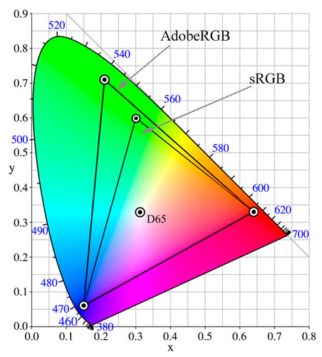
xy Chromaticity Diagram
(with grossly inaccurate colors)
Showing sRGB and AdobeRGB color spaces
This kind of diagram is often seen, but not so often understood, so here are some notes:
The shark-fin shaped blob is meant to represent the chromaticity that the human eye can see. “Chromaticity” is color without regard to brightness; each point on the graph represents a specific spectrum (relative combination of visible wavelengths of light). Such light doesn't become a “color” until perceived by the eye.
Keep in mind that the eye's perception of a light's color is strongly influenced by the light's relative brightness. (For example, relatively unbright white is perceived as gray, and relatively unbright orange is perceived as brown.) Brightness is not taken into account with this graph, which is concerned only with chromaticity.
The two triangles are meant to represent the range of chromaticities that the sRGB and AdobeRGB color spaces can encode.
Note that the size of the green area is exaggerated by the mathematical approach taken with this plot (much like the size of Greenland is exaggerated in a standard Mercator projection map). The difference between sRGB and AdobeRGB is not as pronounced as this plot might at first suggest. This lack of perceptual uniformity across the plot is a common criticism of xy chromaticity diagrams (but that's an issue about the plot, not about the color spaces the plot is attempting to illustrate).
The triangles are the range of chromaticities that the two color spaces can represent; keep in mind that the range of brightnesses across which those chromaticities can be encoded in the color space is not at all represented by this graph.
The total range of colors (chromaticity/brightness combinations) that a color space can encode is called its “gamut,” but again, an xy chromaticity diagram like this shows only two dimensions of a three-dimensional issue.
The colors that you see in the plot are necessarily approximations. The graph is presented via a digital image — an image with the sRGB color space, so by definition anything outside the small triangle simply can't be represented properly because the color space by definition has no way to encode those colors.
Even those colors inside the sRGB triangle are approximations, because the relative brightness is inconsistent across the graph. Since this is all just an illustration to begin with, I opted for a prettier display rather than the much-harder-to-understand correct display. (This page on bad chromaticity graphs shows what they really should look like.)
The top and sides of the fin are labeled with marks ranging from 380 to 700, which are wavelengths of light, in nanometers. The colors around that edge (the edge of the fin except the bottom edge) are the monochromatic or spectral colors — colors made up of a single wavelength of light. Although these select colors are the building blocks of all color, they are rarely found in nature.
Ostensibly, these are the colors of a rainbow, but because one sees a rainbow only in the context of what's behind it, you don't see monochromatic colors when looking at a rainbow. You do see them with a prism, and from a laser.
You'll notice that the entire set of monochromatic (“rainbow”) colors are outside both the sRGB and AdobeRGB triangles. Neither color space can represent these deep, rich, pure colors; they are simply omitted from the color space. The closest colors within the triangles are close, but they are different. Many would argue that they are not so different that most people could tell on our consumer monitors or printers, but in any case, remember that the colors you see in the image are just an approximation.
The point marked “D65” is the white point for both color spaces. You might be surprised that there's not a standard definition for the color “white,” so the white point of a color space is the its definition of white. The white called “D65” is roughly equivalent to late-afternoon shade on a clear day (although evaluate this description in the vague, er, light of the next paragraph). Some color spaces have dramatically different white points, often due to historical conventions within a particular field.
As an aside, it might also be surprising to learn that many lights that we generally consider to be white have fairly strong tints to them. Our eyes/brain compensate quite well (“chromatic adaptation”), so we normally don't notice. The color of sunlight, for example, changes markedly as the sun's height above the horizon, and weather, change. The color of light in direct sun is remarkably different than the color of light in the shade. Yet a “white” shirt (objects generally have no color; they merely reflect light) on a passerby indeed seems white, even though it's usually presented to our eyes via some very light shade of blue or red.
Because a digital camera's sensor doesn't compensate the way our eye does, it sees the light as it is, tint and all. We must therefore set the camera's “white balance” setting to let it know the tint of the ambient light so that it can attempt the same compensation that our brains do automatically. If you're not familiar with the problems of not setting this correctly, I have a short writeup on white balance that might be informative.
An interesting feature of this kind of plot is that the colors between any two points are made up of the various combinations of the two endpoint colors. Similarly, colors within a triangle of three points are made up of the various combinations of the colors of those three points. This last effect means that the range of chromaticities of these color spaces is defined by three points (apply named the color space's red point, blue point, and green point). These points are the exact shade of each color that is considered “pure” within the context of the color space.
Here's a small Java application which allows you to play with a three-point gamut in real time.
There is more to the design of a color space than the location of its four color points. Another important consideration is how it represents brightness. Human perception of brightness is not linear; if you double the luminance of a particular light, for example, yes, it is perceived as brighter, but still much dimmer than twice as bright.
The non-linearity of our perception of brightness can be seen in the “18% gray card” that photographers use when metering exposure and white balance. Have you ever wondered how it got its name? It appears 50% as bright as a white sheet of paper, but achieves that reduction in brightness by reflecting only 18% of the light that hits it. It could well be called a “50% white” card or a “half bright” card; I suppose the “18% gray” name was chosen because how much light it reflects is a reference to a quantitatively measurable characteristic, as opposed to a subjective characteristic of human perception like brightness.
Anyway, because of this non-linear nature of brightness perception, color spaces are more efficient with their finite amount of encoding space if they encode brightness in a non-linear fashion as well. This non-linear component is the color space's gamma.
Continued on the Next Page
If you're really interested in the design tradeoffs that go into a color space, you'll want to continue with the next page: Page 6: Color-Space Design Tradeoffs.
However, if you'd like to skip that, jump right to Page 7: Recommendations and Links.
Just for fun I ran your http://exif.regex.info/exif.cgi on the image in this article, and it says it has no color-space metadata and no embedded color profile. Is that intentional? If not, perhaps fix it?
It doesn’t really matter for this image, since it’s more of an “artist’s conception” than real. No display in the world can present it properly, anyway. —Jeffrey