Nikon D700 + Nikkor 300mm f/2 — 1/2500 sec, f/2, ISO 360 — map & image data — nearby photos
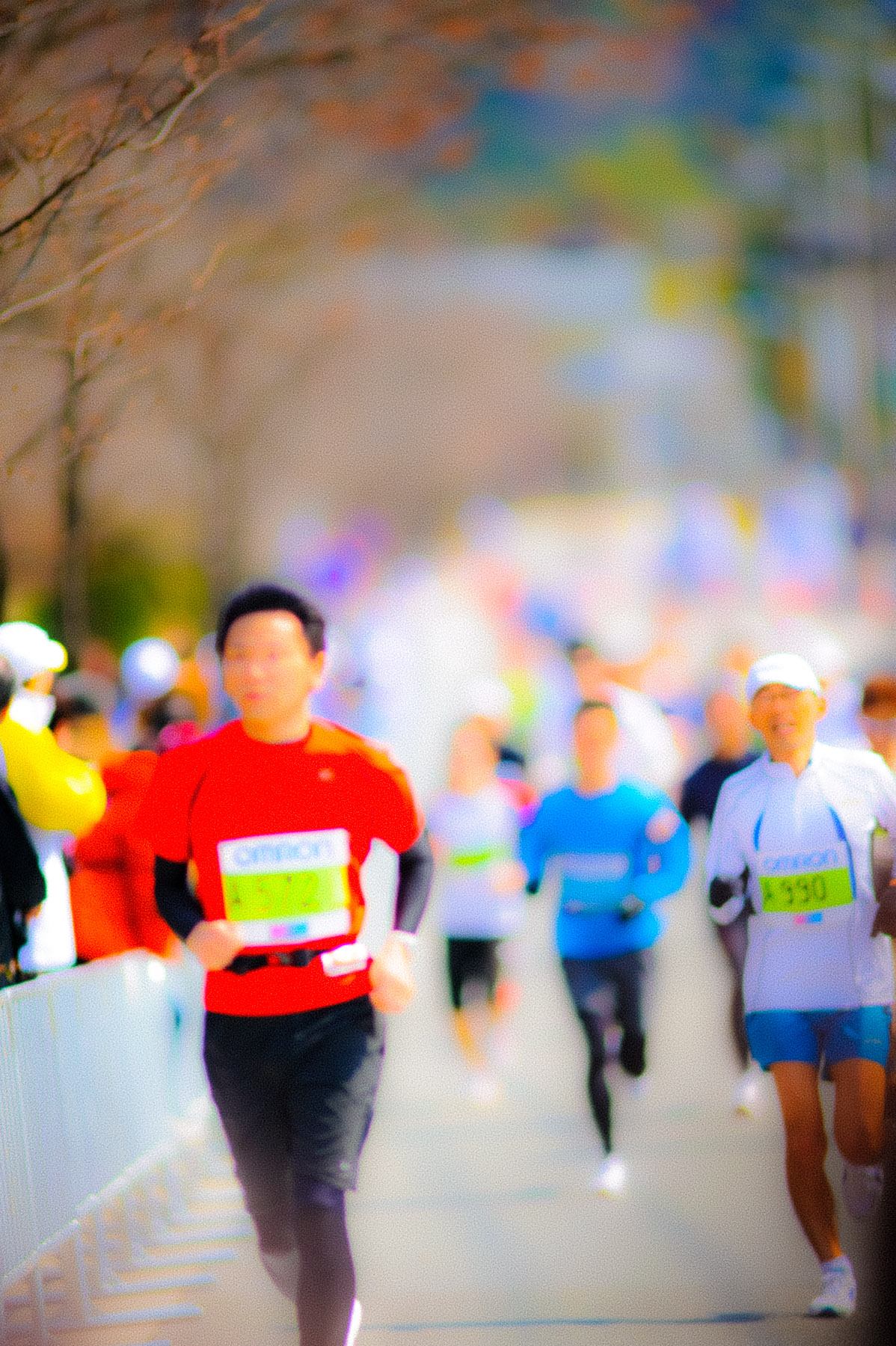
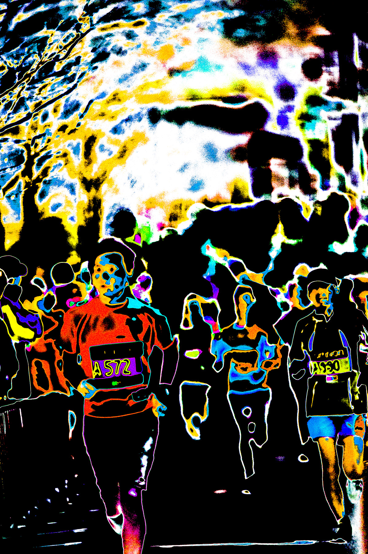
Funky Runners
straight out of Lightroom
featuring gracefully-fuzzy 鈴木 康之 and 河本 哲
So I was going through the photos from last weekend's Kyoto Marathon (京都マラソン2012) and came across an out-of-focus shot that I'd normally just delete, but it had some kind of odd sense of space about it that I found somehow appealing, and wondered whether I couldn't use some funky processing to turn the lack of focus into an asset.
I don't know whether I succeeded, but the result is what you see above, something that vaguely reminded me of my memory of some Leroy Neiman Olympic paintings.
I don't use develop presets very often, but I saved the extreme develop settings used in this photo as a new preset, which I named “Funky Runners”. While there, I noticed the few other presets I had accumulated over the years, and gave them a try with this photo.
The most recent one was “Creamy Autumn Wow” from “Kyoto Fall-Color Preview With Impact: Impressionism in Lightroom”, but the result with this subject was less impactful than the name implies:
Nikon D700 + Nikkor 300mm f/2 — 1/2500 sec, f/2, ISO 360 — map & image data — nearby photos
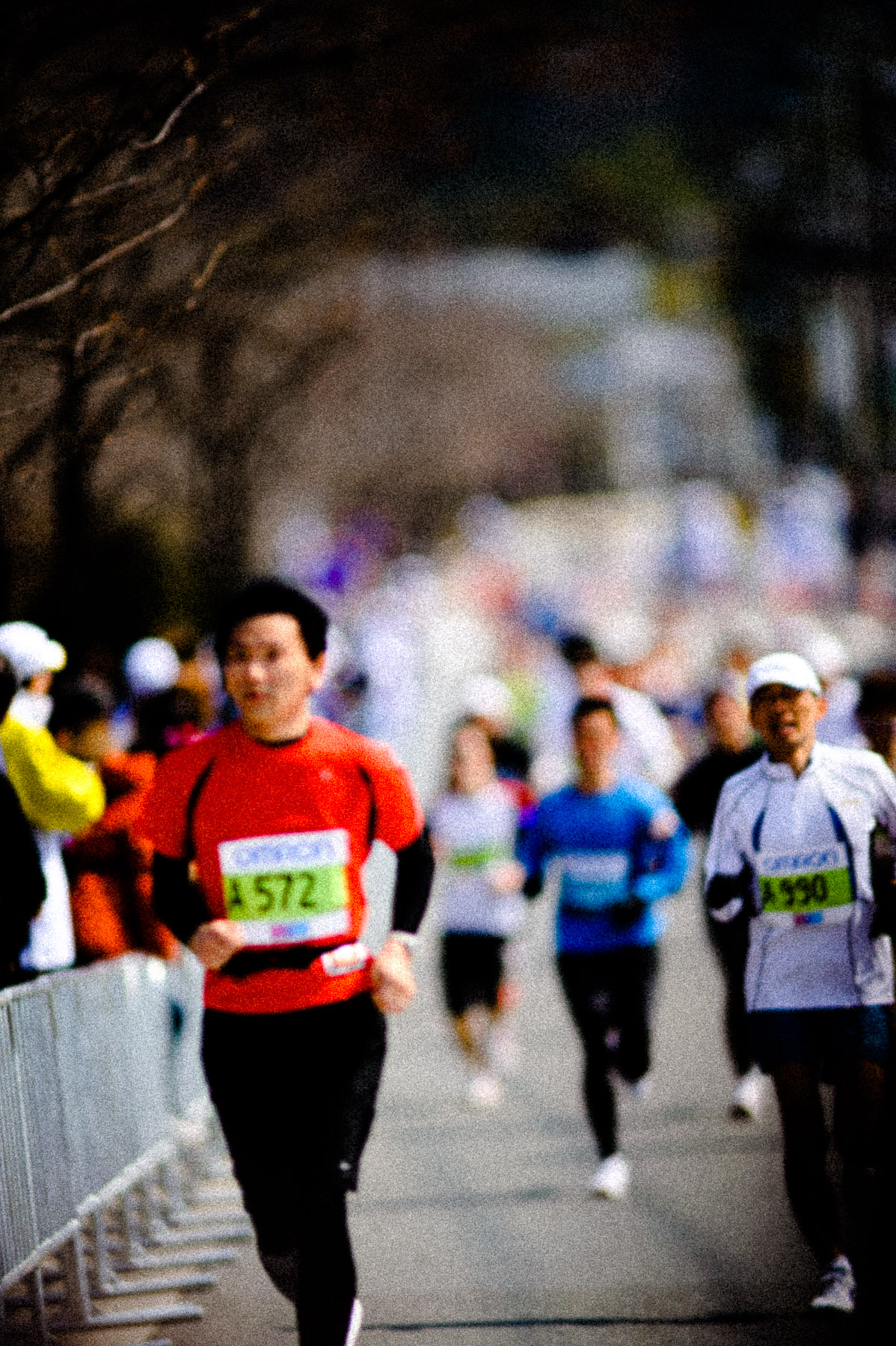
With the “Creamy Autumn Wow” Preset
not really doing it for me
I also tried the first Lightroom develop preset I ever made, one that attempted to match the at-the-time-vogue look of Dave Hill's work, as seen here and here (the former from a post exactly four years ago today, on the annual Kyoto Higashiyama “Hanatoro” lightup event in my neighborhood, which is again going on this week, but sadly, I've had no time to visit).
Nikon D700 + Nikkor 300mm f/2 — 1/2500 sec, f/2, ISO 360 — map & image data — nearby photos
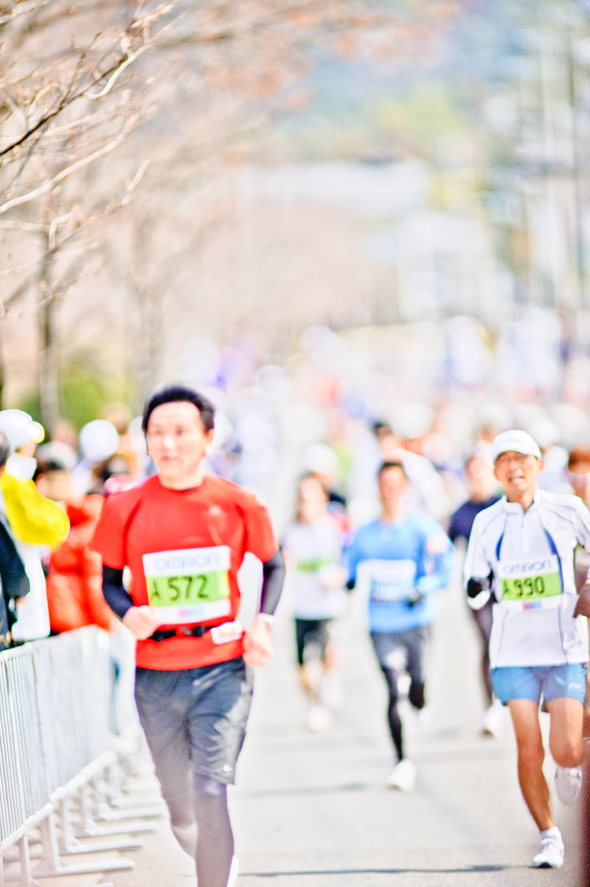
With the “Dave Hill Look” Preset
also not doing it for me
These misses just go to show that not all presets are appropriate for all images (though with the extreme nature of these, you wouldn't be faulted for thinking that they're not appropriate for any images, but I like their effects from time to time, in extreme moderation).
One of the “time to time” situations is the photo of mounted archer printed and framed in my office (as seen in “Dabbling in Some Fine-Art Printing for My Office”). The preset I used for that, named unoriginally as “Funky Archer”, produced this:
Nikon D700 + Nikkor 300mm f/2 — 1/2500 sec, f/2, ISO 360 — map & image data — nearby photos
With the “Funky Archer” Preset
Again, not interesting.
I know I could get “interesting” (though perhaps not “good”) with something from my tone-curve posts from a couple of years ago, either “Stupid Tone-Curve Tricks: A Half Dozen Develop Presets for Lightroom” or “Gettin’ Freaky With Lightroom Tone-Curve Presets”. There's much fodder in there for craziness, and not much for anything else, so I just picked one (“Notch Medium 8”) and then futzed with various brightness settings to come up with:
Nikon D700 + Nikkor 300mm f/2 — 1/2500 sec, f/2, ISO 360 — map & image data — nearby photos
“Notch Medium 8”
at least it's not boring
From the same posts...
Nikon D700 + Nikkor 300mm f/2 — 1/2500 sec, f/2, ISO 360 — map & image data — nearby photos
“Cliff Highlights 2”
Somewhere in the fun waste of time I spent on this last night (a needed diversion from plugin-related work, the crush of which has not yet subsided in the two weeks since Lightroom 4 was released) I apparently futzed around with a black-and-white version, because I found this in my catalog this morning:
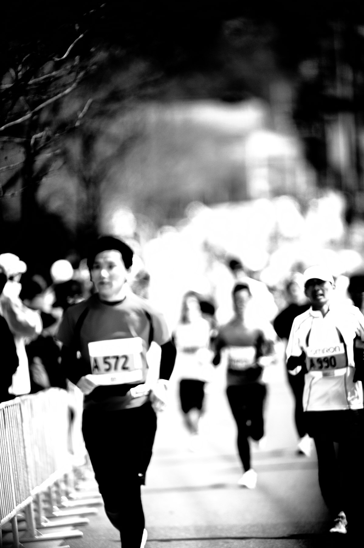
Nikon D700 + Nikkor 300mm f/2 — 1/2500 sec, f/2, ISO 360 — map & image data — nearby photos
One Stab at a B&W
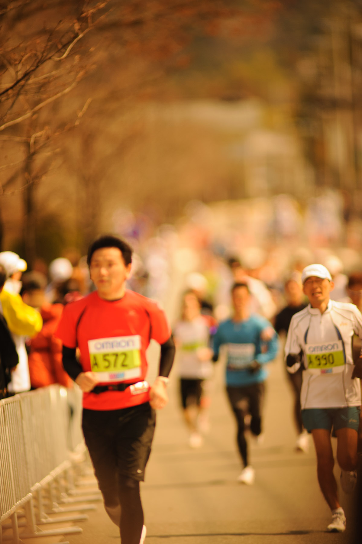
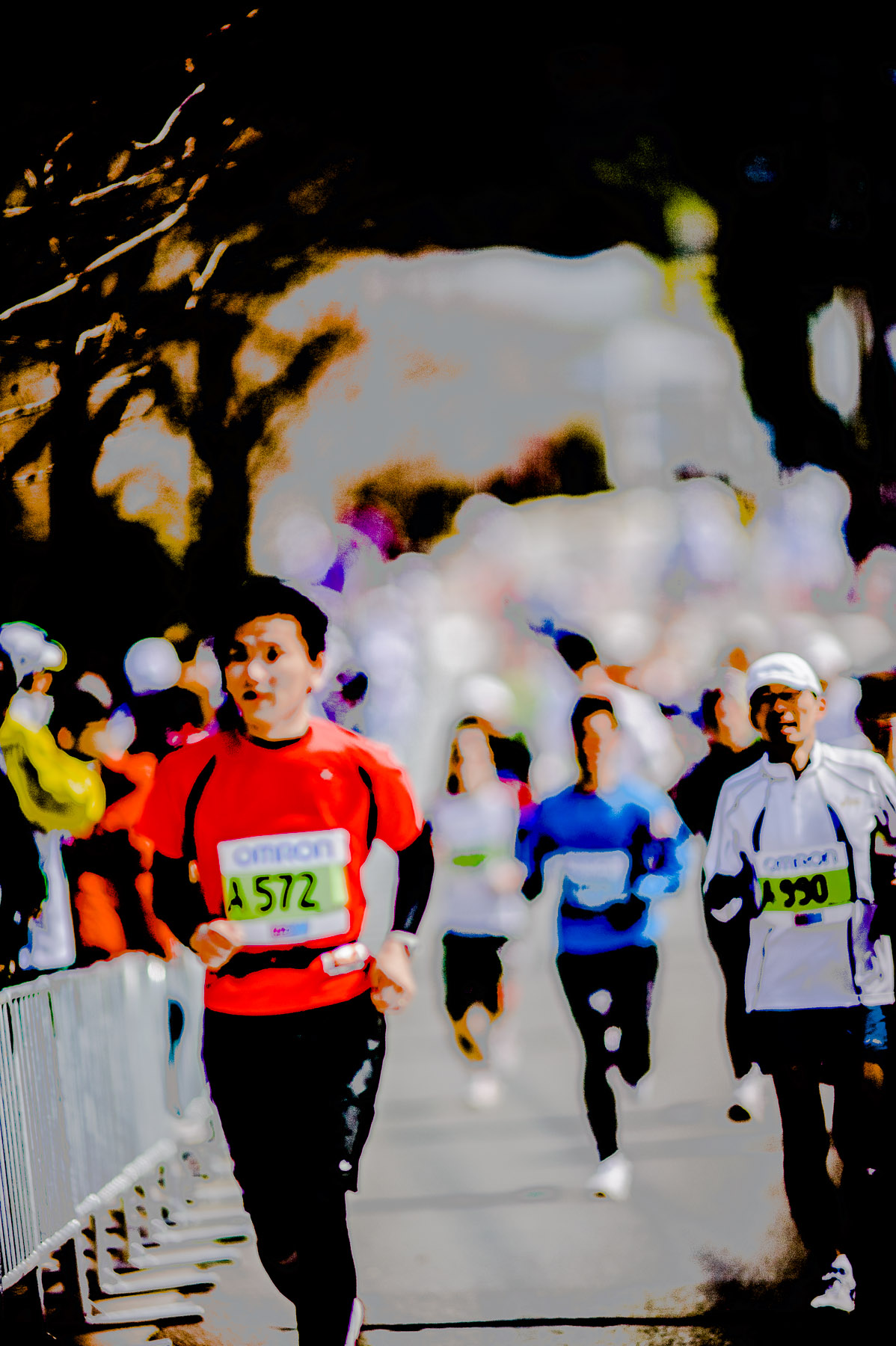
And finally, here's the original:

Nikon D700 + Nikkor 300mm f/2 — 1/2500 sec, f/2, ISO 360 — map & image data — nearby photos
Original
maybe some potential?
I've posted about “extreme” processing in Lightroom a few times over the years. Besides the various links referenced above, ones that come to mind include:
- Funky Joy With Adobe Lightroom
- Context for the Bamboo-and-Leaf Photo, and Some Crazy Post-Processing
- One More From Last Year’s Eikando Temple Fall Colors
- Freaky Raw Processing: From Sunset to Moonrise with Adobe Lightroom
- Serendipitous Fun with Adobe Lightroom
- Camo Duck in Black and White
- A Few Stylized Shots from Bunny Island
- Stark Tree
- Freaky “Artsy” Sharpening with Lightroom 1.1
- Two Sides of the Same Photo
Yet even after all that, it never ceases to amaze me just how much artistic latitude Lightroom affords... obviously way more than I can handle, but I find it fun.... in moderation.
If you've got Lightroom 4 and would like to see what you can come up with, here's “JF7_108110.dng”, a raw version of the original. I'd love to see whether anything good can come of this photo, or whether my first instinct to delete it was right.
That black & white version is most compelling; seems like as if it could be from a magazine or a newspaper. Now only if the the first one had lower saturation … (currently it has effect similar to consuming too much sugar).