Photo being processed: D200 + 70-200mm f/2.8 @ 200 mm — 1/100 sec, f/4.5, ISO 320 — map & image data — nearby photos
On Top of the (Monochromatic) World
via the “Monochrome” preset discussed below
The tone curve is one of the ways that Adobe Lightroom offers to adjust an image. It's basically a “brightness map” that normally indicates "dim parts of the image are shown as black, bright parts are show as white, and things in between are shown proportionally somewhere along the line between the two". The screenshot below highlights Lightroom's default tone curve, which is mostly a straight line (that is, “proportional”) from dark to bright...
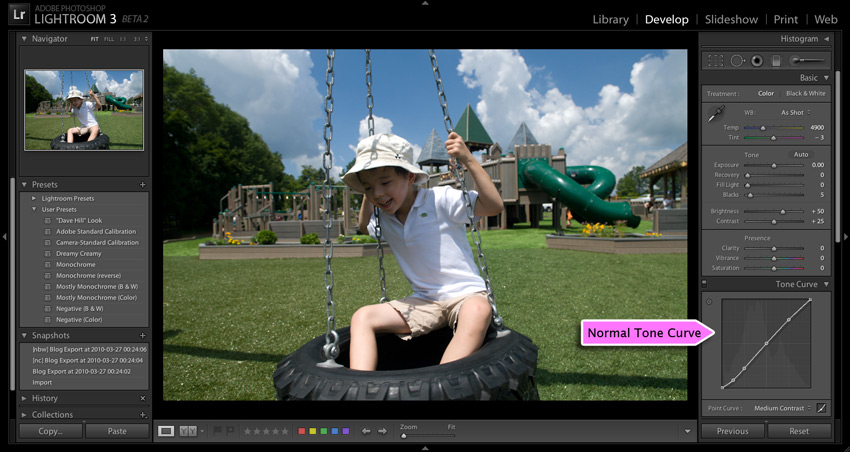
Photo being processed: D200 + 17-55mm f/2.8 @ 17 mm — 1/500 sec, f/5, ISO 250 — map & image data — nearby photos
Adobe Lightroom Develop Module
in the second LR3 public beta
The idea of a tone curve is general to photo-editing applications; if you're not sure of what one is, you might take a look at this or this.
Prior to the release of the second LR3 beta earlier in the week, Lightroom users could tweak the tone curve slightly to try to bring out or suppress detail in tonal areas of an image (e.g. “bring up the shadows”, “compress the highlights”, etc.), but now with we have much more control.
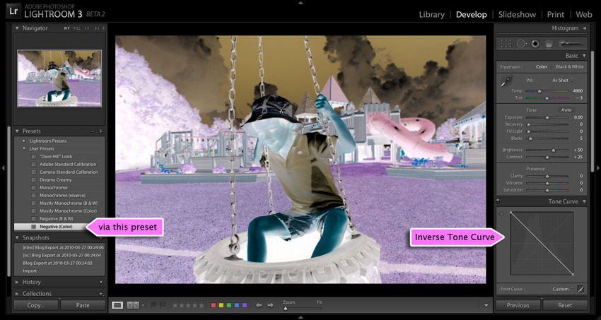
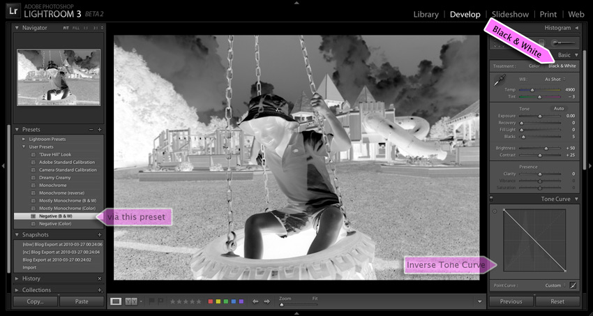
For example, those old enough to remember the real meaning of a “film negative” from personal experience will appreciate the look one achieves when using a tone curve that's been inverted — one that maps bright to dark and vice-versa — as illustrated in the next two screenshots...
(You might find the photo familiar if you saw my “Funky Joy with Adobe Lightroom” post a couple of years ago, about “negative clarity”.)
I've created a half dozen Develop Presets that allow you to do this and more; there's a download link at the bottom of the page. Once you install the presets on your system, they'll be listed in the aptly-named “Presets” section on the left side of the Develop Module, as illustrated by the “via this preset” highlights in the two screenshots above.
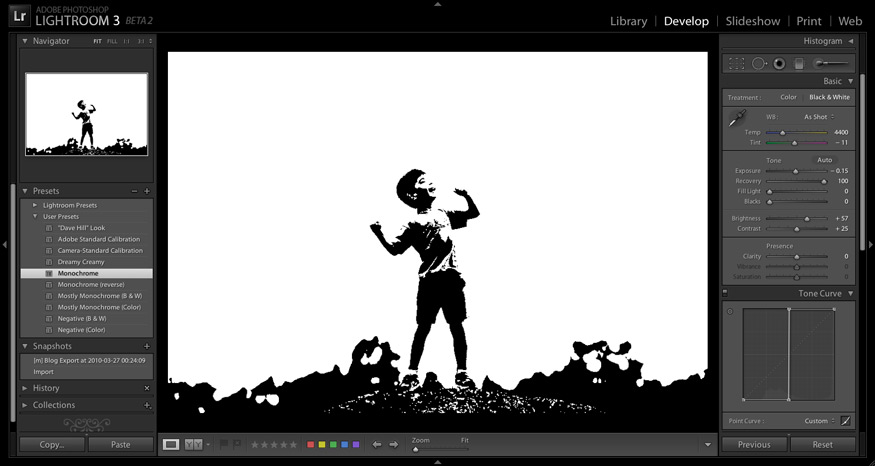
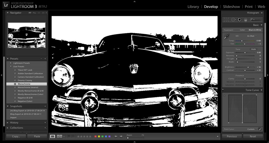
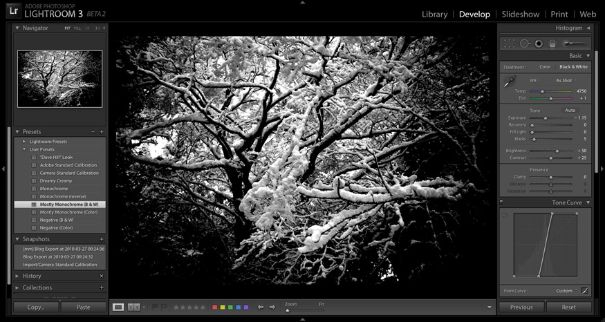
You can do some crazy things with custom tone curves, as the lead photo of my LR3b2 post shows. Less haphazard, but almost as crazy, is a pure monochrome treatment — just black and white; no gray — as illustrated with the following before/after screenshots...
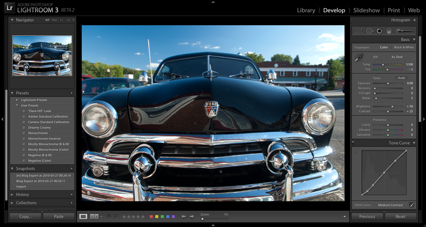
Photo being processed: D200 + 17-55mm f/2.8 @ 17 mm — 1/45 sec, f/6.3, ISO 100 — map & image data — nearby photos
Before
As you can see, the tone “curve” above is a vertical line at the halfway-brightness mark: anything that's supposed to be more than halfway bright is made perfectly white, and anything that's less bright is made perfectly black.
To be clear, I'm not touting this as a “good” effect; it's fun to experiment and play, but whether it's good or useful is very much up to the specific situation and, like all artistic endeavors, the eye of the beholder.
But it is fun to play, especially with this monochromatic idea, because it has such a dramatic effect on the photograph. But “play” is important, because develop changes that make parts of the photo brighter or darker can move those parts across the vertical cliff of our tone curve, so even subtle adjustments can have sweeping, dramatic effects on the final image.
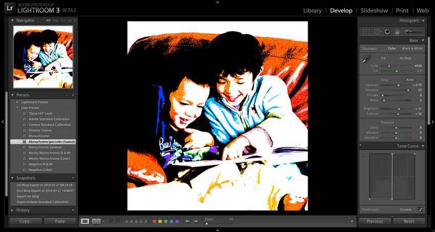
The screenshot that leads this post is another example. It's a photo from the same outing as this one, but it was way overexposed and I really should have just deleted it, but it turns out to make a great example here. I used a lot of the “Recovery” develop adjustment to bring some of the features of his face “below the cliff” (so to speak), so his face wasn't just a white blob on the side of a larger black blob.
It's similar to what I did with last photo in yesterday's post in that it rescues something of at least mild interest from an overexposed shot. I'm not sure what I'd ever really do with something like this, but like I said, it's fun to play.
But with the “subtle adjustments can have sweeping, dramatic effects” bit in mind, one can often get something interesting from regular shots. Here's a version of this photo from 2008 of Anthony with his friend Gen...
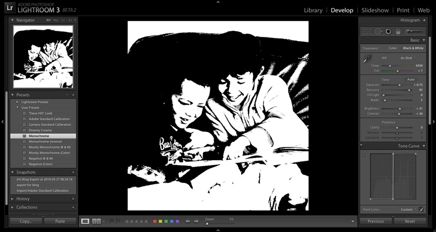
Photo being processed: D700 + 70-200mm f/2.8 @ 210 mm — 1/640 sec, f/4.8, ISO 6400 — map & image data — nearby photos
Via the “Monochrome” Preset
I've also included a “Monochrome (inverted)” preset that's the same as Monochrome, except it's upside-down, so the sense of black and white are flipped.
The monochrome effect can be fun, but as you can see, it's really stark. One step back is the “Monochrome (per color channel)” preset, which is the same as the “Monochrome” preset except that it keeps the treatment as color instead of B&W, so you get a strong posterization effect among the primary and secondary colors (as modified by other develop adjustments, such as white balance)...
Subtle changes to the white-balance setting cause all kinds of freaky, dramatic changes.
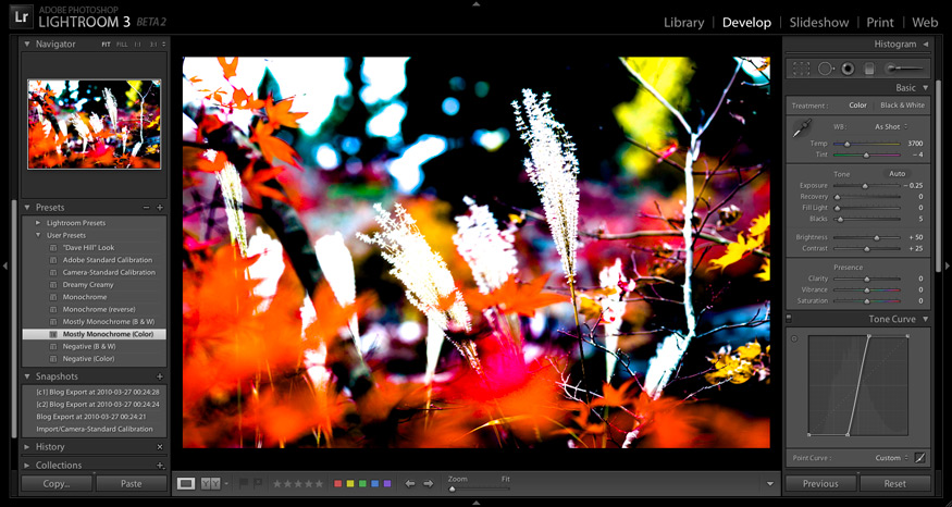
Going even further is to make it less stark by converting the vertical cliff of “monochrome” into merely a steep hill, thereby making the transition from black to white a touch more gradual. Compare the before/after of the next two screenshots...
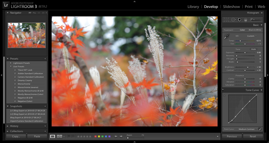
Photo being processed: D700 + Zeiss 100mm f/2 — 1/320 sec, f/4, ISO 320 — map & image data — nearby photos
Normal
The effect here, of some nature at Kyoto's spectacular-in-autumn Eikando Temple, is really interesting to me. Some of the colors are a bit too overwhelming, though, but backing off on a few adjustments, notably Vibrance, makes a real mood-setter:
There's a “Mostly Monochrome (B&W)” preset as well... compare these before-and-afters...
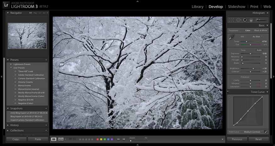
Photo being processed: D700 + 24-70mm f/2.8 @ 35 mm — 1/800 sec, f/2.8, ISO 200 — map & image data — nearby photos
Boring
The key to these monochrome / mostly-monochrome presets is to play with the develop settings — especially Exposure, Recovery, and Fill Light — to adjust what parts of the photo fall across the cliff or steep hill.
Download and Install
First let me say that it's easy enough to create these tone curves and presets yourself. You can create the tone curves by clicking the “point-curve” icon in the lower-right corner of the “Tone Curve” section, then dragging the points around. The points can be a bit temperamental at first, until you get the hang of it; or better yet, check out this great LR point-curve tutorial. Once you've made a tone curve whose effect you like, you can save it to a Develop Preset (instructions).
But, since I've done it already, it's easy enough to share, so here's a zip with all the presets mentioned:
Negative-and-Monochrome-LR-Develop-Presets.zip
[ Lightroom 4 and later: see this warning ]
I also threw in a “Dave Hill” Look preset, and the “Dreamy Creamy” preset I used on this photo last fall. That's pretty much the extent of my preset use, except for some calibration presets I use during import.
After downloading and unzipping, right-click on “User Presets” in the “Presets” panel of Lightroom's Develop Module, choose “Import...”, and navigate to the .lrtemplate files left by unzipping.
Play. Experiment. Have fun.
For even more fun, check out the followup: Gettin' Freaky With Lightroom Tone-Curve Presets.
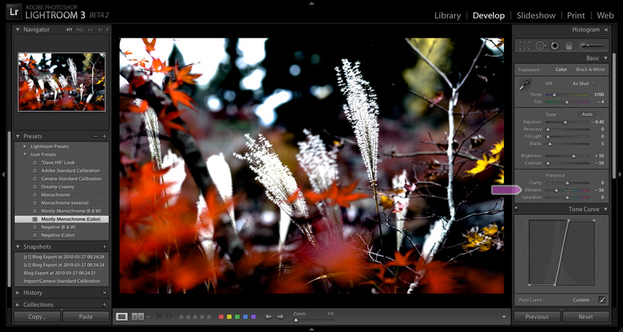
(i haven’t used Lightroom, or have an appropriate environment to run a copy.) From the differences in adjustments alone, of grass+leaves image, it seems “Vibrance” had reduced the contrast. Just looking at the two images (not the adjustments), it seems change was in reduction of both saturation & brightness. Which version is correct, or is there something else going on?
Higher contrast snow-on-branches image certainly looks more appealing. I have found myself that compressing the shadows in low contrast scene (in GIMP; or increasing the black point during raw conversion in ufraw) alone some times saves an image from deletion. I have not tried nothing as drastic you have shown here, but I see now that there is no harm at least trying that.
I don’t think either of the two is “correct”, though “Normal” is certainly closer to reality. Overall contrast in the “vibrance” one was greatly reduced, but local contrast in the mid tones was greatly exaggerated… that’s the whole point of the tone-curve preset. On many images the result is worthless, but with a few extra adjustments I think the result here has some value. —Jeffrey
By “correct”, I meant if my understanding of “Vibrance” control was correct; no worries. Thank you for the Clairty on “Virbrance”.
Nice examples of this new curve in LR3.
I used the monochromatic filter to produce this photo
thanks.
I’m trying to play with the custom tone curve but can’t seen to set the curve to custom? When I click on the little box it only gives me the options of Light, Medium, and Strong Contrast. I’m not able to adjust the slider of the inverse scale. Please help.
Click the little box again to get into the view without the Light/Medium/Strong, then grab the curve itself and drag to whatever custom configuration you like. —Jeffrey