
Nikon D200 + Nikkor 17-55 f/2.8 @ 19mm — 1/15 sec, f/3.5, ISO 400 — full exif
Schweeeeet!
A bad photo of my new multiple-monitor goodness
I found myself suddenly lusting for a second monitor (Lightroom 2 supports two monitors), and with visions of a tax writeoff dancing in my head, I opted for the mid-level Eizo FlexScan SX2461W, a 24" widescreen that offers a 1,920 × 1,200 desktop in luscious relatively-wide-gamut color.
(If I'd had visions of hitting the lottery dancing in my head, I'd have gone for the $6,000 Eizo ColorEdge CG221)
I had trouble setting up my XP box for dual monitors until I installed the latest drivers for my ATI graphics card — ATI's new “Catalyst Control Center” made it trivial to set up the two monitors to work in concert just as I wished.
The new Eizo is in the center of the crappy snapshot shown above, with the Dell running a pretty-pictures slideshow on the side (currently showing an image from this Cherry-Blossom post), and my MacBook sitting in the lower center. The Eizo looks much smaller than it actually is – it positively dwarfs the tiny laptop – due to the perspectives of the closer-quarter shooting that a wide-angle lens affords (as seen here).
Anyway, after getting things set up, I calibrated and profiled the new monitor with my GretagMacbeth Eye-One hardware spectrophotometer. I also redid my old (and still excellent) Dell 2001FP, the 21" 1,600 × 1,200 LCD I've been using for the last four years.
The difference in color quality between the two was immediate and shocking.
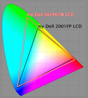
No monitor can display every possible color, so every monitor is necessarily a compromise. If you compromise more on the budget, you can compromise less on the quality, and so my mid-level Eizo (it cost about $1,300) can show a wider range of colors than the lower-level Dell (which four years ago cost $1,000, but now costs much less).
The image at right is a false-color representation of the chromaticities that each monitor can produce. “Chromaticity” more or less means “color without regard to brightness”, and the chart shows that the Eizo can show reds that are a bit deeper than the Dell can, and richer greens. Oddly, the Dell actually has a slight edge on the blues.
(For those few of you actually inspecting the diagram, it's important to remember that it is a false-color diagram – the colors shown are wildly off – and by necessity they must be because the chart aims to signify in part colors that no monitor in the world can reproduce. Also, due to the mathematical nature of how the plot is derived, differences in the green area of the plot seem exaggerated. For more about these kind of shark-fin plots, see my writeup on chromaticity diagrams.)
Many photos look exactly the same on the two monitors, because both monitors can reproduce equally well wide swaths of the spectrum. It's only when colors fall outside the Dell's ability – outside the black triangle in the (false-color) diagram – does the Eizo show its stuff. However, it just so happens that the flowers in my previous post have some of those rich colors, and so they look glorious on the Eizo. Absolutely Glorious. My Dell pales in comparison, and now the LCD on my MacBook seems downright dull.
The diagram shows only a small difference in the red area covered by the two monitors, but the practical difference is huge. The Eizo can produce reds that I've not seen on a monitor before... deep, rich, intense reds that burn into the retina. I'm not talking about “brightness” or “saturation”... I could turn both controls on my Dell to their maximum and it still won't be able to produce colors that it can't produce. This is a whole new flavor of “red”.
Most photos don't have these deep rich reds, but one odd byproduct of this is that non-photo reds (such as the Yahoo! logo) almost dance off the screen to sear your eyes. It's a bit of a simplification to explain it this way, but basically, these kind of reds translate into “the reddest red your monitor can produce”, and so I see these glorious colors everywhere.
The “gloriousness”, of course, is that I'm not used to seeing them on my monitor, and so its the novelty that's most wonderful. I'll eventually get used to it, but it's important to remember that these (and better) colors are all around in real life. Perhaps I should check it out sometime 🙂
When I got my HP LP3065 I was shocked to see my previous monitor and other screens looked almost broken color wise. Especially in warm, rich reddish tones; my other monitors look dull and tan as opposed to rich, warm brown/red. The newer wide gamut monitors really do make huge differences in your pictures. So much so that you wonder how anyone can really “finish” a digital image and say “this is how it should look”
As a fellow owner of a Macbook, I always thought their displays were some of the best. I’m curious to know if you think the Macbook is insufficient for photo work.
My own experience with some of the prints produced from pro labs shows that it seems to be working for me thus far, but as you clearly pointed out, I may not have many photos which are outside of the gamut for the Macbook.
Another informative post!
As someone still working in the dark ages of CRT monitors, have you any thoughts on how they compare, in terms of gamut, with modern LCD ones like your handsome Eizo?
I don’t know how they compare, but I suspect that their sheer weight warps the fabric of space-time sufficiently to distort the picture, not to mention slowing the rotation of the earth. I can’t imagine going back to a CRT. —Jeffrey
I also have a FlexScan SX2461W and it’s a nice monitor (quite reasonably priced too). I also noticed that the colour is very good; significantly better than the 24-inch Dell sitting next to it.
Of course, this big new monitor is no doubt a requisite for your coding…
Dan
hello
I discovered with great pleasure recently your blog.
Great pics !!
I can see on the pic above that you have a Macbook.
I am wondering how does it run with Lightroom ?
I guess 4 gig of ram is a must ?
Does it make sense to get a macbook and a external monitor, like a 23′ cinema display or anything else ?
Thanks
Lightroom runs fine on my first-gen MacBook with 2G ram, and I can use Lightroom/Photoshop on without problem, but when I’m not traveling, I prefer to use a big monitor with better colors. I’ve never used a laptop with an external monitor, so I’m not sure how that would work, but it sounds like it’d be reasonable. —Jeffrey
Hi Jeffrey!
Interesting read this. I’m clinging on to my old Samsung SyncMaster 957MB for dear life because I’ve found it far too difficult to find a LCD monitor to suit my needs. Perhaps I’m just really picky, or perhaps scared to delve into something new.
My reason for sticking with the CRT has been that whites seemed to be blown out. The details weren’t there when I looked at photos. And the black reproduction as well. How does your shiny Eizo deal with that? I might just get one like yours if I can be convinced. 😉
Thanks for your excellent blog! I enjoy reading it!
—
Fred
I’m not very knowledgeable in this area; I can only report that I still catch myself gawking in awe a couple of times a day while using this monitor for photo work. As for blown-out highlights and lack of detail, any monitor can (and likely will) look bad if it’s not profiled properly (and fed an image from an application that understands both the image and monitor profile), so that’s an important step regardless of what monitor you use. —Jeffrey
Hi Jeffrey,
I was interested in buying this monitor but I’ve heard somewhere that there is a massive lag 40ms. Is this true? Even though it states 6ms.
Thanks your help,
Halmat
I’m not exactly sure what lag would look like, but I don’t think I’ve ever noticed any. It’s a great monitor and I’d not hesitate to buy another if I broke this one. —Jeffrey
After bying a new wide gamut 8-bit monitor, my first impressions were like yours: colours so saturated they almost hurt the eye 😉
Impressive! However, saturation is not necessarily a goal in itself. In fact, to get naturally looking colours, I found a hit to turn down saturation a bit. Now I’m very pleased with the monitor.
More details on http://blog.christianehoej.dk/2008/11/05/lang_dai-et-bredere-perspektivlang_dalang_enin-a-broader-perspectivelang_en/langswitch_lang/en/
Yours
Lars (from Denmark)
Hi Jeffrey,
Thanks for the great resource. I stumbled on your site today while researching a new monitor for Lightroom and Photoshop work. I’m an serious amateur photographer looking to step up and maybe sell a few prints. Have been working with cameras since the early 80’s but brand new to LR and PS. After reading you blog on color calibration and sRGB/RGB I searched to find what kind of monitor you used. I would love to buy an Eizo or NEC but have a price limit of about $800 after just building a custom PC (ok to insert laugh track…haha…he’s not a Mac guy…), and upgrading my camera equipment.
I have looked at 24″ and 27″ monitors from Dell (seem to work great if you get a good one, HP (good reviews on PRAD and others), and Samsung (uses PLS versus IPS but good reviews). Also Asus has a model said to be a close of the Dell U2410.
Do you have any advice on monitors: standard gamut versus wide gamut? 24″ versus 27″? IPS versus PLS? One manufacturer versus another (you must have liked Dell at one point). I know a great monitor is somewhat of a waste for the web and sRGB but my plan is to do mainly prints. And one last question regarding monitors – it appears that many wide-gamut monitors do a lousy job of displaying anything but color managed sites like LR & PS. Is that necessarily true or can some display both (LR & PS but also IE, Chrome, MS Office)? Or am I better off getting a monitor to dedicate to image editing and another to the rest of the regular “pc” type stuff? Going for two would probably limit me to 24″ monitors given my price range (and patience of the accountant also know as the wife ;o)
Thanks again for the great site.
Doug
Nashville TN USA
I don’t have a lot of specific experience from which to draw advice, but I’d think that the problem with non-colormanaged apps would be there whether you had a good monitor or bad, though in unpredictably different ways. So I’d just get a good monitor and be done with it. In the end, you can’t predict what other folks will use, so it’s almost not worth trying. —Jeffrey